Recent Industrial
Logo Design
Do you need fantastic looking industrial design?
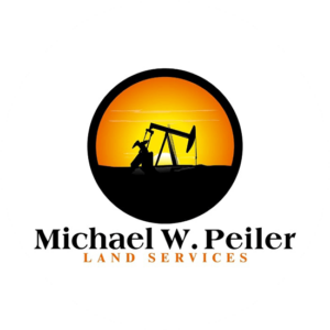
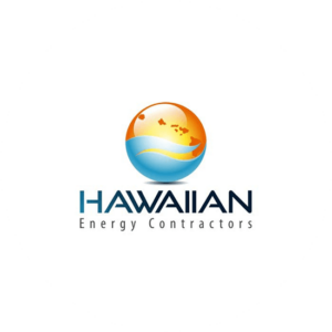
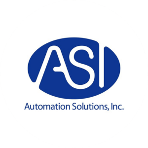
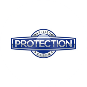
Below are some examples of industrial logo design we have created from scratch for our clients in the industrial sector. Please remember, your logo will be completely unique to your business. These real examples are just to give you an idea of the quality you can expect. You can change to view examples from a different industry by using the drop down menu.
Logo Packages
Logo Only
-
- 5 Logo Designers
- 5 Concepts
- Unlimited Redraws
- Unlimited Revisions
- Money-Back Guarantee
- Copyright Transfer
Logo + Matched Stationery
-
- Logo Only Package
- + Business Card Design
- + Letterhead Design
- + Envelope Design
Logo + Matched Stationery + 500 Business Cards
- Logo + Matched Stationery Package
- + 500 Business Cards
Do You Have Any Questions?
How do you explain industrial logo design.
Industrial logo design is not a simple process. For instance, to design an effective and compelling logo, the creative team needs to thoroughly understand your products and processes to craft a visual brand identity. The design team uses the natural elements of the logo to express your vision for your company in a way that is recognizable, memorable, and separates you from your competitors.
Elements of logos for manufacturing lndustries.
The main elements are shapes, symbols, color, space, text, and fonts. Furthermore, each component conveys a marketing message and influences your customers’ perception of your brand. It’s especially important to incorporate these elements so they are usable across a variety of media formats, from printed materials, web interfaces and mobile apps, to different forms of marketing and promotional materials. In a nutshell, make your industrial logo design simple, memorable, and versatile.
Symbols and Shapes in Logo Design
More importantly, shapes and symbols express qualities like precision, innovation, and reliability. Logo geometry and shapes Consider Volvo’s iconic logo. The company’s name appears inside an iron-colored circle with a right-pointing arrow, the ancient symbol for iron, reinforcing the brand’s message for safety, reliability and strength. Some even say it’s a symbol for the male gender. The Volvo logo and the male gender
Furthermore, symbols are an excellent source for any design inspiration. The NASA logo superimposes the agency’s acronym across a blue sphere with a scattering of stars and dots to represent galaxies. It is memorable and reinforces NASA’s mission.
More so if perhaps the best example of combining shapes and symbols into an instantly recognizable and high impact logo is the Chevron Corporation. Reda more about Symbolism behind the Chevrolet The company name, Chevron, placed above two stacked chevrons into a shield shape, projects safety, reliability and a sense of history. The two chevrons reinforce the brand name, and the simple design conveys a straightforward, no-frills corporation that gets things done.
What colors to choose for your industry logo
In general, most colors elicit a specific viewer reaction. Reds are stimulating, exciting, and powerful, while yellows are cheerful and optimistic. The Power Of The Color Red The Shell Oil Company uses red to draw a vivid border around an inviting yellow shell shape, a combination that projects both power and energy.
Blues represent stability, reliability, and security, qualities most companies need to project. The Mobil logo is a great example of combining colors and shapes to convey the company’s core values: The solid blue letters represent reliability and security, while the letter “o” is a powerful, dynamic red.
Green is another color that works well with industrial type logo designs. Greens evoke balance, possibility and eco-awareness. British Petroleum, striving to position itself as a leader in alternate energy, uses a modern stylized leafy green circle surrounding a yellow flower shape connected to the letters “BP.” It is easy to understand the values the company wants to portray just by looking at the logo.
Browns can also be effective color choices for branding your company. Brown evokes wholesomeness, experience and comfort. One of the best examples of a color representing a company is UPS and their brown shield. The color is familiar and friendly. In fact, the company uses the word “brown” synonymous with the company name: “What can Brown do for you?”
Black and white color schemes convey a sense of simplicity and credibility. Chemical company BASF uses black and white in its stark logo to convey its corporate mission statement of providing simple solutions for its customers. More in-depth information about color gradients Color science using gradients
The power of fonts in logos for manufacturing industries.
Above all, the choice of font in your industrial logo design can either reinforce your brand message, or detract from its power. In general, successful industrial logos avoid using script fonts. While its elegant script reinforces Cadillac’s image, applying the same font to Intel’s logo, for example, would contradict the company’s tech-focused brand.
In general, modern, serif and sans-serif fonts work best for manufacturing logos, although some display fonts work with industrial applications. Read our study on Psychology of fonts
Using space wisely in your manufacturing logos
Remember that, it’s important to achieve balance between design elements and negative space. Because logos get applied to surfaces of many different sizes, it is imperative that they are easily scaled so they don’t lose impact. Whether they appear on a business card or on the side of a company truck, they need to stay easily recognizable. The Hewlett-Packard logo uses the white rounded type for the “h” and “p” in a royal blue circle, instantly identifiable and easily scalable.
Logo trends
Industrial themed logos have always trended towards simplicity and maximum impact, and recent trends continue that pattern. More companies are embracing black and white color schemes, or monochromatic themes with a single accent color. Furthermore, geometric shapes and silhouettes are replacing fussier design renderings. Fonts remain solid and reliable, although sharp, angular types are also turning up in industrial designs. Some companies are taking inspiration from mobile apps and choosing logos in a circular app design. Your design team will show you several options and ways to incorporate meaningful ideas in your visual identity.
Working with The Logo Company
When you work with The Logo Company for your visual identity, a team of design professionals will brainstorm to generate color, shape, and font ideas for a cohesive design. You will receive at least five manufacturing logos ideas in just a few days for your review and feedback. You play a role in the design process from start to finish. After we review your comment and suggestions, we revise or redesign your logo as many times as it takes to get the image you want. Of course we offer Money back guarantee
In conclusion, you do need a fantastic looking industrial logo design because you need to attract new manufacturers. If you use our tips on shapes, color, space, text and fonts then you can’t go wrong.