Recent Leisure And Travel Logo Design
Below are some examples of travel logo designs we have created from scratch for our clients in the travel sector. Please remember, your logo for tourism business will be completely unique to your business. These real examples are just to give you an idea of the quality you can expect. You can change to view examples from a different industry by using the drop down menu.

Logo Packages
Logo Only
-
- 5 Logo Designers
- 5 Concepts
- Unlimited Redraws
- Unlimited Revisions
- Money-Back Guarantee
- Copyright Transfer
Logo + Matched Stationery
-
- Logo Only Package
- + Business Card Design
- + Letterhead Design
- + Envelope Design
Logo + Matched Stationery + 500 Business Cards
- Logo + Matched Stationery Package
- + 500 Business Cards
Do You Have Any Questions?
Understanding Travel Logo & Leisure Logo Design
Most of all you need to understand that a travel logo is crucial if you want to stand out in the tourism business. Above all, the Internet’s popularity has created an explosion of travel companies. Offering deals on a variety of services, including flights, car rentals, and accommodations. While some of these companies appeal to general travelers looking for low prices, others try to capture niche markets that want unique experiences. How to attract more traffic to your site
For instance, a travel agency’s target audience influences the type of travel logo design that it uses. Combining imagery, colors, and typography can help brand a company so that it appeals to certain types of travellers. After all, there are many common elements used in travel logo design for tourism companies. Knowing some of the most popular design elements could help businesses choose logos that suit their needs well.
Images Used in Successful Travel Company Logos
Most of all, images play crucial roles in company logos. Many travel logos use arrows to make potential clients think about movement. Another popular feature is Orbitz. Being one of the most popular companies that offer online travel deals, has a travel logo that replaces the “O” in its name with two arrows moving in a circular path. For instance, these two arrows remind people of traveling to their destinations and returning home after their trips. Furthermore, it also plays on the idea that life itself is a journey. By forming a circle, the travel logo implies that people are always on some type of journey, whether it’s a vacation or changes in life.
The clever use of arrows in a logo to show movement
Another example is, Gemini Tours and Travels uses a similar concept. The travel logo design uses arrows moving in a circle to help clients think about travel. Furthermore, it also uses the arrows to form an inventive “G” design that it can use as the first letter of its name. Perhaps less noticeable is the way that the Gemini logo plays on the concept of the Gemini astrological symbol. By using two rounded arrows stacked on top of each other, the logo creates twins circling each other. It’s not a crucial element of the design, but it shows how much thought went into its creation.
Let’s also mention, The Travel Channel logo also has an arrow, however it doesn’t form a circle. Furthermore, it points in one direction without reaching an endpoint. People could interpret this in the same way that they respond to circular paths. However, it’s a slightly different approach that helps the Travel Channel stand out from other companies.
Visual concept can play with company names
Above all, Travel Planet has one of the most creative travel logos, but it doesn’t rely on arrows. Instead, it features a map of the world that has been stretched to form a suitcase. More so, it even has a handle and a tag hanging off the side. Furthermore, this merges two iconic images associated with travel.
It’s a great way to identify the company as a brand that helps people navigate all over the world. Understandably, the visual concept also plays with the company name. After all, it’s inventive, fun, and evocative; three things that a travel logo should try to include.
Given the creativity that so many companies already use in their logos, new agencies should find talented designers who can take them in new directions.
Popular Typography Used in Travel Agency Logos
Travel companies that have been serving clients for several decades tend to use conservative typography. The Condé Nast Traveler logo, for instance, uses a plain, bold typography. It was clearly designed for the cover of a magazine instead of a website. The simple text (it doesn’t use additional graphics) also adheres to the Condé Nast brand. Condé Nast publishes hundreds of magazines about subjects other than travel. In this instance, the company seems more interested in taking advantage of its larger brand’s popularity instead of using a unique typography that will attract new travelers unfamiliar with its authority.
Newer vaccination and travel companies rely on more creative approaches to grab the attention of potential clients.
Kayak, another online travel company that promises low prices, has made particularly creative use of typography. At first glance, its logo design seems a little plain; it has blocky, black letters set against a yellow background. A closer look, though, shows that the logo links the online company to the history of travel. Furthermore, the letters resemble those commonly used in train station schedules. For instance, it even has a line drawn horizontally across the logo, showing where the letters would fall over to reveal updated information about incoming and outgoing trains.
Colors Used in Travel Company Logos
Travel and tourism logos often try to communicate the benefits of taking a journey. They use greens and blues to remind people of what the planet looks like from outer space. It makes potential travelers think about all of the places in the world that they could visit. Successful companies in the leisure industry use blue and green prominently in their logos include:
1) Travel Planet
2) Happy Holidays
3) Globus
4) LifeMountain
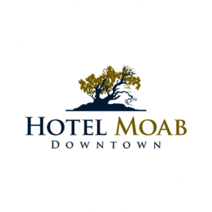
Green and blue dominate this industry’s logos, although some older companies still rely on black or white. One example is the travel logo that we designed for Hotel Moab Downtown Newer companies can try to stand out by bucking this trend, or they can use greens and blues for similar reasons that other companies choose them.
Of course, there are plenty of other colors travel agencies use to get their customers excited about visiting new places. Flyography uses practically every color imaginable. By wrapping the colors like lines of yarn around a ball, it reminds people of all the airplanes flying the world. The design concept wouldn’t work as well if it only used a few colors. By including dozens of colors, it emphasizes the large number of travel possibilities.
Getting the Right Logo for Your Company
Most important to remember is that The Logo Company offers design services that could help you find a travel logo that speaks directly to your target audience while helping you define your agency’s brand.
The Logo Company has clients fill out a questionnaire so it knows what they want the logo to achieve. This information is sent to five designers. Each of these designers creates a rough sketch that serves as a creative jumping off point. They then add details and color to their designs. This gives clients the opportunity to choose between five designs made by industry professionals, which is always a good thing for business trying to attract more clients in this competitive industry. Check out our logo process