What are the modern trends in logo design? Foremost, fashions come and go over time. That’s just as true as fashions in clothing, hair, and makeup as it is in logo design. In fact, the logo design that looked fresh and modern as recently as 10 years ago might appear hopeless outdated today.
After all, companies that have used the same logo for a long time need to balance tradition and familiarity with modernity and progress. Furthermore, consumers may be surprisingly loyal to their favorite brands’ logos. However, they may be willing to embrace an update if it doesn’t go overboard.
As a marketer or company owner, your job is to take an honest look at your current logo. Above all, consider modern trends in logo design, and then make an informed decision about whether it’s time to update your logo design.
Logo Design trends throughout history
The best practices for designing logos have changed significantly over time. What used to be considered standard now may look old fashioned and hopelessly outdated. It’s important to pay attention to how logo design has changed if you want to make the right decision about your logo.
How Logo Design Trends Has Changed
In the day of print advertising, it was very common for logos to be rendered in black and white. That was the trend. Furthermore, the colors (or lack thereof) ensured that a company’s logo would be just as recognizable when it appeared in a newspaper. As it was when it appeared in a color magazine or – later – on television.
More importantely, it also used to be common for logo designs to be fairly complex. Using complicated fonts and detailed designs. If you look at the evolution of logo designs over the decades, it’s easy to see that the trend, overall, has been toward simplification and streamlining.
Example of Logo Evolution
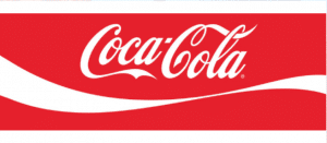
It may help at this point to look at an example to understand how trends logo design have changed. Here, we’ll use the iconic logo for Coca-Cola as an example. However, if you review other logo designs over time, you’ll notice that many of the same trends are on display there.
First of all, the original Coca-Cola logo was rendered in black and white. It featured a swirling script that is very close to the script that we see on Coke bottles today. However, even a quick glance at it reveals that the script is dated in subtle ways. Here’s the original logo:

Over the years, the Coca-Cola logo has undergone many transformations according to trends in logo design. One of the biggest changes was transforming the logo from its original black and white design to today’s distinctive red and white version.
You can also see, if you look closely, that the font has undergone some changes too. It still has those distinctive swirls, but they are both less ornate and far more modern looking than the old version. According to logo design trends.

The reason we like this logo as an example is that, at its heart, it hasn’t changed much. The basic idea and trend in logo design has stayed the same for decades, and yet the current version has a far more modern feel and appearance than the original logo.
Above all, what this illustrates is that even small changes in the design and appearance of your logo can make it feel fresh without disturbing the public’s recognition of the logo or its connection to your company.
Modern Trends in Logo Design
Everything changes, and logo design is no exception. Most importantly, you need to be aware of the trends in logo design. While some aspects of logo design remain fairly constant, there are certainly trends that spring up periodically. Therefore, in the modern digital age, there are a number of trends that we see emerging in logo design.
Minimalism – a trend in logo design that remains trendy
Firstly, the first trend that we are seeing is a trend toward minimalism. So, companies in every industry are simplifying their logos, paring them down to their most essential elements.
One example is, the Starbucks logo which began as a fairly ornate one inspired by a wood carving. Even today’s logo still has many of the same characteristics, but the logo is rendered in close up and is far cleaner and more modern looking than the old one.
Furthermore, logos that are cluttered and busy are definitely out of style at this point. Perhaps one reason for the change is that clean logos look better as thumbnails, which are commonly used in digital marketing.
Line Art
Another trend that is increasingly popular, and goes hand in hand with minimalism, is the use of line art in logos.
Most importantely, line art has the benefit of being striking and memorable while also looking modern and minimalistic. Furthermore, a well-executed line art logo can be extremely effective in both online and print marketing.
Gradients and Overlapping Gradients in Logo Design Trends
Above all, gradient colors used to be very popular in logo design, and then they feel out of favor for a while. That’s not uncommon and we see it on other fields as well.
Recently, though, we’ve seen an increased demand for subtle gradients and overlapping gradients. Let’s also mention the one classic logo that uses overlapping gradients is the MasterCard logo.
Stencil Fonts
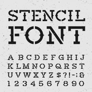
Font styles and preferences come and go. It wasn’t that long ago that Serif fonts were considered the height of modernity. Today, some of those may look very old fashioned. However, Sans Serif fonts are clean, modern, and look great in digital media. More about fonts and fonts to download for free can be found Dafont

Another one font style that is a bit of a throwback is the stencil font. We’ll talk more in a minute about the appeal of logos that have a handmade look. However, we suspect that one of the reasons that stencil logos are making a comeback is because they have an “arts and crafts” appeal that is enjoying a resurgence.
Black and White Logos are Always Modern
Earlier, we mentioned that black and white logos used to be the norm. Today, many companies are electing the clean, modern appearance of a black and white logo.
I think black and white logos are easy to reproduce and look good in almost any setting, so worth investing in. Furthermore, they also offer some real versatility when it comes to finding ways to dress up your logo for special marketing campaigns and occasions. In many ways, a black and white logo is a blank slate and can be used in some very creative ways.
Handmade (looking) Trendy Logos
Finally, the final trend we have been noticing is a movement toward preferring logos that look as though they are handmade or hand drawn. This might be a natural ricochet caused by the overwhelming preference for digital logo design in recent years.
As we mentioned earlier, the emerging preference for both line drawing and stencil fonts may be linked to the trend toward handmade logos. After all, companies want the convenience of digital marketing, but they also want to appear warm and approachable. A handmade logo is a good compromise.
Does Your Logo Look Modern?
Now that you understand some of the recent trends in logo design, let’s talk about how to decide if it’s time to update your logo. It’s not a bad idea to step back periodically and assess your marketing tools, and that includes your logo design.
Tips for Evaluating Your Logo
Here are some basic tips to help you evaluate your logo.
1. First of all, does your logo look good as a thumbnail? If it’s difficult to see all of the elements of your logo or it look busy, it may be time for an update.
2. Secondly, does your font look modern or old fashioned? A font that’s overly busy or ornate may be getting in the way of your central message.
3. Ask yourself, can your design be simplified at all?
4. Furthermore, does your logo still do a good job of conveying your message and values?
Therefore if your logo isn’t working for you, then it’s time to make a change. Perhaps it’s time to keep up with modern times logo design trends.
Easy Ideas for Trendy Logo Updates

Remember that updating your logo doesn’t have to be stressful – nor do you need to do a complete redesign. The Coca-Cola example above can be an inspiration if you want to give your logo a boost without completely changing it. Here are some suggestions.
1. First of all, remove any unnecessary design elements that might be making your logo difficult to see or understand. After all, stripping away complicated designs is a good way to update without losing sight of your original logo.
2. Secondly, streamline your font. Again, you don’t have to change it. However, a good logo designer can take your existing font and find a replacement that is similar in key ways, or simply strip away embellishments to give it a clean and modern look.
3. Above all, change colors to more modern versions of the same shades. A shade of blue that looks faded and outdated can be easily changed to one with a more up-to-date feeling.
So easy, these three simple changes can take your logo from dated to modern in just a few easy steps.
Conclusion
In conclusion, logo design is always changing. Smart marketers make a habit of assessing their logos periodically to ensure that they honor tradition while also keeping up with the times. The designer at the Logo Company can help you with a logo update at any time.
