When you are ready to get your clever logo logos started you can order a logo
These logos are fun and memorable. Here I want to show you 10 clever logos designed for clients of The Logo Company. Clever logos have an obvious or subtle twist that make you go “Oh”. This design style is suitable for most types of business but is not often found in Fortune 500 companies. It may be a little too gimmicky for big business. If your small business is looking to get noticed, this logo design style will stick in peoples memory.
MBOTTLE – A clever logo
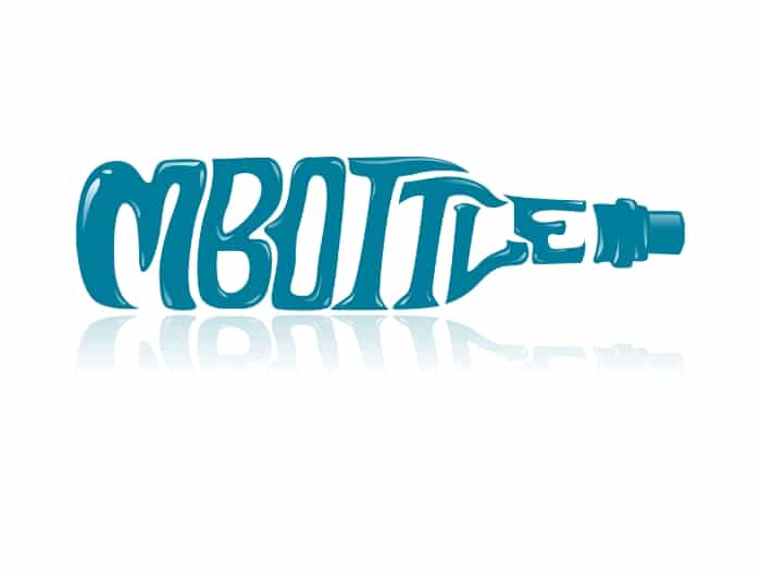
MBOTTLE is a trademark of Ryan Rossi from Florida. It is registered in the category of On-line social networking services. You can read a bit about the trademark at Trademarkia.
This is a fun clever logo where the designer has imagined the letters in the shape of a bottle and then morphed the text into the shape. The letters lend themselves well to this shape but could probably work well with other letters too.
Text morphing into a shape is quite rare in clever logo design and very few companies use this style as their wordmark. It is easy to build a brand around this type of clever logo because it is so memorable to the viewer. This style of design works best with short names. The longer the name, the harder it gets to morph that name into a logo. Layout wise, the clever logo could work in vertical as well as horizontal but as it is primarily for a website, horizontal was selected because of the restriction of above the fold space. Can be used in any single color as well as with drop shadow or without drop shadow.
The clever Logo For Blades Beyond
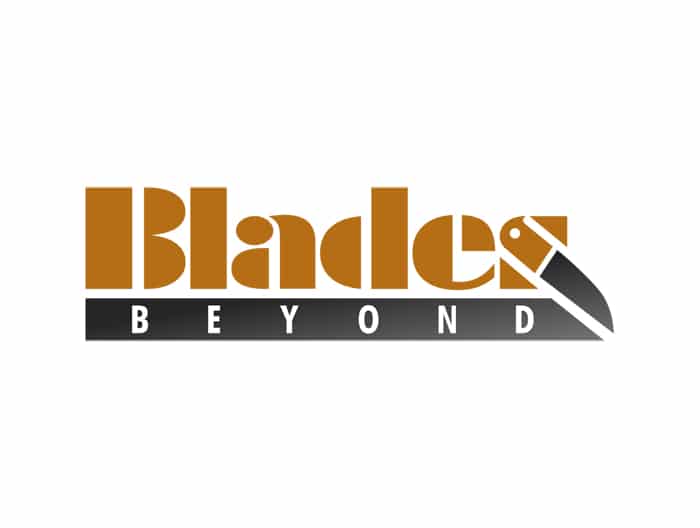
Blades Beyond is one of those clever logos that just makes you go Oh. The knife is made possible by the choice of font used for blades and the selection of 2 colors. The designer must visualize a knife shape and then consider what letter to morph to make the knife. The S in blades in not the obvious choice but with a little imagination turns out to be the best option. Making a predominantly straight knife work in a curved letter is ingenious and shows off the imagination and skill of the designer.
This clever logo can be used in any complimentary 2 color system but also works with one color. Feel free to read more about The Psychology Of Color In Clever Logos. Blades Beyond is a website set up to sell knives of all shapes and sizes.
Tempo Lures – a clever logo with movement

Tempo Lures was created by The Logo Company several years ago. The energy and movement of this clever logo makes this design so memorable. The powerful black and red color combo adds to the magic of this logotype. Typography in combination with a creative mind allows the use of a fisherman with a fish on the hook where just the fish plays a part in the creation of the text but allows the fisherman to not distract away from the name. The imagery and the text together in this clever logo paints a positive winning message for the product.
When you consider the simplicity of the illustration in this logo design and the conventional layout of the text, it is difficult to imagine how the clever logo presents the energy it does. The designer has demonstrated a lot of skill and vision in making such an uncluttered design speak on so many levels.
A clever logo illustration for – Creative Printing Solutions
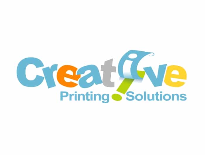
Creative Printing Solutions has to be one of our favorite clever logos of all time. The designer has mixed in some simple but clever illustration, typography and color to put together a clever logo that literally paints a picture for the viewer. This is one of those logos designs that says to the viewer, this does what it says on the tin.
When the designer has been this smart it makes it easier for the client to start to build their brand. Because the clever logo sticks in the mind, it does not cost so much money to force that reaction on the viewer, they just make the connection the first time they see it. This is when it becomes cost effective to use a clever logo to create a brand. Small businesses don´t have the resources of Fortune 500 companies so their advertising spend is minuscule in comparison. When you don´t have a lot of money to promote the business, any powerful marketing tricks that help you get your name out there for minimum spend become more important than ever. A clever logo design like this can be a big part of that marketing problem solved.
Wray´s Plumbing – a clever character logo
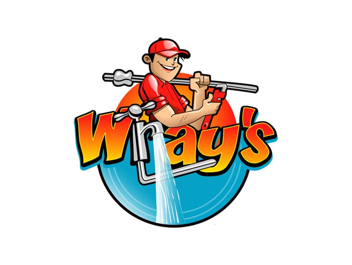
Wray´s Plumbing clever logo is a clever cartoon or character logo that warrants a second look. Imagine this on the side of a van outside your neighbors house. Wray´s plumbing is going to get a name for itself pretty fast using a logo like this. It is a fun design but more importantly, you remember it for the right reasons. When you think of plumbing in the area that Wray operates in, you will fast be thinking of Wray´s Plumbing. This clever logo is designed to get Wray noticed. In a fiercely competitive local market like the plumbing trade, if you are new it is hard to get a foothold. Anything you can do to help get you noticed is going to be positive.
The way the designer has incorporated the running tap into the design is pure genius. You have no doubt at all about What Wray does when you see this clever logo. The message delivered is strong and memorable, even though the logo is fun and friendly. After all, who do you want in your house, a miserable plumber or a fun and friendly plumber that gets the job done. This is powerful marketing for a small business.
General Spade – a clever logo with negative space
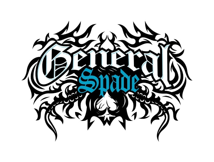
General Spade is a hip-hop artist from Buffalo NY. The music industry is notoriously competitive and getting a record deal almost impossible for someone new on the scene. For an artist to build a brand they need something that is more than audible, something their fans can latch on to and follow. That is why a clever logo for an artist is so important when it comes to building their brand.
The General Spade logo uses negative space and celtic symbolism to present a logo design that is completely unique like the music the artist produces. The use of negative space to create the image of the spade makes you take a second look. A double take followed by an oh, that´s clever. This is the reaction that negative space clever logos seek however, makes the design memorable whilst also appealing to the cult like mind of the following fans. You can listen to General Spade on Youtube.
Axe Anchors Premium Guitar Hangers – clever 2 images in one
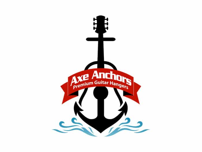
Axe Anchors Premium Guitar Hangers logo design takes a different morphing aproach. Instead of morphing the text into an image, this clever logo morphs 2 images, the guitar and the anchor. It is quite an obvious transition but because it is obvious when laid out for you does not mean it is not creative. A guitar and an anchor are literally 2 random objects so for the designer to come up with a smart way to morph them together takes some creative thinking.
This is one of those creative clever logos where critics will say of course he did that. But the simplicity belies the creative thought process. It is only obvious because it is laid out in front of you. For a designer to hear how obvious it is would be music to their ears because this is the desired result. People don’t forget clever logos like this and for a small business that is worth it´s weight in gold. How have the logos changed over the years? Logo evolution
Sniper Hockey – simply a clever design
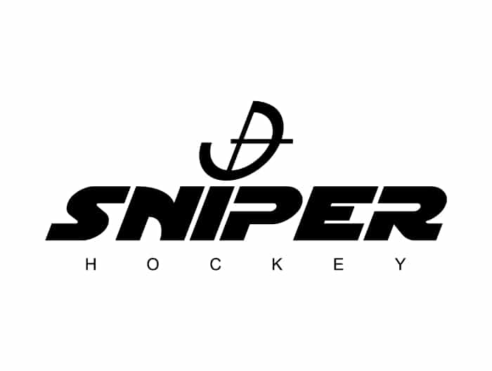
Sniper Hockey are a sports team hockey brand. Of all the clever logos that The Logo Company has designed through the years, this one is possibly the simplest. Because the logo is simple, does not mean it is not powerful as a tool to build a brand around. Simple, with a clever twist, a great font selection and powerful black are what makes this logo so strong.
Clever logo design does not have to be complicated. There is an argument that simplicity on it´s own makes the cornerstone of a strong brand and when you look at Fortune 500 businesses you can understand what that means. When you add a clever twist to a simple logo design it takes it to another level. The most important thing for a small business is instant recognition. If people remember your clever logo they associate that with your brand. If your brand is positive, your logo will adopt that meaning and project a positive image.
The font gives the impression of forward movement at speed, whilst the target cross hairs portray the sniper as well as the hockey puck. Simple and clever with as few brush strokes as possible. This is easy to market but you need to know how, Difference between marketing and branding
Irrigation Pros – shows what clever logo it is is about
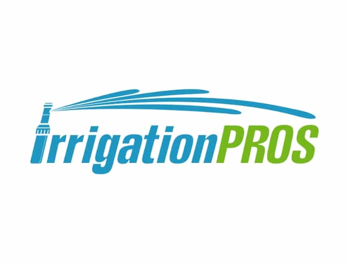
Irrigation Pros is a small business with a system of watering gardens. Their clever logo reflects perfectly what their business is about. There is no requirement in logo design to show any aspect of the business literally but some businesses just lend themselves so well to this.
The designer has taken a simple idea and without much illustration has turned that idea into a clever logo. Above all, it does not need to be explained what the designer has done here because it is obvious. Furthermore, the lack of subtlety works really well here though because it would be hard to present this system any other way than obvious. The designer has worked with the design brief in such a creative way without complicating the concept. This is a perfect case for the cliche “less is more”.
Hitman Customs – a single color cleverness
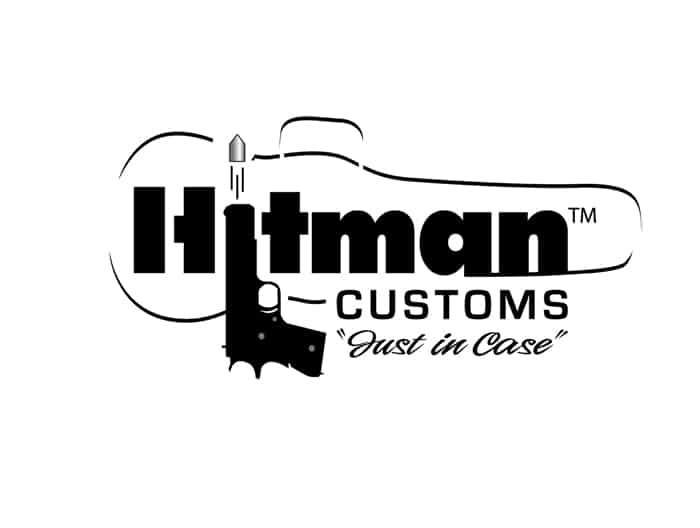
Hitman Customs is a gun case maker. Without getting into the politics or the rights and wrongs of gun ownership this logo is clever in several layers. Apart from the gun making up one of the letters of the clever logo, the use of the violin case in the design adds the extra dimension. Being a single color black logo adds to the power of the overall design. Dare I say a sinister message portrayed in a fun way.
Are You Looking For A Clever Logo?
If you are looking to have a clever logo designed for your business, you should contact us here at The Logo Company. We will put 5 great designers on your project for maximum creativity. You will be looking at initial clever logos in just 3 working days. Check us out on TrustPilot too.