The Best Retro And Vintage Logo Designs
Why do we love retro logo design?
First of all, I know, old-fashioned, retro, and vintage logotypes seem to be making a comeback these days. Old is the new “new” so to speak. However, what is it about this vintage style of design that keeps us designers coming back year after year after year? Therefore, let’s take a look at the best vintage and retro logo designs. Secondly, learn more about why this design style is becoming popular again, and discover some tips on how to create retro or vintage logos. See ours here : Vintage logo
The Best Retro and Vintage Logo Designs
Furthermore, we all love a good vintage logo design and, as they become popular again, many companies are switching to a more retro logo. Here are some of our favorite retro and vintage logo designs.
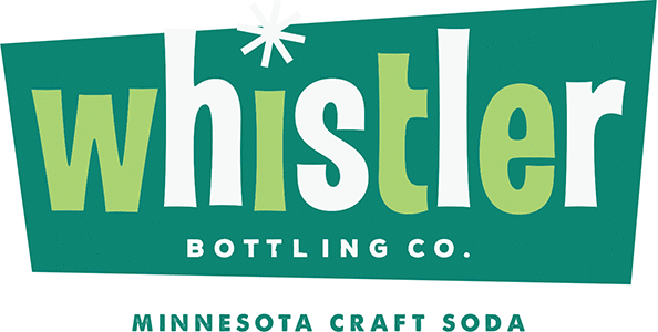
Whistler Bottling Co.
First one up, the light green and white colors combined with a retro font and the asterisk over the “i” help create a whimsical, 1970s vibe to this vintage-inspired logo. I really like this fat font as I call it. It is often used to create a vintage or retro look.
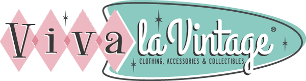
Viva La Vintage
For instance, this vintage logo looks like it came straight from the ‘50s. The triangles and swooped shape, the starburst details, and the pink and mint green colors immediately invoke nostalgic feelings of yesteryear and life during a simpler time. The company advertises vintage clothes, accessories, and collectibles and their logo is right on brand.
Levi Strauss
Another great example, the original Levi Strauss logo used hand-drawn, old-time imagery and retro workers to highlight the company’s long history. Furthermore, while the logo has recently been updated, the original retro logo design still reminds us just why Levi jeans have been around as long as they have.
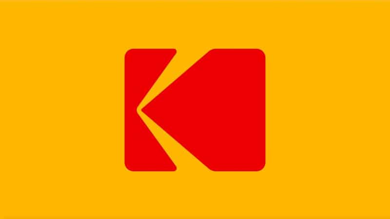
Kodak
In an interesting twist, this popular brand did a rewind and returned to a similar logo style that they used in the ‘70s and ‘80s. More interestingly, the yellow square with the large red “k” shape reminds many people of the old-school photos we used to take. Do you remember them?
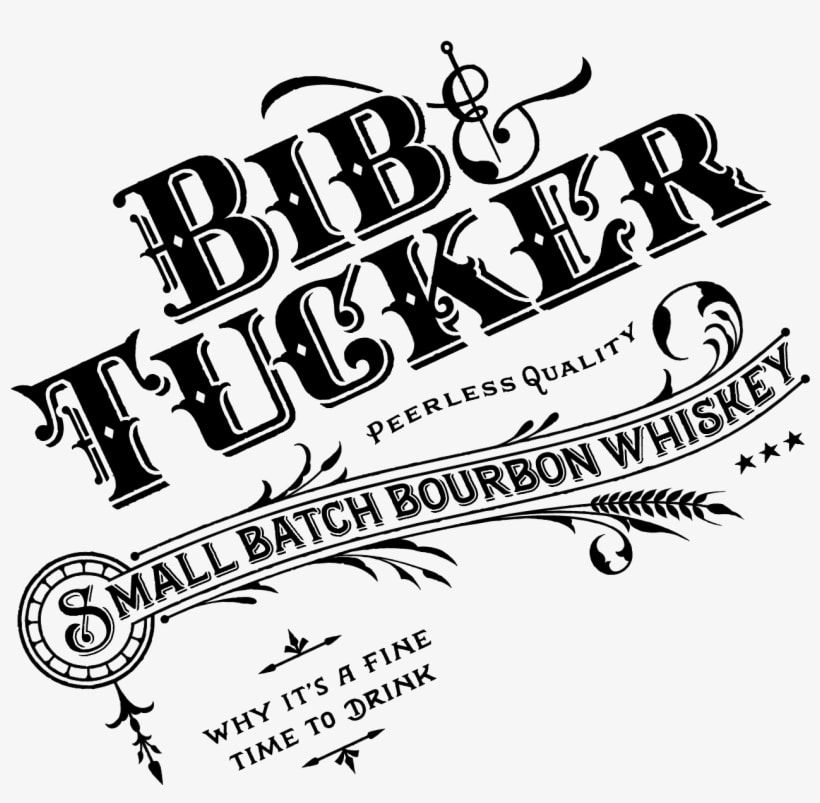
Bib & Tucker
Last but not least, I would also take a look at this logo which uses vintage fonts, hand-drawn images, and ornamental flourishes to create a retro logo that I think would be just as popular in the early 1900s as it is today.
Why Is This Design Style Coming Back?
In addition to this, I know that designers are known to want to push the boundaries of modern. Therefore, the latest design trends catch on fast and designers take to change better than most other industries. Furthermore, commercial design is driven by fads and fashions and the work produced can date very fast. In conclusion, why would we be driven backward to vintage logo design?
Above all, could it be that real designers are harkening back to the days where they were revered by their peers for their undoubted craft and skill? Perhaps, is it that the old vintage era of design is where designers gravitate in hopes of being associated with the retro logo design scene and thus feel more like a design professional of old? Pin up logos are definitely back to stay. Whatever the answer, retro logo design is here to stay.
Types of Vintage Logo Designs
As you well understand, not all vintage logos are created the same. Here are the most popular types of vintage logo designs.
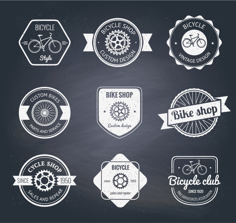
Badges
More importantly, this vintage logo design makes the logo look like a badge to be worn. The logo is often circular, ovular, or triangular, and characterized by a bold outline. These vintage- or retro-style logos often have a worn and weathered appearance and a muted color palette with only a few colors.
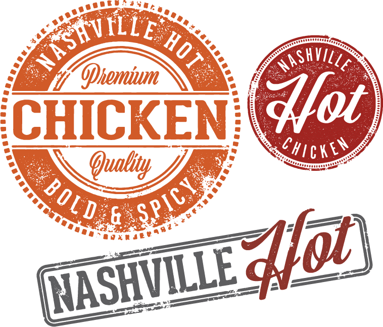
Stamps
For instance, vintage stamp logos can look like a stamp that has been pressed in ink and stamped onto the paper however these logos often looked faded. Usually, with the ink being splotchy or faded in some areas. As these vintage logo designs have a stamped look, they also look like they have some texture to them.
Illustrations
Last example, vintage icons and illustrations were usually hand-drawn, so that same style should be used in vintage-style logos. More importantly, these illustrations were often highly detailed and usually portrayed natural scenes.
Tips on How to Design a Perfect Retro Logo
Above all, I can let you know how I think you can create a perfect vintage or retro logo design. Therefore, if you follow these few tips you won’t go wrong.
- Be flexible with the style. Many different vintage styles can work to create a great logo, so try various styles to see how each one works.
- Draw up a rough draft — Before anything is set in stone, create a few rough drafts to see how you like everything laid out. You may find that some elements don’t work well or that the overall design looks too cluttered.
- Choose the right colors — Most retro logo designs use a variety of colors to make the design pop. Colors can be muted or vibrant and used in all shades, depending on which vintage design style you choose. The most popular colors are yellow, orange, red, purple, blue, green, gray, and black.
- Pick a retro font — One of the easiest ways to identify a vintage logo design is through the font. Some font options include:
- Bazar
- Blessed Day
- Candy Inc.
- Hill House
- Matchbook
- Park Lane
- Playball
- Upper East Side
- Decide on illustrations and shapes — Find the right images that highlight your brand while still playing on the vintage design.
- Study other vintage logos — See what other popular brands are using for their vintage-inspired logos. Just remember, get inspiration but keep your logo unique.
Vintage Logo Design and Marketing
A last few words, I must say that there is a humorous take on the relationship between client and designer on the net. Most of the time, it has a retro marketing style in the genre of pushy soap product marketing. After all, if you like funny videos you can find plenty of them on YouTube about the relationship between a retro logo designs and the client. More importantly, if you have anything at all to do with marketing, you will enjoy the fun. Learn about Vintage New York Blog
Above all, why do we love retro logo design? Well, simply because they keep coming back looking good. Every time.
Work With Vintage Logo Designers
Last but not least, if you need a retro or vintage style logo design, check out our retro logo designs first. The Logo Company has designed many logos in vintage and retro styles and we are experts at turning your idea into reality. Connect with our team to discuss your vintage logo design today.