
Edgy logo design is for companies that want to stand out in the crowded marketplace. Turning to edgy logo design to differentiate themselves from the competition. Do you know what exactly defines an edgy logo?. I understand that edgy logos are characterized by their protruding typography, striking imagery, and attention-grabbing color combinations. Furthermore, these designs allow brands to showcase their uniqueness. Above all their creativity, making them particularly effective in industries where there is a lot of competition. Probably where customers are looking for something that breaks away from the mainstream. I believe that when it comes to creating an edgy logo, there are different approaches. I know this depends on the industry you are operating in.
Whether it is through the use of geometric shapes or unexpected imagery, the key is to think outside the box and push the boundaries of traditional design.
Best practices for memorable cool graphics.
How do they look?. To give you an idea how different edgy designs can look for various industries we have summarized some of our best practices in edgy logo design. Just take a look at within our portfolio in this blog post.
Detailed edgy logo
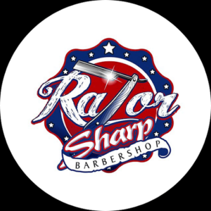
For instance, just take a look at the logo of the Razor Sharp Barber Shop. Here, you may notice that instead of following the traditional and plain designs, ( seen in the barber industry). this logo incorporates multiple details. For example, different fonts, and strong colors to make a statement. Furthermore, it forgoes commonly used icons such as heads with beards or mustaches. you can see that instead the logo focuses on personal details about the history of the brand, making it not only visually striking but also meaningful and unique. I understand that it might be risky to not implement those commonly used icons in your logo design. However that is exactly what an edgy logo stands for. If you are willing to take this risk it can result in a big win for you and your logo!.
An emotional unique design
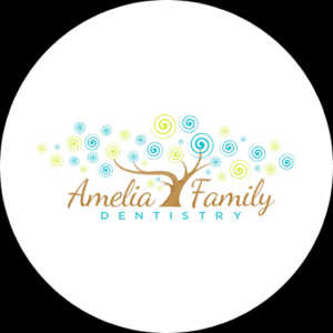
Let’s talk about another successful cool graphic the The Amelia Family Dentistry logo. Above all, it is different in that you would not initially associate it with a dental office if it did not have the word “dentistry” in it. This unique edgy logo wants to put the family reference in the foreground. Furthermore, it uses the playful fonts paired with a colorful tree. This combination conveys a sense of warmth and friendliness, which is not typically associated with visits to the dentist.
Now you see that by tapping into emotions in this way, the edgy logo design is able to strengthen its impact. Creating a positive association with the brand. This is especially important in this context, where many people may have anxiety or fear about visiting the dentist.
Understandably, by using a design that evokes feelings of comfort and positivity, the Amelia Family Dentistry logo is able to differentiate itself from competitors. Also appealing to potential patients, which makes it an edgy logo.
Metaphorical edgy logo design
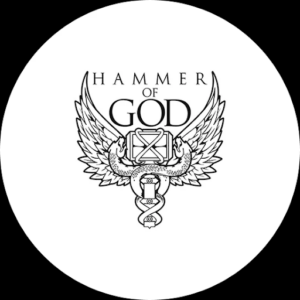
Last but nor least, The Hammer of God logo catches the eye with its unique design that is not immediately recognizable as a tattoo studio logo. Unlike many other tattoo studio logos, which often feature a lot of colors, images and even the word tattoo, the Hammer of God logo takes a different approach.
The use of a metaphor in the logo, such as the Hammer of God, gives the logo an edgy look and makes it stand out from the crowd. The hammer of god in this context can be seen as a reference to Thor, who is a strong and impressive viking god. By relating to this, the tattoo studio is adopting these metaphoric values for their brand. The tattoo industry is known for its creativity and it is becoming increasingly challenging for tattoo studios to differentiate themselves with a unique logo. This is where the metaphor in the logo comes into play, it makes the logo different, striking and memorable. An edgy logo, such as this, can be particularly effective in an industry like tattooing, where customers are often looking for something unique and different.
A cool logo: Playing with icons
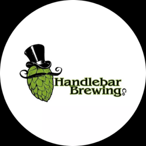
A hop bud dressed as a man – could a logo get edgier? The logo features an unexpected combination of icons, which differs a lot from the typical brewery logos that often feature a beer glass or bottle. By using bold colors and a hop bud with a top hat the brand immediately stands out – giving it an edge. This unique design makes the Handlebar Brewery’s logo unforgettable and it does not get lost in the crowd. It emphasizes the importance of being creative when developing a logo, as it is the first thing that catches the eye of a customer.
With this amazing logo potential customers get attracted that are looking for a unique beer experience.
Graphical corporate edgy logo
Working with a plain and settled design in the corporate world is nothing new. What makes this logo particular edgy is the included graphic design. I think this transfers a modern and timeless appeal. Despite its simplicity, the graphic design element demonstrates creativity and versatility. Furthermore, this example showcases that an edgy logo can vary from industry to industry and that there are many possibilities. An edgy logo does not necessarily have to be loud and in your face. I believe it can be subtle but still make a big impact. More importantly, I think this logo is a great example of how a simple design element can set a brand apart. Making it memorable. It is for instance, a way for the company to showcase its modernity and timelessness. To above all, stand out in the corporate world.
Creating an edgy logo starts with knowing your audience
To conclude, it is important to know the industry you are operating in and your target groups interests. Even though edgy logos pose a great opportunity to differentiate, be aware of what is possible within your scope. That means, what works well for an edgy logo in the hairdressing industry for example. However, is not necessarily considered as edgy in the corporate world, or in the art world where artful logos is a must. Therefore, it’s crucial to conduct proper research and understand the design trends. To understand the conventions of your industry before deciding on an edgy logo design. If you are still unsure about what is currently trending in your industry. Check out our blog post about the recent color trends in logo design.