To get the best music logos requires than just a symbol. Above all, it’s a powerful way to show of sound and emotion. All the way from rock legends to pop icons, music logos have always had played an important role in shaping an artist or band’s brand. It does not matter if you are a musician or even a designer. Everybody knows that exploring the best music logos can provide both inspiration and insight into what makes a design really special.

Guidelines to Create the Best Music Logos
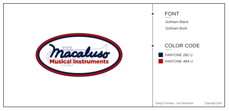
Above all, you’re looking to design a music logo that leaves a lasting impression. Therefore you will need to have a few key guidelines in mind. First and foremost, simplicity is your best friend. In fact, some of the most recognizable best music logos are minimalistic yet deeply symbolic. Check out John Macaluso logo and see the simplicity. Just think about how The Rolling Stones’ tongue logo is both simple and instantly attached with rebellious rock ‘n’ roll energy.
Another essential element is of course the all important versatility. The best music logos should look great on an album cover, a t-shirt, or a concert banner. Therefore it needs to be scalable so that it works in both large and small formats. A complicated design with too many details might lose its impact when resized.
Another important guideline is to consider the right color palette. Different colors evoke different emotions. In the color emotion guide we explain it all to you so don’t miss that. One good exemple is the color black and red. These two are often used in rock and heavy metal. However soft blues and pastels work well for indie and folk genres. Typography is another key factor. Try using bold, blocky letters as this might scream punk rock. If you are a more elegant classic music while company then elegant scripts could be perfect for you.
Most importantly, your logo should be the heart and soul of your music. Whether you’re edgy, experimental, or laid-back, your logo should tell that story at first glance.
Highlighting the Most Iconic Music Logos
There are some companies or musical bands that have succeeded better than others in creating the best music logos. They kind of have stood the test of time, becoming just as legendary as the artists they represent. Below I have picked three music logos that are both iconic and inspirational.
ABBA
My all-time favorite, the Swedish pop group ABBA’s logo. A complete masterclass in simplicity with a clever twist. Truly the best musical logo, in my opinion.
A short history behind the clever look. The iconic ABBA logo, featuring a mirrored “B,” was first introduced in 1976 and has since become one of the most recognizable symbols in pop music history. Designed by Rune Söderqvist, the band’s longtime graphic designer. Interestingly, the logo cleverly reflects the symmetry of the group’s name while also representing the two male and two female members. The backward “B” was reportedly inspired by a photoshoot where the band members stood behind large letters spelling “ABBA,” with Benny Andersson positioned behind a reversed “B.”Clever, right?
Not surprisingly, this distinctive design quickly became synonymous with the group’s image. Quickly, appearing on album covers, merchandise, and promotional materials throughout their career. Actually, today, the ABBA logo remains an enduring symbol of the band’s lasting legacy in music.
The mirrored ‘B’ adds a unique and memorable touch, making the logo instantly recognizable. This simple yet effective design mirrors the group’s well-balanced harmonies and innovative approach to pop music. The clean, bold typography also reflects their sleek, timeless sound.
The Rolling Stones
Second exemple, one of the most legendary music logos of all time, the red lips and tongue designed for The Rolling Stones. This is one of the best music logos and symbolize rebellion, rock energy, and attitude. Cleaverly, inspired by the mouth of Mick Jagger, this logo transcends music and has become a universal symbol of rock and roll itself.
Nirvana
Third and last exemple, Nirvana’s smiley face logo with crossed-out eyes. This image is both playful and slightly eerie. Making it perfect for capturing the band’s mix of grunge, punk, and raw emotion. More so, it reflects their anti-mainstream attitude while remaining effortlessly cool and recognizable across generations.
The Role of Creativity in Music Logos
Of course creativity plays a big role in creating the best music logos. It is the heart of a successful logo. A great logo isn’t just about looking good. More so, it’s about telling a brand story that represents the artist’s unique sound and message. In fact, some of the best logos challenge traditional design norms. This could include the use of hand drawn elements, bold colors, or unexpected symbols.
For example, Prince’s unpronounceable ‘Love Symbol’ broke all the rules by becoming a symbol instead of a name. This was the first time ever that happened. Furthermore, this creative decision made a statement about his artistic independence and refusal to conform. Similarly, Daft Punk’s futuristic logo, with its sleek typography and neon glow. Above all, perfectly embodies the electronic, otherworldly vibe of their music.
In short, creativity in logo design doesn’t always mean being flashy. Sometimes, the most subtle choices. Like for instance, a custom font or an unexpected twist in lettering can make all the difference. You should try it.
How to Revamp Your Existing Music Logo
Even the best music logos need a refresh from time to time. Ask yourself if you need a complete rebranding or just a touch up? If you’re considering revamping your music logo, start by evaluating what’s working and what’s outdated. Perhaps ask yourself, does this still reflect my brand? Does it stand out in today’s music landscape?
A revamp doesn’t always mean a complete redesign. Small tweaks might just do it. Perhaps by modernizing the typography, updating the color scheme, or simplifying the design. For instance, in 2008, Metallica refined their classic logo. This was done by sharpening the edges while keeping its original identity intact. That was enough to give it a new more modern look.
More imortantely, if your logo feels too cluttered, simplifying it might be the way to go. Look at what major music brands and artists are doing today. That is to say, many are opting for cleaner, more adaptable designs that work well across social media, merchandise, and digital platforms.
The Psychology Behind Successful Logos
Don’t forget to consider the psychology behind this best music logos. You will need to be able to triggers emotions and connections in the minds of fans. The psychology of design plays a huge role in making a logo stick.
Shapes Matter: For example, circular logos (like the MTV logo) suggest inclusivity and unity. However, sharp, angular logos (like Metallica’s) create a sense of energy and power.
Typography Sends a Message: For instance, script fonts often feel personal and artistic. Bold block letters show strength and impact.
Color Influences Perception: Red and black evoke excitement and intensity. Thus, making them favorites for rock bands. Understandably, gold and silver often signify luxury and timelessness in jazz and classical genres.
So, by understanding how design elements affect perception, musicians and designers can make logos that truly go down well with their customers.
The Evolution of Music Logos Over Time
More importantly, music logos have changed dramatically over the decades. Often reflecting shifts in both design trends and cultural influences. In the 1960s and 70s, logos were often bold and experimental. In short, reflecting the rebellious energy of rock and punk. The Beatles’ logo, for example, was simple yet became legendary due to the band’s global impact.
Then, in the 80s and 90s brought high-energy, neon infused designs,. Like for exemple bands like Guns N’ Roses. The he design has small details and bold metallic aesthetics. Another exemple is Hip-hop artists of the 90s, such as Run DMC. The best music logos more or less embraced a minimalist typography driven images that became streetwear staples.
Today, best music logos tend to favor cleaner, more minimalistic designs. In fact, many artists now choose custom lettering or hand drawn elements to make their brand feel more personal and unique. As digital media plays a bigger role in music marketing, best music logos now have to work everywhere on every platform and streaming services, YouTube thumbnails, social media banners. Therefor, adaptability hold a strong key.
Last Few Words
Last few words in the blog about best music logos. We all understand that they are essential and the heart of the music branch. They don’t just represent a name, but more so they represent an entire sound, energy, and emotion. Whether it’s the timeless simplicity of ABBA, the rebellious lips of The Rolling Stones, or the grungy smile of Nirvana, the best music logos stay with us for a lifetime.
If you need any help in creating your music logo then Contact Us
I am sure that we can create the dream logo that you are looking for.