Recent Spiritual And Wellness Logo Design
Are you looking for a wellness logo that communicates the mission of your organization? Is your goal to evoke feelings of restfulness and energy? Are you after a spiritual logo that will keep your clients coming back? If your answer is yes, you are in the right place!
But how can you be sure that the team at The Logo Company will be able to bring your vision to life? Here’s why we’ve created a portfolio of our past work.
Below are some examples of wellness logo design we have created from scratch for our clients in the wellness sector. However, do remember, your logo will be completely unique to your business. These real examples are just to give you an idea of the quality you can expect. You can change to view examples from a different industry by using the drop down menu.



Do You Have Any Questions?
Do You Really Need a Spiritual or Wellness Logo For Your Business?
Yes – and Here’s Why
Today, the global wellness market is worth a whopping $1.5 trillion, and it is growing at an annual rate of 5-10%. These figures alone tell us that, yes, it is certainly worth starting or growing a business in these industries!
Furthermore, the industry’s competitive nature makes wellness logo design very important. Organizations need well-designed logos that evoke positive emotions. At the same time, motivating them to participate in healthy activities. Corporate wellness is crucial for companies after all. This need has led to a variety of spiritual logo design features that take advantage of color psychology, fluid typography, and imagery that remind people of health and nature.
Spiritual Logo & Wellness Logo Design Explained
What is a spiritual logo? Whether you are running a successful day spa, looking to increase the reach of your retreat, or working towards starting a fitness center, a well-designed logo is a critical pillar on which to build your business.
With the right wellness logo, you can communicate your business’s mission and values, transmit your love for health and wellbeing, and entice clients to choose your organization over the competition.
Color psychology – coupled with fluid typography and evocative imagery – can help you bring to life a spiritual logo that is perfect for your business. The expert team at the Logo Company is here to help you turn your vision into reality. Let’s get started!
Why Color Matters in The Design of Health and Wellness Logos
Studies have shown that the right logo colors can boost brand recognition by 80%!
But not all colors are suitable for your needs. To understand what colors are best for your logo, let’s start by understanding what your logo should communicate. Above all, most health and wellness logos want to emphasize restfulness or energy. For instance, organizations that focus on meditation and massage typically opt for colors that create restful feelings. However, those that want to evoke energy, youth, and exercise tend to use colors that stimulate the eyes and body.
Below, we’ll look at some of the colors recommended for wellness logos. But, before we start, let’s look at some key factors to consider when selecting the right tones:
- Think of the mission of your company (i.e.: whether you wish to empower people to take care of their health or offer a pampering, relaxing experience)
- Look at the visual and vocal identity of your business to create a continuum
- Consider the choices made by your competitors, as well as the ones made by successful companies in your industry
- Think about what message you wish to communicate
Don’t worry – at The Logo Company, our team of experts will be by your side throughout each step to guide you towards the best choices!
Yellow, Orange, Blue, and Green: The Pillars of Logo Design for The Health & Wellness Industry
According to studies, color is a key factor influencing the human senses, physical health, and psychology in the design of health and wellness spaces. This principle holds true when speaking about the logos and visual identity of a wellness brand.
So, what are the best colors for spiritual or health logos? To understand this, we need to dive deep into color psychology. Here are some key tones to integrate within your logo:
Green: The color green sits in the middle of the color spectrum, so it has an easy balance to the human eye. Furthermore, this balance makes it perfect when designing logos for spas, hotels, and wellness retreats. Furthermore, green also reminds people of nature, which plays a crucial role in the branding of wellness organizations. Green, after all, is the color of thriving plants. Since people who attend wellness centers often draw a connection between health and the natural world, it makes sense to include some green in wellness center logos.
- The Logo Company example: ReCoga Yoga
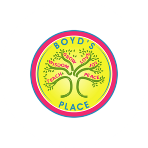
Yellow: The color yellow is frequently associated with happiness, energy, and optimism, which are all vital components of a positive and successful health and wellness journey. Yellow reminds people of sunlight, which has an emotional and logical connection to health. Without abundant sunlight, plants don’t grow and humans cannot thrive. Using too much yellow, however, can counter the restfulness of greens and soft colors. While yellow makes people think of the natural world, it also has a stimulating effect. Therefore, before choosing yellow, organizations should consider whether they want their logos for spas to communicate restful, balanced wellness, or health created by high-energy, aerobic style exercise.
- The Logo Company example: Boyd’s Place
Blue: Blue often represents a sense of trust and reliability. It can also symbolize calmness and serenity, making it a great choice for businesses looking to promote peace of mind and well-being. Hue of blue is often used in the healthcare industry.
- The Logo Company example: Remedy – Chiropractic & Family Wellness
Orange: The color orange is used to symbolize energy, vitality, and enthusiasm. It’s frequently used to portray a sense of positivity, warmth, and emotional health. This vibrant hue can also represent creativity and adventure, aligning with the idea of exploring new paths toward well-being. It can be used for businesses looking to promote Ayurvedic therapies, massages, physiotherapy, and recovery.
- The Logo Company example: Pathways to Recovery Centers
Pro tip: it’s all about balance! Let’s look at an example: Jeunesse Salon, one of New York City’s top day spas, does a good job of striking a balance between relaxing and energetic colors. Firstly, the top half of the wellness logo contains bright oranges and yellows that stimulate the eye. Secondly, the bottom half of the spa logo uses green that lets the eye rest. Above all, a great color combination for a day spa that wants clients to relax, but also wants to appear youthful and hip.
Remember: Potential members will pick up on these visual clues, so it’s important to understand what an organization offers and how it wants to brand itself before choosing colors for its wellness logo design.
Typography in Wellness Logo Design: How Fluid, Lightweight Lines Communicate The Right Message
Now, let’s talk about the best typography, lines, and fonts for your wellness logo, health logo, or spiritual logo.
Nearly all top wellness organizations use logos that have round, fluid typography. After all, bulky, boxy letters simply do not communicate the message that a wellness hotel or wellness center wants to communicate. More so, serif typography, for instance, looks too heavy. Furthermore, it makes people think of obesity, which has become the cultural opposite of wellness.
Instead, opt for the following:
- Curving lines. Thin, curving lines make people think of flexibility. The letters often have a Zen-like quality that reminds potential clients of meditation and relaxation, as well as the physical flexibility of yoga practitioners.
- Think and flowing letters: Letters that flow effortlessly into each other like water making its way down a stream can help clients associate their health and wellness journey with ease and accessibility.
Example: One & Only, one of the world’s top health resorts, uses excellent typography in its logo.
- Simple and clean typography: Choosing easily recognizable fonts can help your clients feel at home from the get-go, and start building trust in your clinic or center.
However, the wellness logo’s thin lines also remind people of fitness. Therefore, if the logo’s typography were a person, she could bend over to touch her toes without straining. Most of all, that’s the kind of wellness that most logos for day spas, wellness centers, and hotels want to communicate.
Visual Elements in Health and Wellness Logos: The Impact of Imagery
To create a great logo, you’ll also need visual elements that are easily memorable and recognizable in a crowded market. Since day spa logos usually try to evoke natural health and beauty, they often include images of trees, lotuses, and other plants. Some of the best and worst wellness logos use leaves to remind people that they can realign themselves with the natural world. Those symbols of nature have become ubiquitous – which makes using them in your logo a double-edged sword!
- If you are set on using nature-inspired imagery, the team at The Logo Company can guide you toward the right choices for your wellness or health brand!
Other organizations choose less-obvious imagery that still make people think of natural health, as well as other great choices worth considering:
- Lotuses: Lotuses draw on the social psychology that connects nature with health, while also taking advantage of cultural beliefs that people living in the East (Japan, China, Korea, and the like) have better rates of health than people living in the United States and Europe. Furthermore, the lotus has such a strong cultural connection to the East that including it in a logo immediately makes people think of healthful activities. For example meditation and tai chi.
- Stylized sketches of the human body: Fluid outlines of the human body make people think of vigorous activity.
- The sun: This symbol evokes feelings of vigor and health (especially when colored bright yellow).
- Circles: Circles remind people of flexibility, wholeness, and the yin-yang symbol.
- Hands or hearts: These elements indicate care and compassion, which are essential factors in a successful health journey.
- Apples: Apples, as well as other fruits, remind people of the saying “an apple a day keeps the doctor away” while also playing on the idea that whole, natural foods offer better health than processed foods. These elements are great for wellness companies focusing on nutrition or detoxing.
- Traditional healthcare symbols: For health clinics, symbols such as the red or green cross, Asclepius’s staff, or the bowl of Hygeia can communicate the values of accessible, high-quality medical care.
Don’t forget to experiment! Elements such as mountains are great for companies focusing on outdoor wellness journeys, while lines that remind of water are suitable for spas and water therapy centers.
After all, any of these images can work in coordination with color psychology to express a brand’s unique approach to health and wellness.
Bringing To Life The Right Logo For Your Health and Wellness Company: Start By Partnering With The Logo Company
Now it’s time to put knowledge into practice! But don’t worry, you are not alone in this journey! When working in partnership with The Logo Company, you’ll be able to leverage the expertise of a team of specialists in logo design, color psychology, typography, and more.
In conclusion, The Logo Company offers services that can help wellness organizations appeal to their target audiences. To do this, before we start working on your next wellness logo or spiritual logo, we spend time getting to know your company, offers, values, and missions, so that we can help you communicate your vision in the best way possible.
For instance, clients start by answering questions that help the design team determine exactly what they need to communicate. Some wellness centers want to focus on high-energy services while others want to focus on relaxation. Knowing how the client wants to brand itself tells designers what strategies to use when creating initial designs.
What to expect from The Logo Company: First of all, clients get five designers, each of whom submits at least one detailed sketch. Secondly, designers then add refine their sketches and add color to create professional logos. Thirdly, clients then get to choose between those logos. Instead of relying on one logo from one designer, clients get options from The Logo Company. In the end, each wellness organization gets to select a logo that matches its unique vision of health.
Ready to get started? Check out our portfolio above or get in touch by filling out the online form. If you are ready to create a website for your spiritual or wellness company, check out this guide.
