One of the most challenging things about designing logos is avoiding clichés. In today’s world, every industry has hundreds of companies competing for attention. Almost any image you can imagine has been used more than once, and that means that designers are constantly having to redefine images to make them memorable and unique.
As a business owner, your job is collaborate with a designer to come up with a logo that represents your firm well while also helping you stand out from the competition. With that in mind, let’s talk about how you can avoid clichés when choosing a firm logo.
Avoiding Logo Clichés Considerations
Let’s start by talking about the things your logo must do. They illustrate why it is important to avoid clichés.
Representing Your Industry
The first goal of a logo is to give the people who see it a clear idea of what your company does. That means that you must – to some degree – adhere to industry standards. There’s a reason that landscaping firms use plants in their logos while apparel companies use clothing. These images are simple and effective, and they clearly communicate the industries these firms are in.
Positioning Your Company To Avoid Logo Clichés
The next thing your logo must do is to position your company so your target audience can find you.
What that means is that you must move from the general to the specific. The scales of justice might represent any law firm, but scales of justice featuring a man and woman with their backs to one another clearly represent a firm that specializes in divorce.
You should work with your designer to determine which images and iconography best represent the specific products or services your firm sells.
Standing out from the Competition
Finally, your logo must differentiate your firm from your competitors. A caterer that specializes in weddings might have five competitors. If all of their logos feature the identical picture of a bride and groom, potential clients won’t be able to tell them apart.
The logo choices you make can tell your audience a lot about what you do. Using the above example, a florist specializing in traditional arrangements might use red roses in their logo. By contrast, a florist who creates funky, modern arrangements might represent them with an offbeat arrangement and surprising colors.

Whatever your industry, the logo you choose must strike a balance between meeting expectations and surprising people. That’s the key to effective branding.
Common Logo Clichés
There are three basic areas where logos can run the risk of becoming clichéd. Let’s look at each one in turn with some examples so you can learn how to spot clichés.
Cliché Images and Icons
The first area where logos can run into trouble is in their choice of images. Images and icons are an important part of logo design, but they can easily become run-of-the-mill if you’re not careful.
Consider the aviation industry. It is safe to say that the majority of companies in that industry use images of airplanes, wings, or clouds in their logos. When you consider how many aviation companies there are, it’s hardly surprising that some of these logos are cliché and boring.
Does that mean you can’t use the most common images associated with your industry? Of course not. What it does mean, though, is that you must find a new way to use them.
Cliché Color Choices
The next area of risk involves the colors you choose for your logo. Here, it can be very difficult to avoid choices that are expected and even dull.
Perhaps the most common example is the color blue. It is by far the most commonly chosen color for logos. It represents trust, conservatism, and serenity. If you look through our portfolio, you’ll notice hundreds of logos that feature the color blue.
Let’s use the airline industry as an example again. A quick scroll through the samples on our site, which you can see here, reveals that 18 of the 22 logos we featured used at least one shade of blue. That’s a huge majority and it clearly illustrates the problem.
Again, this doesn’t mean that you can’t use blue. It just means that you shouldn’t use it in the same way everybody else does.
Cliché Typography
The final area of consideration is the typography you choose for your logo. There are thousands of fonts out there but many companies tend to gravitate toward fonts that look similar – or are even identical – to the other companies in their industries.
It’s very common for companies today to choose Sans Serif fonts. They’re clean, modern looking, and easy to read on a computer screen. It makes sense to use them.
However, you don’t want the fonts you choose to be boring. They can be clean but not dull. You can be unique without going overboard – in fact, it should be your goal to do precisely that.
Tips to Make Your Logo Unique
The challenge is clear. Your logo, whatever it is, must meet consumer expectations for your industry while still containing an element of surprise. You need familiar icons that are a little unfamiliar, and the same goes for your color and typography choices.
There’s no question that it’s a challenge – but here are some suggestions for how to avoid clichés and choose a truly unique logo.
Twisting a Cliché
The first option is to take a cliché and twist it to make it unique. You can use a familiar image, for example, and find a way to jazz it up.
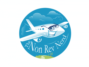
Let’s keep picking on the aviation industry and look at an example from our portfolio. This logo is one we created for an aviation firm with a unique name and outlook. We used an airplane in the design, but look what we did with it:

We’re pretty confident that there aren’t any other aviation logos out there that feature an airplane wearing glasses. This logo speaks directly to the value proposition and unique qualities of the firm in question while still clearly representing its industry.
Keep in mind that you can use this same idea for any element of your logo. Do the majority of the firms in your industry use navy blue in their logos? You might try deepening the shade you choose to midnight blue – or lightening it to robin’s egg blue, for that matter – to make your logo unique and memorable.
Combining Images
The next open you can try is to combine two cliché ideas to make something new and memorable. You don’t have to play by the rules when creating your logo. Why not have a little fun with it?
Here’s another example from our portfolio.

This logo is one we designed for an aquarium supply store. As you might expect, the logo features a fish. What makes it unique is that we used the company’s name as inspiration and put a stop sign in the fish’s fin.
You get the idea. You can take standard images and iconography – or standard colors or typography – and combine them in new and surprising ways to come up with something unique.
Emphasizing Your Company’s Unique Qualities
Our final suggestion to make your logo special and memorable is to focus intently on what makes your company unique. Whatever it is you do, you do it in a way that nobody else does. Let that be your inspiration.
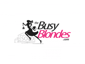
Here again, let’s look at an example. This logo is one we designed for a real estate company. It’s a woman-owned business that caters to female clients.

The logo features a house, which is definitely a standard icon for the real estate industry. However, the house isn’t the focus of the logo. Instead, the primary image is that of the woman dashing in front of the house. Her shape and the sense of movement in the logo makes this logo completely unique in an industry that often features clichés.
Conclusion
As you can see, your company’s unique value proposition and abilities can help you hone in on a logo that meets clients’ expectations without turning into a boring cliché. We encourage our clients to work with us to highlight their abilities in a way that attracts new business while still honoring the traditions of their industries.
