Are they alike? The legal logos on TV and professional law firm's logo designs.
Legal logos in TV shows. In other words, there is one TV genre that is guaranteed to pull in the viewers, and that genre is crime. Whether it’s police procedural, forensics or private detectives, the viewing figures speak for themselves. Furthermore, legal and courtroom dramas are another of these offshoots.
Here at The Logo Company we have designed numerous logos for law firms and legal professionals. Is there anything we can learn from these television shows regarding how to create an effective legal logo? Or is there something that they can learn from us?
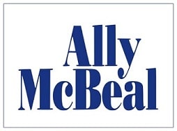
Ally McBeal’s Legal Logo

(Image from Wikipedia)
Ally McBeal was a legal comedy/drama that aired between 1997 and 2002. Above all, set at the fictional law firm of Cage and Fish, the legal cases were really just a backdrop to showcase the character’s personal lives.
The logo is fairly simplistic. Actually, just using the main character’s name. However, it shows a number of design features common to real law logos. In other words, the vast majority of law firms and law offices use a personal name in their company name. Often this is the name of the founder, or of the senior partners in the firm. The font is a fairly traditional which uses serifs.
Traditional Font For Law Firms Used In Legal Logos
Many law firms use these traditional style fonts as a way denoting a certain gravitas, although other fonts have slowly made their way in to legal designs. It might be useful to compare with these top 5 typographic logos. Finally, the blue colour is also common for law offices as it denotes reliability and trust. All in all this logo would not look that out of place amongst legal logos in the real world.
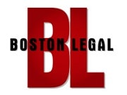
Boston Legal

(Image from Wikipedia)
Boston Legal is another legal comedy/drama that ran for five seasons between 2004 and 2008.
The font here is strong, bold and sans serif. The colours are striking black and red. The black shows sophistication and professionalism, while the red is aggressive. Furthermore, taking this legal logo in isolation, you would assume that this is a serious television program about the legal profession, perhaps even a documentary. More surprisingly, this is in complete opposition to the actual tone of the show. Perhaps this is what the designer was going for.
Damages Super Image!

(Image from Sony Pictures Television Press Website
Whereas other legal shows tend to have one case per episode, Damages has one case per season which unfolds over the course of 13 or 10 episodes. It also utilises two separate timelines that converge as the series’ progress. More so this has been echoed by the split in the logo, which also takes on the more obvious meaning denoted by the title itself; the concept of something having been broken or damaged.
In this case it is the fractured state of the main character’s life by the end of the first series. In legal terms damages refers to an award, usually of money, given as compensation for loss and injury, which is the focus of the court case in season one. Absolutely everything about this cleverly designed legal logo has more than one meaning.
Law And Order Legal Logos In Tv Land

(Image from Buddy TV)
The original Law & Order aired for twenty seasons from 1990 to 2010, and has spawned a myriad of spin off shows. Very much a show of two halves, it combined police procedural with courtroom drama.
The Law & Order logo has remained identical for every one of its American spin-offs, simply adding in the relevant subtitle. Utilising a traditional font with serifs, in the colours of red, white and blue, the logo proclaims stability, trust and power, while making a nod to the colours of the US flag.
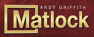
The straight forward Legal Logo In Tv Land Matlock

Ben Matlock was as much an investigator as he was a defence attorney, often visiting crime scenes to find what the police had missed. Nearly every case ended with a courtroom acquittal and the real criminal being brought to justice.
The gold lettering implies quality and success, and the simple sans serif font suggests clarity and straightforwardness. The box around the M could be a play on the “lock” part of the name, indicating a criminal being put behind bars.
Legal Logo in Tv Land For Perry Mason

The defense attorney who always got his client cleared of the crime while simultaneously unmasking the true guilty party. In Mason’s case this was usually at the preliminary hearing, rather than at trial.
The first two images show title cards from two episodes. They are both strong, bold fonts, although the rather spikey original version was later tamed into a rounder, more friendly version. The third image is from the DVD releases and shows a deliberate effort to create a retro vibe.
Legal Logos In The Real World

However, looking at these law firm logos from our portfolio you can see the frequent use of blue and of traditional fonts. Other common motifs are balance scales, long associated with justice and balance, shields, implying defence, and classical architecture, sometimes whole buildings sometimes just columns. This last motif echoes the tendency of court buildings to have this kind of architecture, but also the strength and stability of the law. Whatever branch of the law you represent, a professional legal logo is one way to help your company be seen by more people and potential clients. Take a look at our legal logos and let me know what you think. Could they fit into a TV show ?
Yes, Our Legal Logos Would Fit In TV Land.
As a conclusion, I will say that we have made many many legal logos and they would proudly fit into any TV show I believe. Above all, I mean look at Bergen Leadership Group. Their logo is proud and the colors are just so strong. I love this type of logo and I could easily see it on a show on a Friday night prime time television. More to the point, if you want to read more and get feedback on the today’s legal shows with different legal logos to see, look at this one How to get away with murder

Finally, do you have any questions about how we work at The Logo Company? Please Contact us and read our FAQ.
