When it comes to creating a logo that truly lasts, classic design is hard to beat. Above all, it’s like the little black dress of branding, elegant, reliable, and always in style. A classic logo doesn’t follow trends. It sets a tone that feels familiar, trusted, and steady.

Think about the world’s most iconic brands. Their logos haven’t changed much in decades, and that’s no accident. There’s a quiet strength in something that stands the test of time. Understandably, a classic logo builds recognition not by being flashy, but by being consistent and clear.
So, let’s take a moment to explore why classic logos work so well, what they’re made of, and how you can create one that speaks for your business for years to come.
Classic Logo Design For A Timeless Appeal
There’s something comforting about a logo that doesn’t rush to keep up with every design trend. In fact, classic logos have a certain charm that feels stable and lasting. They don’t shout for attention, they earn it, slowly and steadily.
This kind of appeal works especially well for businesses that want to build long-term trust. Don’t we all ? More importantly, a classic logo suggests that your company has history, or at the very least, plans to stick around for a while. It feels dependable, thoughtful, and well put together.
For example, take the Rolex logo. Its crown symbol and elegant serif lettering have stayed remarkably consistent over the years. While the brand has refined its look slightly, the core design remains strong and familiar. That kind of consistency builds trust over time. People know they’re in good hands.
Above all, timeless logos don’t age poorly. Because they’re built on simple, strong foundations, they hold up even as design trends come and go. And that’s exactly what makes them so powerful.
Elements of Classic Logos
So what goes into a classic logo? First of all, simplicity is key. Most classic designs use clear shapes, balanced spacing, and strong lines. They aren’t overloaded with effects or gradients. Instead, they rely on clarity and structure.
We all know that typography often plays a starring role. For instance, serif fonts, which have small lines at the edges of letters, are a favorite in classic logo design. They bring a feeling of tradition and trust. Second exemple, script fonts can also work well, especially when paired with clean layout and gentle curves.
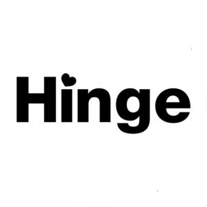
Now the all important colouring. After all, color is another important element. Many timeless logos use bold, uncomplicated color schemes. Take a look at the all black Hinge classic logo that we designed a few years ago. Try, black and white, navy and gold, red and cream, as these combinations feel grounded and reliable. They’re not about shock value. They’re about presence.
Shapes are usually geometric or based on symmetry. For exemple, a shield, a circle, a banner. These forms help anchor the design. Interestingly, these shapes often evoke tradition, strength, or unity. They feel solid without being heavy.
Most importantly, every element in a classic logo has a purpose. Nothing feels extra or random. It’s a little like a tailored suit, clean, fitted, and built to last.
Classic Logo Design Principles to Follow
Designing a classic logo is a bit like building a house. Obviously, you want it to look good, of course, but it also needs a solid structure. That’s where design principles come in.
The first principle is balance. A well-balanced logo feels stable and complete. That might mean equal weight on both sides or a central focus point that holds everything together. This kind of visual balance gives the viewer a sense of calm and trust.
Next comes proportion. Proportion is all about making sure the different parts of your logo work together in harmony. The symbol shouldn’t be too large compared to the text, and the spacing should feel even and intentional.
Another key principle is legibility. Your logo needs to be easy to read at a glance. This means choosing fonts that hold up well at different sizes and avoiding clutter that might distract from the core message.
Color harmony also plays a big role. Try not to use too many colors. Stick to two or three that work well together and feel appropriate for your brand. For instance, deep blue often suggests professionalism, while warm reds and golds can feel rich and welcoming.
Above all, consistency is your best friend. A classic logo doesn’t jump around, it feels grounded and familiar every time you see it.
The Evolution of Logos
While classic logos are all about timeless appeal, that doesn’t mean they never change. In fact, even the most iconic logos have evolved over the years, but always with care.
Logo evolution is usually subtle. Maybe the font is updated for better clarity. Maybe the spacing is adjusted, or the colors are softened. Of course, the goal isn’t to reinvent the wheel, it’s to keep things fresh while preserving the heart of the original design.
For example, think of the classic Ford logo. It still uses the same signature script, but over the years, it has become more polished, more refined, and better suited for modern use. Yet it still feels like Ford. That’s the power of thoughtful evolution.
Interestingly, small updates can have a big effect. Adjusting a line weight or switching to a more readable font can make your logo feel more current without losing its timeless charm.
Sometimes, a logo may need a full refresh. But even then, classic design principles can guide the process. A new look that still feels rooted in your brand’s history often works best.
After all, logo evolution is part of growth. For instance, a great classic logo design keeps what works, updates what’s needed, and continues to build recognition with every version.
Creating a Lasting Impression
At the end of the day, your logo should leave a lasting impression. Not just because it looks nice, but because it feels right. In fact, it tells a story without saying a word. It becomes a symbol that customers recognize and remember.
In short, by creating that kind of impression isn’t about being the loudest in the room. More so, it’s about being the one that feels authentic. A classic logo connects through familiarity and thoughtfulness. It says, “You can count on us,” without needing to say it out loud.
One way to strengthen this impression is through consistency. Use your logo across all your materials. Like for exemple, your website, signage, packaging, emails. Over time, people will start to associate your logo with the quality and care you put into your work.
Another key point is simplicity. A complicated logo can be impressive, but a simple logo is memorable. And memory is everything when it comes to branding. People may forget what you said, but they’ll remember how your logo made them feel.
A classic logo doesn’t just look good. More so, it works. Incredibly, flexible, recognizable, and clear. Whether it’s printed small on a business card or displayed large on a storefront, it always holds its shape and meaning.
And that’s what creates true impact, not flash, not tricks, but timeless design that makes people feel something real.
Final Thoughts
So, in fact, classic logo design is a little like a familiar landmark. It’s always there, steady and reliable, guiding people to the right place. Of course, it doesn’t chase attention, it earns it, through clarity, confidence, and care.
Therefore, by focusing on timeless appeal, thoughtful elements, balanced design, and subtle evolution, you can create a logo that truly lasts. One that feels just as strong in ten years as it does today.
After all, your logo is more than a piece of art. More importantly, it’s your business’s signature, your visual handshake. So why not make it something you’ll be proud of for years to come? Contact us at The Logo Company if you would like to know more.