Keeping up-to-date: technology logo evolution
February 19, 2021
Do all tech companies go through an evolution in branding?
Microsoft Logo. Let’s see the evolution the tech company has undergone. More importantly and unless you’ve been living in a cave for the last 25 years, you can’t have failed to witness the massive strides that the technology industry has taken in that time. However with the technology itself evolving at a rapid rate, businesses within the industry must evolve too. I know that nowhere can this be better seen than in the Microsoft logo. More so let’s me see how popular tech companies have updated their logos over the years.
Microsoft Logo Evolution
Did you know that in 1975, Bill Gates and Paul Allen created BASIC, the first computer language for a PC?. Further I must mention that this system would eventually evolve into the Microsoft brand we know today. More importantly let’s walk down memory lane and see the Microsoft logo evolution.

The Original Microsoft Logo
I know it was initially named Micro-Soft, the hyphen was soon dropped and Microsoft was listed as two words. The original logo used multiple lines to create every letter and the font looked bubble-like and playful.
The Early ‘80s Update
I understand that the rounded, fun font of the late 1970s was replaced with a bold font that used straight and angular lines to create a sharper look. I believe there was another change at the time. Microsoft became one word and stayed that way. Many people noticed the Microsoft logo shared many similarities with the band Metallica’s logo. I believe this new logo design showed the company was evolving and becoming more confident in its product.
A Third Microsoft Logo
I must mention that when the rocker logo was changed in 1982, Microsoft chose to go with a cleaner, simpler design. This time, however, designers chose to make the “O” an emphasis point, adding a featured element to it and nicknaming it the “Blibbet.” This Microsoft logo lasted until 1987 when the company decided it was ready for another logo change.
The Late ‘80s Logo
More noticeable, the Blibbet from the last Microsoft logo was retired in 1987 in favor of the ”Pacman” O, named as such because of the mouth-like slash cut into the side. I have read that many employees were upset over this change and petitioned the company to leave it alone. Seeing as Microsoft was becoming a household name around the world since the late ‘80s, the logo became an instantly recognizable symbol of the brand, hence the lack of significant change over the last 25 years. Furthermore I understand that the only noteworthy modification has been the addition of a tagline in 1994. This has changed numerous times over the years culminating in the current one, which was introduced in 2012.
The Current Microsoft Logo
In conclusion, as late as in 2012, the Microsoft logo that most of us know was introduced. Featuring the iconic four-square “window” with different colors in each section. Updating, more importantly, the design to represent decades of Microsoft logo evolution and highlights how the company has changed and grown over the years.
Apple Logo Evolution

I know that the phenomenally successful Apple was established in 1976 by Steve Jobs, Steve Wozniak, and Ronald Wayne. The first logo was an illustration of Isaac Newton under the apple tree where he thought out the theory of gravity. However, it was quickly decided that this was far too complicated, and designer Rob Janoff was brought in.
He created the rainbow apple design that the company used for over twenty years. I heard that Janoff added the bite mark so that it wouldn’t be mistaken for a tomato. The rainbow represented the unique selling point of Apple’s colored graphics. Apple switched to a monochrome version of the apple in 1998, before changing to the current design with a silver gradient finish. Above all, I believe that this logo is all about the shape. Whatever color you put it in, it is still instantly recognizable. Incredible I think. Check out some apple icons and their shapes Apple Shapes
IBM Logo Evolution

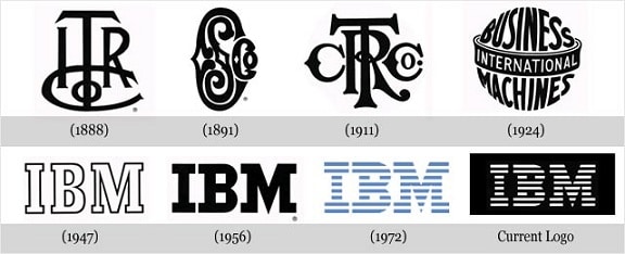
Let’s look at IBM which started in 1888 as ITR, The International Time Recording Company, making and selling mechanical time recorders. ITR merged with CTR, the Computing-Tabulating-Recording Company. In 1911, and both sets of initials were incorporated in the logo.
I understand that in 1924, the name was changed to IBM, the International Business Machines Corporation, changing the logo accordingly. Modernism had recently taken over the art world and the new logo reflected this, leaving behind the rococo swirls for a simpler font. The spherical shape banded by the word “International” shows the company’s global interests.
In 1947, IBM moved from punch-card machines to computers, and again the logo was changed to suit. I must also mention that the globe was dropped and the name was reduced to its initials. The font was subtly changed in 1956 to create a more solid look but has remained the same ever since. The stripes were added in 1972 to create the impression of ‘speed and dynamism’.
Windows Logo Evolution

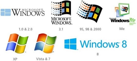
Microsoft Windows is a graphical operating system for PCs first introduced in 1985. The original Windows logo included a blue “window” icon and the product name in a simple serif font. The multi-colored wavy version was introduced in 1993. The undulating shape with the railing pixels gives the logo a sense of motion, with the window becoming a flag.
I know the flag motif remained in use until 2001 when, with the release of XP, a major redesign was introduced. The black frame and trailing pixels were excised, while the colored panes were given a more three-dimensional look. This design was altered only slightly for Vista and 7, released in 2007 and 2009 respectively, with the font changing to Calibri.
With the heralding of Windows 8, set for release later in 2012, the logo went back to the beginning, echoing the Eighties design yet also bringing it up to date. Could this be a risky move when the multi-colored flag has been so etched in consumer’s minds I ask? Only time will tell. The Windows logo may change over time, but many people will recognize the popular brand, regardless of logo design changes.
Nintendo Logo Evolution

Starting as a playing card company in 1889, Nintendo started branching into other areas of business in 1963. They entered the video game industry in 1974 and their first games console, the NES (Nintendo Entertainment System) was launched in the mid-’80s.
Over the years, the Nintendo name has become a smaller and smaller part of the company’s product logos and was finally abandoned with the release of the Wii in 2011. I know that the vibrant colors of the earlier logos, which emphasized the colored graphics of the consoles, have also been discarded.
Internet Explorer Logo Evolution

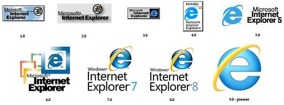
The graphical web browser Internet Explorer was introduced in 1995 with the logos for versions one and two utilizing the Windows flag icon. It was version three that introduced the “e” icon that has remained to this day. The “e” is meant to represent a globe, while the orbiting circle is meant to represent speed and exploration. The Helvetica font was chosen for its solidity and balance, and the blue color for reliability.
I remember With 2006’s IE7, the name was changed from Microsoft Windows Explorer to Windows Internet Explorer, and the orbiter was made yellow. I believe the current logo has retained much of the previous design; however, the “e” is now rendered in a custom font, the blue is lighter, and the orbiter has been made to give an even greater impression of speed.
What Does This Mean for Your Business?
So, the top companies from the technology industry are constantly re-inventing their logo as fast as they re-invent their products. So yes I have shown you how all major tech companies go through major re-branding. Furthermore, you can understand why this is important. If you walked into a shop to buy a new laptop and you saw the 1980s Microsoft logo on it, you’d immediately think that the product was outdated. Whatever industry you are in, there is a lesson here for all businesses. Keeping your logo up to date just as you would do with your products and services.
If you need help updating your company logo to a fresh, modern one, The Logo Company can help. Simply contact our team to start discussing your logo redesign today. Order now
