Best Volleyball Logo Design: Tips and Inspiration for Teams

How do you get the best volleyball logo design ? Well, a really good volleyball logo is more than just a graphic. More so it need show the spirit, energy, and identity of a team. Whether you’re part of a competitive club, a high school team, or an amateur league, the right logo design can set the tone for your team’s presence on and off the court. The best volley ball logo becomes a symbol of pride, motivation, and unity. Actually, making it essential to approach the design process with creativity and intention.
Innovative Ideas for Volleyball Logo Design
Above all, creativity is key. Many teams incorporate elements like volleyballs, nets, and dynamic player silhouettes. However, but taking it a step further can create a truly memorable design. For example, incorporating motion lines can suggest speed and power, while geometric patterns can give a sleek and modern look. Some teams use animal mascots to represent strength, agility, or resilience. Even going as far as integrating the essence of their mascot into the volleyball itself. Others lean into mythology or symbolism, such as lightning bolts for speed or flames for intensity.
The best volleyball logo design needs to have fantastic typography, of course. In fact, it also plays a crucial role. Some teams opt for bold, athletic block lettering that kind of shows power. However, others prefer script fonts that suggest agility and finesse. The key is to make sure that the logo feels aligned with the team’s personality. Foror instance, a team known for aggressive play might use sharp, angular designs. If f you are more of a strategic fitness team then you might want to opt for something more refined and sleek.
How to Choose the Best Volleyball Logo Design
Selecting the best volleyball logo design requires a balance between creativity and functionality. We all know and agree that logo should be easily recognizable, even from a distance. Don’t forget that it needs to be versatile enough to work on jerseys, banners, and promotional materials. In short, simplicity often leads to the most effective designs. I believe that overly complex logos can become difficult to reproduce and may lose clarity when resized.
Another factor to consider is originality. Avoid common clipart style images that lack character. Do use a professional logo designer like The Logo Company to make sure that you get original work created for you. The best volleyball logos reflect a team’s culture and values. It can also help to gather input from team members, coaches, and fans to ensure the design resonates with the broader community.
Top Trends
Like so many other things, volleyball logo trends have evolved over the years. Nowadays, many modern designs leaning toward minimalist aesthetics. That is to say, clean lines, subtle gradients, and monochrome or black color schemes are popular choices for teams looking to maintain a professional yet striking look.
Not surprisingly, vintage and retro designs have also made a comeback, featuring classic fonts and handdrawn illustrations. These evoke a sense of tradition and heritage. Furthermore, making them perfect for teams with a long standing history. Alternatively, futuristic and tech-inspired designs have gained traction. This is mainly done by incorporating sleek metallic elements and digital images that reflect innovation and progression.
The braver teams experiment with abstract designs to try to create the best volleyball logo design. In short, moving away from literal volleyball imagery and instead using shapes and patterns that give a sense of movement, energy, and competition. These designs can feel fresh and unexpected, setting a team apart from the typical sports logos seen in the past.
The Role of Color in Volleyball Logo Design
Color is one of the most powerful tools in logo design. More so, it influences emotions, energy, and increases brand recognition. In volleyball logo design, teams often choose colors that reflect their competitive spirit.
Some colors that you might not think of are bright and bold colors like red, orange, and yellow. Don’t dismiss these as they could very well add a bit of intensity and passion. On the other hand, cooler shades like blue and green can add calmness an even focus, on strategic thinking. Black and white designs provide a timeless and classy look, often used by teams that want a professional and classic appearance.
Some teams opt for unique color combinations that stand out in a crowd. Neon hues and metallic finishes add a contemporary edge, while pastels can provide a modern, sophisticated feel. Regardless of the color scheme, the key is to maintain consistency across all branding materials to build a strong and recognizable visual identity.
Customizing Your Volleyball Logo Design
When it comes to customizing your very best volleyball logo design then it is essential to have a logo that truly represents your team. Therefore, to add personal touches, like for example the year the team was founded, a slogan, or a even unique emblem can actually help create a sense of identity and pride.
Many teams personalize their logos by incorporating elements that reference their hometown. That could be in the shape of a skyline or a landmark. However, others add symbols that reflect their team’s ethos. For instance things like wings for speed or shields for resilience. More importantly, the typography choice can also be a defining feature as well so do pick it wisely as your image will also depend on your font.
It’s also important to think about how the logo will appear across different mediums. A good logo should be adaptable. Be clear always in all weathers and impact whether printed on a jersey, embroidered on a cap, or displayed on a website.
Inspiring Examples
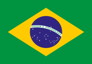
One of the most recognizable volleyball logos belongs to the Brazilian national volleyball team. Their logo features the classic yellow and green colors of Brazil, with a sleek and modern design that emphasizes movement and dynamism. This is probably one of the best volleyball logo designs in the worlds if I may say so. In fact, the incorporation of curved lines around the volleyball creates a sense of speed and precision. This is actually something very difficult to create. More so, the design also reflects Brazil’s deep rooted passion for volleyball, making it an iconic emblem in the sport.
The second example is the logo of the USA Volleyball team. Here, the design incorporates the red, white, and blue colors. Of course the patriotic corps of the American flag while using a stylized volleyball that mirrors the stars and stripes motif. Cleaverly does and this design successfully merges national pride with the sport, making it both meaningful and visually striking.
Let’s not forget the club teams around the world. They have also tried to make the best volleyball logos. Many European teams add modern and minimalist designs, favoring geometric shapes and simple yet effective typography. However, the exception to this is Japanese volleyball teams. These often understandably, incorporate traditional calligraphy fonts, blending heritage with contemporary sports branding.
Final Thoughts
Some final thoughts ! A volleyball logo is more than just an image. It mean a lot to the team and should represent their efforts for a very very long time. Whether inspired by dynamic motion or not but with thoughtful choices in design elements, color schemes, and customization, any team can create a logo that stands the test of time and adds the passion and energy of the game.