The Best and Worst Sports Logos of All Time
Which ones are the best sports logos and which ones are the worst sports logos? Is it in the eye of the beholder?
Logo design can be a challenge and sports logos are no exception to this rule. Actually, some of the best and worst logos in the world come from the world of sports. Some teams and events (e.g. the Yankees) have kept the same logo for years and years, while others seem to change every season (e.g. the Houston Rockets). Let’s take a look at the best sports logos and worst sports logos of all time.
The Worst Sports Logos
Many people agree that the following logos are some of the worst sports logos of all time. Perhaps you disagree. Let me know Contact me
Buffalo Bills
Take this oddly named Buffalo Bills logo. The logo shows a blue buffalo (or American bison) running with a red line coming from its horns. Mostly, apparently to indicate the speed at which it is moving. Since Buffalo Bill Cody was a person and this logo has nothing to do with people, it is confusing. Furthermore it is visually unimpressive.
Anaheim Ducks
The Anaheim Ducks, formerly the Mighty Ducks, have dropped the “Mighty” and moved on to a new logo that barely incorporates their mascot at all. The D looks like a wing or possibly a webbed foot, but this logo might be better suited to a junior league team.
Carolina Hurricanes
The Carolina Hurricanes logo takes the concept of swirling and the letter C to make a sickening mess of blurred color and movement. It looks more like water going down the drain than a hurricane, and the solid red, black, and white combination is somewhat reminiscent of the eye in Tolkien’s Mordor.
Los Angeles Kings - Alternate - the worst sports logo
For Los Angeles Kings logo we can say a lot or not very much. It t is extremely dull with the worst color combination ever in my opinion. Rest assure, nowadays the worst sports logo design has turned into one of the best. It did take some thinking about and hopefully the team has learnt from their mistakes.
St. Louis Cardinals
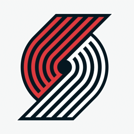
Let’s talk about, The Trail Blazers. Above all, the logo is supposed to be a “pinwheel” shape. Five lines on each side meeting together in the center. This design creates a balanced logo but most importantly, it doesn’t have anything to do with basketball. I believe it has nothing to do with the team as a whole. If you aren’t a Portland fan and don’t follow the NBA closely, it would be difficult to match this logo design with the basketball team. Could you? I can’t
Denver Nuggets (1982-1993)
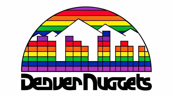
The current Denver Nuggets logo still isn’t great. However, the team’s logo from 1982 to 1993 was one of the worst logos ever. The rainbow-colored blocks representing the city along with the rainbow-colored lines for the sky overwhelm the logo. Furthermore, it is chaotic and hard to look at. Aside from the mountains, which aren’t singular to Denver, nothing about the images highlights basketball or the team. The font is also hard to read and looks unbalanced with a mix of capital and lowercase letters.
The Best Sports Logos
The following logos are considered some of the best sports logos of all time.
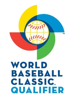
2006 World Baseball Classic
For the 2006 World Baseball Classic, the United States team developed a logo of pastel red, white, and blue. The letters “U” and “S” were intertwined around a large star. The typeface was bold (figuratively speaking). More importantly, the skewed angle of the whole thing seemed to inspire movement and the excitement of the event.
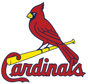
St. Louis Cardinals - one of the best sports logos
The St. Louis Cardinals had a red cardinal holding a baseball bat as their logo for ten years from 1956 to 1966. The sharp red, black, and yellow contrast deliver an image that looks both challenging and fun. Plus, it’s a bird playing baseball.
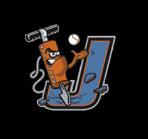
Joliet Jackhammers
The Joilet Jackhammers. Northern League logo includes an angry, vicious jackhammer tossing a baseball in the air with one hand and drilling into a giant letter J at the same time. The fragments flying off the J are possibly one of the best uses of damage imagery in sports logos.
New York Yankees, is the best sports logo
The interlocking “N” and “Y” of the New York Yankees has created one of the most recognizable sports logos in history. The logo has remained largely unchanged for over 100 years. So when people see it, they automatically think of the Yankees. Fun fact New York Yankees ballpark music
Dallas Cowboys
A simple blue star with a white and blue outline immediately conjures images of America’s team, the Dallas Cowboys. The single star represents the team but also Texas, known as the Lone Star State. This logo was originally just the star and the outline was added a few years later. Probably for a more modern look. Many people consider this to be the best logo in sports history.
Los Angeles Lakers
The Los Angeles Lakers logo beautifully combines purple and yellow, the team colors, without feeling overwhelming or garish. By including a basketball in the logo, it is easy to understand what the team does and where they are from. This logo feels bold and shows good movement while staying easily recognizable.
Fictional Sports Logos - Part of best sports logo
Some people like to have some fun coming up with logos for fictional sports teams or events. This can include updating real sports teams logos to have a fictional twist or creating sports logos for fictional characters even when no sport exists.
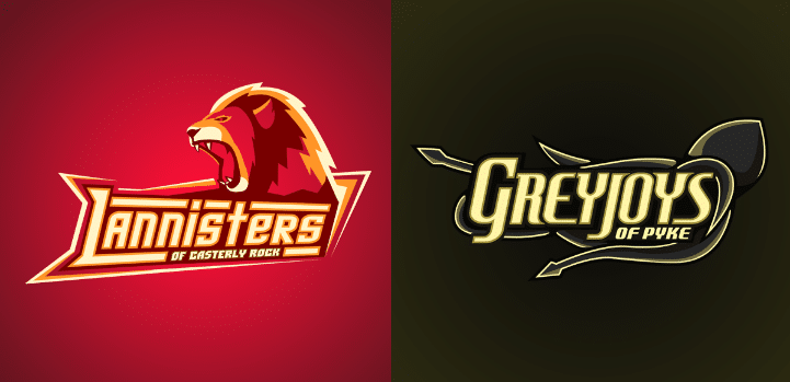
Game of Thrones Meets Sports
Ukrainian artist Yvan Degtyariov (Vanadium) came up with sports logos for the houses in Game of Thrones, giving the Lannisters of Casterly Rock a hot red baseball look, while the Greyjoys of Pyke got a dark squid-like image. Who has not seen it?
Football to Quidditch
Another Italian online artist converted the New York Giants football uniform into a quidditch robe, fit for the characters of Harry Potter.
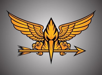
A Movie Logo Tie-In
And, of course, whenever they make a movie that depicts fictional sports or activities, they have to come up with ideas to represent the teams. Luckily, a lot of authors already lay the groundwork for this type of thing in their work.
Suzanne Collins’ The Hunger Games, however, failed to describe corporate logos for the games themselves. The whole focus of available imagery is on the Mockingjay pin that Katniss wears. One group of fans decided to make real-life ice hockey jerseys with a fierce gold Mockingjay holding an arrow in its beak on the front.
Fans and Logos - worst sport logos or actually good?
The world of sports logos brings good and bad aspects to the table. Whatever your personal preference, there is always a new logo cropping up or an old one to admire or tear down. Sometimes, a team changes its logo for the better and sometimes fans miss the old imagery.
Above all, most sports fans are just looking for something that depicts competition, energy, and focus. At the same time highlighting the team. Getting this balance right is a challenge for many designers who might think they have a great idea. But, sometimes it just does not work out the way they wanted or imagined. In most cases, the die-hard fans are going to be out there buying up all the collectibles with the team’s logo, no matter how much they complain about it.
In conclusion, you must decide the best sports logo design and the worst for yourself, however I think this blog has enlightened you somewhat.
Need Sports Logo Help?
If you are struggling to create or update a sports logo — or any type of logo — The Logo Company is here to help. Contact our team to learn more about our logo design services.
