Logos in the digital era have changed immensely. However, prior to the digital revolution, it wasn’t much of a challenge for companies to choose unique logos that were different from others in their industry. While there was always some overlap in imagery, logos were still hand drawn. Originality was the norm.
In today’s world of digital marketing and design, it has become more difficult than ever before to stand out. Gone are the days when companies could solely focus on outperforming their local competitors. Nowadays, businesses find themselves in a highly competitive global arena, where they must navigate and adapt to rivals from all over the world.
With logos in the digital era more widely seen than ever before – and the accessibility of digital design tools – it is essential for companies to look beyond the obvious and find a design that helps them to differentiate.
How Logos Have Changed In The Digital Era
Let’s begin by talking about how logos in the digital era have changed over the years. While the basic idea of logo design is the same, both the methodology and marketing preferences have changed substantially.
Early Logo Design Methodology
As mentioned earlier, the first company logos were designed and drawn by hand. Everything started to change in 1969 with the invention of the computer. By 1984, Apple had released the first Macintosh computer featuring bitmap graphics.

Gradually, logo designs changed with the digital era. As graphic designers embraced new technology, they began using it to create logos. While some designers still prefer hand drawing, today, any good logo designer must keep digital requirements in mind to be successful. With the rise of AI in graphic design, the landscape of logo design has further evolved. Artificial intelligence algorithms are now capable of generating and unique logo designs, often surpassing human capabilities in terms of speed and creativity.
These AI-powered tools analyze vast amounts of data, including existing logos, design trends, and brand preferences, to generate logos that are tailored to specific industries and target audiences. However, these tools may not replace a professional logo designer, as they maintain an artistic vision and human touch in the logo creation.
Marketing Evolution In The Digital Era
As logo design has evolved, so has the field of marketing. Initially, marketing efforts were mostly conducted through face-to-face interactions or written materials. Print advertising emerged as the medium for reaching all kinds of audiences.
As time passed and technological advances became commonplace, marketing kept up with the changes. First companies added radio advertising to their marketing mixes, then television advertising. But perhaps the biggest change of all has been the rise of the web and the move to digital marketing.
Online marketing poses challenges and opportunities for companies who do it. It’s easier than ever to connect with audiences using sophisticated targeting methods. However, it’s also harder than ever before to separate from the competition and make sure that your voice – and your brand – are seen in the ever-rising sea of competitors.
Changes in Logo Preferences
Logo preferences have changed with the times, too. Digital marketing requires certain logo elements that simply weren’t a concern with print or television marketing.
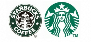
One of the biggest trends we have seen in logo preferences is the trend towards simplicity. We have written on this blog about how companies such as Target, Starbucks, and Coca-Cola have simplified and refined their logos over the years. Let’s take a look at the previous and current iterations of Starbucks logos:

This streamlined approach not only enhances its visual appeal but also improves the ease of recognition. Despite this simplification, the essence of the Starbucks logo remains intact, serving as a direct evolution to its original design. This continuity ensures that loyal customers still instantly recognize and connect with the brand, while also attracting new audiences through the modern and refreshing appearance.
Qualities of an Effective Digital Logos in the Digital Era
What are the qualities of an effective digital logo? It’s important to know so you can make the best possible choice for your company. Remember that your logo is likely to be the very first thing that a potential customer sees. Therefore, you should not rush the design of your logo and allocate enough time for the process.
Simplicity Is Key To Create Logos For Today’s World
The first hallmark of an effective digital logo is simplicity. As mentioned earlier, many large companies have made a distinct and obvious move toward simplicity with their logos in the digital era.
Some of the things companies do to simplify their logos include streamlining fonts, shapes, and images. Here’s an example of a minimalistic logo we designed for a real estate company:

Note the way our designers incorporated the simple house shape into the name of the company. As you can see with this design it does not always need to be an elaborate logo.
Communication in the Digital Era
The next key factor of an effective digital logo is communication. Your logo must communicate who you are and what your business does.
A potential customer should look at your logo and know immediately what you do. They might not get every nuance, but if they can’t at least tell what industry you’re in, it’s time to go back to the drawing board.
Recognizability is Key To Logo Design In The Digital Era
Well, it should go without saying that logos in the digital era must be recognizable. People who see it once should find it impressive enough that they will remember it if they see it again.
For instance, the two elements we have already discussed, simplicity and communication, can both help to render your logo recognizable. Ultimately, you want your logo to be the perfect representation of your company. When you achieve the right balance of design elements, your logo will be memorable.
Utility and Versatility Are Requirements For Digital Logos
Most importantly, the final element you need to consider when choosing a digital logo is the utility and versatility of the logo itself. In the past, companies had to think about versatility, but not to the degree that they do today.
Prior to the invention of the internet, most digital logos appeared on the sides of buildings, in print, and on television. Logos could be small or large, but companies had a significant amount of leeway in terms of how big a logo they wanted on the letterhead, for example.
Today, logos must be designed with digital marketing in mind. That means that they have to look equally as good on the side of your building as they do in a thumbnail profile picture on Twitter. You may still have print needs for your logo, but you have to be thinking about how it will look on your website, on social media, and in emails.
Digital marketing concept
Before you finalize a logo design, you should make a point of looking at it in different sizes and formats to decide if it is versatile enough to suit your needs. A logo that becomes muddled or contains too much detail to be seen as a thumbnail is not the right logo. Above all, it needs to fit all marketing challenges possible.
Tips to Help You Choose a Great Digital Logo in the Digital Era
Now let’s talk about how to choose a great digital logo. You need to be thinking about all of the things we have already discussed as you make your decision. We have summarized the core points for you in the following:
Choosing the Right Digital Elements
Your logo choice should start with the three main elements of logo design: colors, shapes, and fonts.
- 1. Firstly, the colors you choose should be representative of your company. While there is plenty of leeway in color choice, the truth is that certain psychological associations must be kept in mind. For example, blue represents trust and conservatism, while green may represent money or the environment. Shades of color have slightly different meanings. For example, bright red conveys excitement, while burgundy shades are luxurious.
- 2. Secondly, the overall shape of your logo must be taken into consideration along with internal shapes. Circles tend to represent warmth, safety, and connection. Squares and rectangles symbolize solidity and trust, while triangles stand for creativity and innovation.
- 3. Thirdly, the fonts you choose can impact how easy it is to recognize your digital logo. You might be tempted to choose a showy display font thinking it will be memorable, but your first consideration should be legibility, closely followed by appropriateness. A fanciful font might be perfect for a kids’ apparel shop and completely inappropriate for a financial services company.
Make sure that your logo elements translate well in a variety of sizes and uses, and that it looks as good printed as it does on the screen.
How to Avoid Looking Like Everybody Else
The final consideration in logo choice is originality. While you want to have your logo be recognizable as belonging to your industry, you don’t want it to look like every other logo out there. That means you need to balance tradition with innovation.
Earlier we showed you a real estate logo, and that’s a good example of an industry with a strong tradition. It can be challenging for real estate companies to find a way to represent themselves without slipping into cliché.
For instance, you can differentiate yourself by finding unique ways to use traditional shapes and images. Avoid hackneyed images and ideas whenever possible. Perhaps, you might be in the business of giving loans, but using a dollar sign in place of an S is not going to win you any points for originality.
Furthermore, it may help to think about the things that make you unique and work with your logo designer to make sure those things are represented in your digital logo. Without a doubt, there are things about your company that are special. After all, your logo should celebrate them while still embracing the traditional characteristics of companies in your industry.
Conclusion Logo Design in the Digital Era
Wrapping it up, logo design has evolved over time, yet the fundamental principles remain relevant. It is crucial to ensure that the images, colors, shapes, and fonts in your logo harmoniously collaborate to communicate your identity and purpose to viewers encountering it for the first time. Also keep in mind to keep your design simple.
While achieving originality may appear challenging, by outlining guidelines you can choose a logo that is distinct, memorable, and impactful. Whether it is featured on letterheads, displayed on a company vehicle, or used as a profile picture on social media platforms such as Instagram, a well-designed logo will effectively represent your brand.
