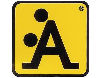
Why did not anyone stop and think before creating these bad logo logo designs!.
Let’s talk about rude logo design. I know we have all seen them before, creative logos that have captured our imaginations. More importantly, burned their brand into our psyches and made us willingly part with our hard-earned cash.
I have over the years seen many bad logos, which are memorable for all the wrong reasons. However strange it sound, it’s true. Why do we remember them better then the good logos you might wonder.
At The Logo Company, we specialise in creating professional and memorable logos. Our motto is always to get your logo designed right the first time, so you don’t have to go through the stress and hassle of a re-design further down the road. Order a good one from us
Bad Logos
Firstly, we thought we’d take a look at some of the bad logos around the world that should have definitely considered a re-design before launching to the viewing public. The rude logos mentioned below all have logos that don’t manage to convey the right message. Incredible but true that some of them (unintentionally) conveying something darn right rude. So, without further ado, we present to you some of the funniest, rudest and simply wrong rude logo design of the world. Im sure you will agree that most should never have made it past the drawing board. Well, all of them actually, come to think about it.
Our Top 30 Rude Logo Design (Viewer Discretion Advised)


In n conclusion, you just have to sigh and laugh. How on earth could anyone create these?. Rude logo design is not and should not be a way to attract people’s attentions but it does. How could the logo designer imagine this and then a company actually paying to print and use bad logos like these? I don’t think I will ever understand it however it does happen. I think we get a bit caught up in what’s cool and what’s not to actually think.. hang on this is rude logo design is too much for anyone. Take a look at these rude tattoos. They are at least laughable. Funny bad tattoos
If you need a nice looking logo then Get in touch
