Famous and not so famous logos with D
So, finally time for logos with D. Welcome back to Friday Feature.
Continuing on through the alphabet of business logo design, this week we’re looking at some of the best logos beginning with D.
1. The Dove logo begins with the letter D
Wow, it is a work of art. Using the bird itself it evokes a feeling of peace and relaxation. As Dove has been on an campaign to promote natural beauty, its design is perfectly suited. It gives a sense of natural, peaceful simplicity. It is also very timeless and recognisable. It even works across different languages as the dove communicates when the text does not.
2. Digg – Logos With D
Well, most of all, this is one of those logos that looks incredibly simplistic. It is simple, but the design works flawlessly for the company. It even looks like a “digger”. Look closely. The “g”s look like wheels and the d could be the front part of a construction site excavator. It’s a great design, clearly very well thought out.
3. Delorean Motor Company – DMC
As you guesses, the geek in me couldn’t resist this one. While you won’t see this around much, it’s the logo design for that great Back to the Future vehicle, the Delorean. It’s very slick and timeless, despite the not-so-timeless car for which it represents.
4. Domino’s Pizza Is A Logo With D
Domino’s is a classic example of great typography and the use of colour and space. The three dots represent the first three stores, and the intention was to continue adding dots as more stores opened but the international success of Domino’s made this plan a little implausible and thus the 3 original dots remained and no more were added.

5. DC Entertainment
The final famous logo beginning with D for this week is from DC. It has sparked quite a lot of controversy and I can see why. I personally liked the old design, but this one was well thought out. If you want to read more about the reasons behind DC’s new designs check out this article. The first logo that was revealed was this plain design:
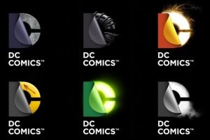
However, DC comics logo then officially released the following logos for DC Comics. And I have to say, while I loved the old logos these are pretty cool. I love how adaptable they are! What do you think?
What do you think? Are there any logos beginning with D that you like better?
In two weeks time we’ll be looking at logos beginning with the letter E. If you’ve got a favourite you’d like to appear here or one you designed yourself, which you would love to see showcased, please submit it to us via Facebook or tweet it to us @thelogocompany using the hashtag #fridayfeature
