A text based logo is preferred by big businesses. Typographic logos are a specialist design skill that is used by designers specializing in the layout and style of text for any medium. Furthermore, Typography logo design falls within this specialization.
Typographic logos are often very simple logos in structure but complex in concept. Hidden meanings are littered throughout these clean texted based logo and are usually very subtle and hard to spot. Fo sure, others are more obvious in their meanings and this text based logos style is preferred by smaller businesses with smaller marketing budgets.
Brand building is a slow and often expensive business so any short cuts to brand recognition (and there are few) are adopted by smaller businesses on tighter budgets. It’s easier to remember a text based logo if you see the meaning of it right away. Is it time for you ? To know when it’s time for a new logo
In no particular order, here are our top 5 typographic logos of all time.
1. Utopia Finance
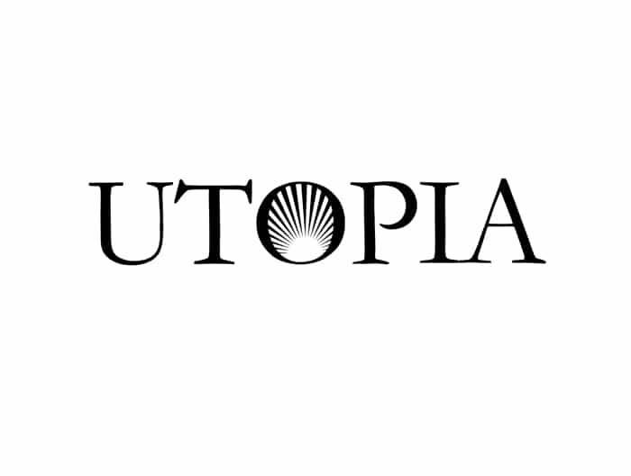
What makes this text based logo what it is?
Well, first it is important to understand a bit more about the business. Understanding what makes the business tick and understanding their values and ethos. Do they need typographic logos? For instance, where does this business fit in with the rest of the market?. Asking, where do they want to take their brand going forward?. What qualities best describe this business? Perhaps show qualities describe other businesses in this market and how is this brand different from those. Lastly, is this company different from the rest?
Once we understand more about the business we can put together some ideas that represent these qualities. Let´s think about some qualities generally that would be desired by any financial institution for their brand and then get more personal. Words that resonate with finance could be; strong, reliable, honest, creative, traditional. The text needs to represent conceptually these qualities.
Text based logo for traditional yet modern look
In the case of Utopia, the client wanted to adopt all these qualities but also wanted to be seen as a new generation of financial institution. Traditional but modern, a leader rather than a follower. Shining out as a beacon of light among a crowded market.
To achieve this goal, our design team came up with several different concepts typographic logos that would take these desired qualities on board and project the business in the desired light. After much brainstorming of logo ideas, the client was presented with Utopia above.
The typographic logo design works in a vast array of color combinations so is cost effective for marketing materials. The text based logo uses a Serif font in a traditional style, kerned for overall visual balance. The “O” represents the new start, the shining beacon and the leader rather than the follower. It has a modern but traditional feel which is a contradiction that is not easily achieved in typographic logos. Learn more Typography can make or break your logo
2. Leeshots Photography
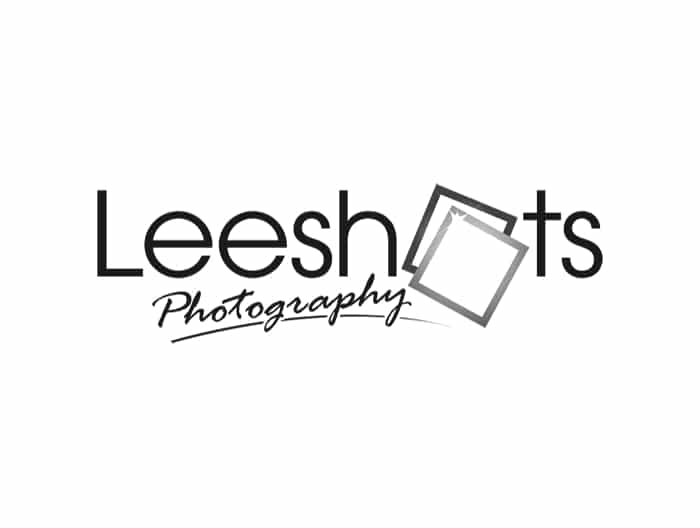
San Serif font for a fun and clean look
Above all, the photographic market is often very local in nature. Local photographers are competing for a local market and to stand out in a local market you need to build your brand.
More so, a lot of photographers feel it is enough to just type out their business name and rather than use their logo design to build their brand, they think it is enough to think of themselves as the complete brand. However, this is a mistake because in a competitive market if everyone looks the same to the potential client. Furthermore, the choice of photographer can be rather random. So, this is not how to set yourself apart. Leeshots realized this and commissioned us to design their text based logo to help them compete in a very crowded space.
Leeshots Photography is a serious business with a fun and modern approach. For instance, they offer a very personal service that produces a high quality product. Most of all, it’s a business that makes personal connections and lasting memories.
The fun and clean San Serif font means they offer a service that is professional but they don´t take themselves overly seriously. They are people people who are easy to work with and there is nothing complicated about them or their service.
To highlight how personal the service is, a script like handwriting font is used for the word photography. The “O” in Leeshots represents the lasting memories with the photo flash in the front frame depicting the speed at which they work and that it is a business very much in the present tense. It´s happening now.
3. Irrigation Pros
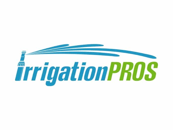
Text based Logo with movement for a modern look
Most importantly, I guess, manufacturing businesses can be seen as boring and very matter of fact. Irrigation Pros do not want to be taken this way with their irrigation systems. They want to be seen as a modern solution to an age old problem. Nothing complicated but it gets the job done. Their system is simple but very effective. It´s a progressive company that is moving with the demands of modern horticulture.
Do you see how the designer has built movement into this design. This text based logo feels like it is alive. It feels like it is working, it´s doing a job. The colors represent the task in hand and the italics font is progress. Always making progress.
The water jets are showing the solution protruding from the capital “I” of Irrigation. This text based logo design, although simple and made up mostly of typography feels like it is doing a job of work. It´s memorable and versatile. Manufacturing logos do not have to be boring, they can have an element of fun too as long as they maintain a professional overall feel to them. It’s also important to make sure typographic logos can work in single colors and that it can be re-sized without loss of clarity.
4. Automobile Inc
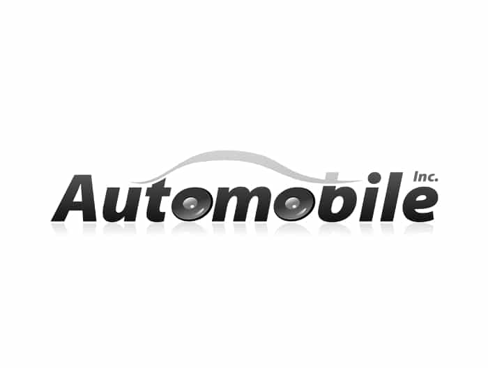
Memorable automobile logo
Shiny, sleek, smooth lines. 3 words that an automobile business might want to be associated with. As you know, the automobile market place is known to be one of the most competitive industries in the world. Especially hard to make a mark and stand out in this business if your branding is weak. You have to be memorable to stand a chance of getting in on the game.
A lot of car dealerships and Auto Stores have not got typographic logos but logos that are far too complex and over engineered. This type of car logo design does not always make it easy to remember which is a key ingredient when it comes to building a strong brand.
So just look at the sleek line in this text based logo that makes up the body of the car. It’s streamlined and flows smoothly. Furthermore, the top part of the B could actually represent either a spoiler or a supercharger depending on how the viewer first sees an image. It works just as well both ways and both objects are equally aspirational. The “O”´s of course make up the tires and the italic font again adds movement.
Lastly, the glassy shadow adds to the clean and new look but can be left out of the text based logo too without degrading the overall message of the design. Keeping up with times with a modern logo design
5. Creative Printing
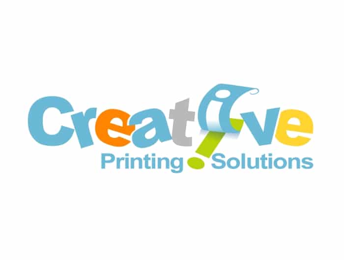
Uncluttered typographic logos are always effective
The challenge here was to take a name offering so much creative promise and deliver that creativity through the text based logo using a simple and effective use of typography. So not much of a challenge there then. Being a print business too, color has to play a leading role in the logo design. Using the printed “I” to run over as a separator in the tagline was a master stroke too as it solved the problem of which is the best letter to print.
For instance, the logo design is not subtle at all however, it says what it does and it does that in a creative way. The text based logo is uncluttered and clean but most definitely memorable.
When creating a logo to represent any brand you need to think about how you are going to make the design easy to remember. It’s easy to overdo the design and make it overly complicated to try to achieve something memorable but this is nearly always a mistake. It’s just as hard to make a simple text logo memorable as it is to make a complex illustrated logo memorable.
The skill is in the concept visualization and execution and this is not something you just do. It takes a proper design process to go through all the stages of logo design to deliver this consistently. Need to see The birth of a logo
If you would like to get a text based typographic logo design for your business, please complete the order process here: