
The Season for Standing Out
So, what are the summer color trends for logos this year ? Summer is more than just a season—it’s a mood, an energy, and an opportunity. It’s when people take action, go outside, explore, and spend. And for businesses, it’s a golden window to connect, refresh, and be remembered.
One of the simplest yet most powerful ways to make your brand feel fresh and relevant this summer is through color. A chosen summer color palette in your logo can speak volumes before a single word is read. More so it creates emotion, sets tone, and influences the way customers sees you—often in seconds.
In 2025 trends, logo design is leaning into boldness. More importantly, designers are embracing colors that feel alive: vibrant citrus, ocean-inspired shades, and energetic neons. But these choices aren’t random—they’re driven by the psychology of color, seasonality, and strategy.
Let’s take a look into what’s trending, why it matters, and how your brand can harness the power of summer color trends this year.
What’s Trending in Summer Logo Colors?
Across industries, the summer of 2025 is bringing in palettes that feel bright, confident, and highly emotional. It’s not just about being colorful—it’s about being intentional with how color is used to communicate your brand’s personality and values.
In fact, one of the standout summer color trends this year is the return of citrus tones. Think lemon yellow, juicy tangerine, and fresh lime. These colors are naturally energizing fun summer logo ideas and often associated with clarity, positivity, and renewal. Of course, they’re an excellent choice for brands that want to feel fun, welcoming, and forward-thinking.
On the cooler side of the spectrum, ocean tones are making waves—pun intended. For exemple, soft aquas, deep teals, and coral pinks evoke a sense of calm adventure, perfect for travel brands, wellness businesses, or anyone tapping into a lifestyle-oriented audience. These colors invite trust while maintaining a relaxed and aspirational feel.
However, if you want to make a more daring statement, neons color palette are still on trend—but with more control than in past years. Rather than full-on fluorescent chaos, this summer’s neons are used sparingly and thoughtfully. Therefore, a single punch of magenta or electric green, balanced against neutral backgrounds, creates a modern and youthful image without overwhelming the customer.
On the more natural end of summer color trends, warm neutrals inspired by the sun-baked earth—such as sand, terracotta, and clay—are quietly rising in popularity. These tones bring a grounded, minimalist elegance that works beautifully for boutique and artisanal brands. It t goes with out saying that they still reflect the warmth of summer, but in a more muted and sophisticated way.
And then there’s the joyful category of berry tones—raspberry, watermelon pink, and blueberry purples. Above all, these colors feel playful, indulgent, and full of personality. Actually, they’re perfect for lifestyle, beauty, and creative brands that want to project a bold sense of self.
Why Color Matters More in Summer

Obviously, color always plays a central role in branding, but in summer, it takes on new meaning. As consumer behavior shifts with the season, so does the way people respond to visual cues. Summer is a time of optimism, spontaneity, and emotional spending. Companies that consider their identity with these feelings often see stronger engagement.
One one hand, warm and bright summer colors trends tend to stimulate excitement, happiness, and action. On the other hand, cool tones help build trust and calm. When used together in the right balance, they can guide how people feel about your brand long before they consciously process your message.
Think of how a sunny yellow evokes freshness, or how a splash of turquoise can instantly make you feel like you’re near the water. We know that these aren’t just visual impressions—they’re emotional signals.
In a season where people are planning vacations, attending events, and spending more time outdoors, your logo’s colors should reflect the same energy they’re already experiencing. When your brand visually mirrors the season, it feels more relevant, more timely, and more put together.
How to Use Summer Colors Without Losing Your Identity
Understandably, a common concern for businesses is staying on-brand while adapting to seasonal trends. The good news is that you don’t need to overhaul your entire visual identity to embrace summer energy.
One approach is to develop a seasonal version of your logo. For exemple, using your existing design but with refreshed summer colors. This variation can be used in marketing campaigns, social media content, product packaging, or email headers. It keeps your brand consistent while giving it a fresh twist that feels current.
Broader Brand System Summer Color Trends
Alternatively, you can introduce summer colors into the broader brand system rather than the core logo. Use seasonal shades in your website banners, ads, and promotional materials. This allows you to remain visually adaptable without changing the logo itself.
For businesses launching new products or summer-specific campaigns, it can also be effective to create a temporary logo variation or campaign-specific mark that embraces the full summer color experience. This is a great way to create a summer color trends hype and distinction without affecting the recognizability of your main logo.
Ultimately, summer branding isn’t about becoming something different—it’s about amplifying the best parts of your identity in a way that feels in tune with the season. It’s rather easy when you know how.
Looking at Brands That Get It Right
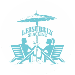
Many well-known brands already apply seasonal color thinking, even if subtly. Let’s take travel companies, for example, often warm up their visuals in the summer, using coral and turquoise tones to reflect leisure and adventure. See our recently finished Leisurely Slacking logo above. A very summery feeling logo and part of the leisure logo design portfolio. Beverage brands embrace citrus yellows and fresh greens to signal refreshment. Beauty brands lean into fruit-inspired shades to evoke luxury and playfulness.
What these examples share is an understanding that seasonal branding is emotional branding. It connects with people’s moods, rhythms, and expectations at a time when they’re already primed to engage.
Your logo, as the centerpiece of your brand, is a powerful place to begin that connection.
A Final Word on Color and Connection
Lastly, color in a logo is more than just an image—it’s communication. And in the heat of summer, when emotions run high and attention spans are short, your choice of palette can make all the difference.
Above all, this season, consumers are drawn to brands that feel vibrant, human, and joyful. People want to feel something when they see your logo—whether it’s excitement, relaxation, inspiration, or delight. They’re looking for brands that understand the moment and reflect their mood. More than ever, they value authenticity, clarity, and confidence. When your logo color taps into the emotional current of the season, it doesn’t just look good. It’s very well in keeping of 2025 summer color trends.
So whether you’re building a new brand or refreshing an existing one, ask yourself: What do I want people to feel when they see my logo this summer?
Once you answer that, the colors will follow.
Ready to Refresh Your Logo for Summer?
At The Logo Company, we believe that color isn’t just part of your logo—it’s the soul of your brand story. Our experienced designers work closely with you to understand your goals, your audience, and the season ahead, delivering a logo that looks as good in July as it does year-round.
Let’s make something bold and bright.
Let’s make something that feels like summer.
📩 Contact us today to start your summer logo project.