
Elements of Great Logo Design
What are the principles elements of effective logo design?
Elements of effective logo design is a significant part of creating and marketing your brand. Most importantly, your brand communicates to your customers who you are and why you are relevant to them. At the same time, marketing is how your organization manages this communication. A logo is important to both of these concepts because firstly it acts both as a visual representation of your business’ brand identity, and secondly as a recognizable identifier for your services and/or products.
Furthermore, to have the best elements of effective logo design for your company, you will need to determine your identity and incorporate different elements into the design. Read on to learn more.
Determine Your Identity
Basically as you know, the first step then is to determine your brand identity. Ask yourself these questions:
- What industry is my business part of?
- What services/products does it offer?
- Who are my customers?
- What is my Unique Selling Point, i.e. why should a customer choose my company over another?
Once you can answer these sorts of questions you will have a greater understanding of your brand and can start thinking about how best to represent it as a logo.
Elements of a Effective Logo Design
The following elements of effective logo design can be used to make a great logo. Using all of these elements is considered best practice when it comes to logo design. If you use these, you cannot go wrong and furthermore you will end up with the best loo ever, in my opinion.
Visibility - one of the elements of effective logo design
One of the best practices for your logo is that it needs to be visible. In a crowded marketplace, it needs to make an impact and stand out from the crowd.

McDonald’s Golden Arches were initially a physical part of the restaurant design. When viewed from an angle, they looked like a stylized “M.” They were made a main part of the logo in 1962 and since then have spread across the globe to 119 countries. The bright yellow color and simple shape make this logo both striking and highly visible.
Distinctive - another one of the elements in great logo design
A good logo needs to be distinctive. If your potential customers can’t remember or describe your logo to other potential customers, then you have a problem.

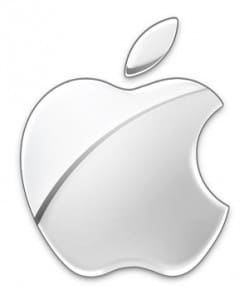
Although simple, the Apple logo is an immediately recognizable symbol of the brand. This is in stark contrast to the original Apple logo, which was highly complicated and, frankly, rather boring.
Adaptable
Your logo needs to be adaptable. Will it work as well in black and white as in color? Will it scale easily or is it so complicated that detail will be lost at small sizes?

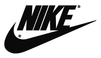
The Nike “Swoosh” was introduced in 1971 to go on its sports shoes. Since then, it has been used on hundreds of different sports products, from soccer balls to baseball caps to electronic wristbands. Whatever color it is in, and however large or small it is reproduced, the “Swoosh” is still instantly identifiable.
Timeless
Another of elements of great logo design is to aim to make your logo timeless. Harder than it looks. It shouldn’t look out-of-date but it shouldn’t be so trendy that it will age badly.

The London Underground logo started out in 1908 as a red disc with a horizontal blue bar through the middle, with the respective station name written on it in white. In 1917, the red disc became a circle, and, other than a change in font, the logo has remained the same ever since. For a design that is nearly 100 years old, it is just as effective now as it was in the Edwardian era.
Relevant
Your logo has to be relevant. It doesn’t have to be a literal representation of your business, but it should have some relevance to your particular industry. Additionally, your logo should make it clear to potential customers why your business is relevant to them.

When Starbucks was first established in Seattle in 1971, the three founders wanted to reflect coffee’s maritime history along with Seattle’s seaport connections. The name Starbucks is taken from the seafaring adventure novel Moby Dick, while the seductive siren was chosen to represent the brand. The company is now so confident in her iconic status that the name has been dropped entirely from the logo.
Elements of great logo design - Simple
A simple logo can make a big impact. A single image can become so recognizable no matter how it is colored or sized.

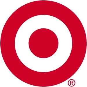
The Target logo is two simple circles, one inside of the other, with open space between them. The traditional colors of this logo are red and white, but the design is so simple and understated that we can always recognize it.
Memorable - Most important ! Make sure people remember you!
The best mark of a good logo is one that is easily remembered. When using the element of simplicity, you can create a logo design that people can always identify and remember. Get a memorable one Logo Design Order
Some of the logos mentioned above — Apple, Nike, and Target — are perfect examples of memorable logos. For each of these logos, you could just see the stand-alone image and know exactly which company is being referenced.
Unique
Your logo should be unique to your company. You wouldn’t want to use similar images or colors that another company uses. This creates brand confusion and can lead to consumers not trusting your products.
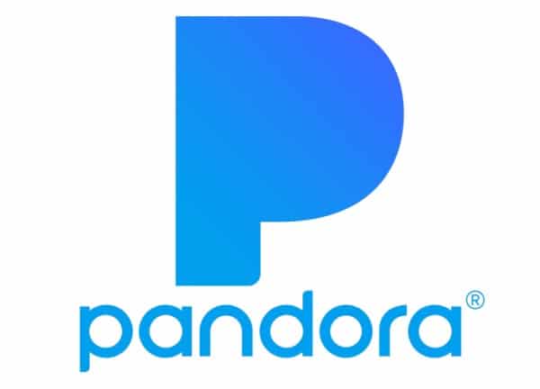
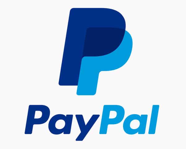
Two popular apps, Pandora and PayPal, both identify themselves with blue “P’s.” While PayPal uses two “P’s” and they are angled to the right, the blue in both logos is extremely similar. On a cellphone, it would be very easy to open one app when you meant to open the other.
Another example is Capital One and DoorDash. Both brands use a red swoop on a white background as their logo. Capital One’s swoop is more open while DoorDash’s is closer together to look like a “D,” but they are similar enough that the brands can be confused for each other. You don’t want your logo design to share too many similar components with another brand.
Elements of effective logo design = Balanced Logo
A balanced logo reads easier than an unbalanced logo. Balance in logo design doesn’t necessarily mean the logo is completely even on both sides. It means that the main elements of the logo have the same expressive power.
The Adidas logo is a good example of balanced design. The three black shapes are bold and angled in one direction while the brand name is placed in a straight line underneath the shape and has thinner lines. The logo doesn’t feel unbalanced and each part feels equally important to the overall design.

Derives Meaning From Brand
Your logo should adequately represent your brand, and you should have a strong brand identity before you start the logo design. You want your logo to be memorable, but you want your brand to be known for what you do, not just by your logo. Contact us at TLC
One Final Tip
Your logo should adequately represent your brand, and you should have a strong brand identity before you start the logo design. You want your logo to be memorable, but you want your brand to be known for what you do, not just by your logo. Take look a learn why I Love NY came to be I Love NY
Get a Logo Design Team
If you feel overwhelmed with the logo design process and want to work with a small, professional team to get the job done, The Logo Company is here for you. When you get started with our logo design process, we assign a small team of designers to work closely with you to design a great logo for your company. Contact our team to learn more.