Logo designs that cause controversy. Are they really that bad?
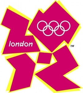
You’ve probably noticed that there has been a fair bit of controversy surrounding the rather strange Olympic Logo Designs for London 2012 logo (pictured right) since it was unveiled. Above all, the majority of comments with regards to the olympic logo have been negative. In fact, petitions were created in the hopes of revoking it. However, the very unpopular design remains and, despite its lack of popularity, was nevertheless apart of the Olympics.

How much do olympic logo designs really cost?
So over £400,000 went into creating the olympic logo design and the London 2012 brand. I think that in other words, the intention of this design was allegedly to inspire and encourage involvement and positive action. This however did not happen and instead it has mostly disgruntled and upset. In conclusion I would say that the effect has not at all been what the designers intended. Why not? In my opinion, it is because a lot of different people get involved in the creation of olympic logo designs and we know what is said about having too many cooks! Exactly. Firstly, Designers and non-designers, all want to stand out in the creation of this event so everybody starts arguing, even forgetting its for a sporting event. Secondly, its above all about the money. It pays well.
Complicated ideas give strange designs.
The brief that a nation is given to dream up such a creation is usually long and complicated. Even with vague ideas and colors. Creating a logo design is about more than simply throwing together a few images, words and lines. Colors, and the emotions they invoke, need to be thought of and the impression of the overall style must be considered.
Unfortunately, the jagged edges and bright colours of the 2012 logo do not inspire anything. In fact, it would seem it merely inspires hostility. I’m sure this was not the intent when putting the colors together. However, I do agree it does not look good.
The Paralympics Logo. Was that any better?
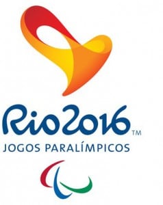
Recently the Rio 2016 Paralympics logo was unveiled. This logo was designed with similar ideas in mind to the London 2012 logo design. In other words, the ideas of inspiration, inclusion, passion, movement and transformation. However, this look was welcomed and more hostile.
The Rio Paralymic logo seems already to be more effective at achieving its intended effect than the 2012 logo. Take a look at our portfolio for sports and team logo designs. Sport Logo Design I find them so much more professional.

What do you think about the logo design below? Is this olympic logo effective? Does it embody the intended values? I think the colors are better balanced and the font used is good, however the shape of the logo design is too complex in my opinion. It should be a simple logo design, even clever logo design using negative space. Above all, it should inspire people to come and visit the paralympic games and Im m not so sure it does. Next time its Paris 2024 and I am very eager to see what kind of logo design they come up with then. Paris 2024 olympic games. After all the olympic games are made for inspire people and keep the nation healthy
Do you need a logo design that is sleek and does not use any strange color combinations? Try us at the TLC Order a Logo now

