Recent Sport Logo Design And Teams Logos
Whether you are running a gym, organizing fitness events, or looking to take your sports center off the ground, success starts with choosing the right logo. A sports logo that stands out from the background noise can help you establish your business and build an audience of loyal clients.
So, how can you be sure to choose a logo that communicates your mission, values, and unique selling points? The Logo Company can help!
Below are some examples of sport logo design we have created from scratch for our clients in the sports industry. Please remember, your logo will be completely unique to your business. These real examples are just to give you an idea of the quality you can expect. You can change to view examples from a different industry by using the drop down menu.






Logo Packages
Do You Have Any Questions?
The Reasons Why You Need a Sports Logo For Your Fitness Company
The global sports market is growing at an annual rate of over 5.2%, and it reached a whopping value of $512.14 billion in 2023. These figures make it clear that, if you are starting or growing a business in this sector, you’ve made a winning choice.
But don’t be fooled: Given the fierce competition in the industry, having a clear strategy to help your business stand out is of vital importance. Beyond creating a stunning brand and implementing powerful values, you also need to think of the impact of your unique team sports logo. A sports logo that is efficient in communicating the history and personality of your sporting organization can help you win over the loyalty of your audience and build a respected institution.
So, how do you get started? Let’s look at the characteristics of a winning team or sports logo below.
Teams & Sports Logo Design Explained
When it comes down to designing a sports logo, choosing the right tones and highlighting the name of your company is critical.
But, more importantly, a sports logo design for an athletic team or sporting event needs to symbolize more than just the colors of a team or athletic company.
For instance, the spirit and history of the game and its fans should also be taken into account when choosing sports logos. After all, what is the first thing that comes to mind when you think of your favorite football team or athletic league? That’s right, their logo! This is because a logo that truly stands out tells a lot about the history of a sporting organization – and it even has the power to create an emotional connection with the audience.
Here is a look at what you should consider when deciding how to represent a sports team. Perhaps even when dealing with an athletic equipment/apparel company, or sporting event with a logo.
Decide What Your Brand Represents to Create a Sports Logo Design
Whether you need a new branding strategy for your sports team or you are looking to rebrand your athletic organization, it is impossible to choose the right logo if you don’t know what the values and mission of your company are. After all, the goal of your logo is to communicate both what your brand does and what it stands for.
Because of this, the first step in creating sports logos is drilling down which values and characteristics you want to embody.
For example, your goal may be to make sports more accessible to all. Or, you could be leading an already strong team towards winning an international championship. Whether your values are accessibility and teamwork, or strength and endurance, your logo will speak of this ethos for you!
This is why you’ll want to carefully select fonts, images, and colors that accurately depict your team or company.
Values you need to communicate with a sport logo
So, what are the values you need to communicate? Of course, each brand is unique, but there are some universal themes when it comes to sports logos and branding.
A few of these include:
- Strength. Choose bold, powerful fonts and colors if you want to convey a sense of vitality in your design.
- Energy. Many sports logos use design elements that give a feeling of movement in order to convey energy. However, static designs can still feel like they are moving. Perhaps, think of how a sports logo design as simple as the Nike swoosh illustrates motion.
- Passion. Since most athletes are driven by a love for their sport, use color and imagery to mimic the passion behind your brand.
- Enjoyment: Some important values of any sports club should be enjoyment, accessibility, and teamwork. After all, your athletes and fans are brought together by their love for the game! Be sure to communicate these values using visual elements that suggest inclusivity and collaboration.
- Ambition: When it comes down to leading a sports team to success, being ambitious is critical. While not all sporting organizations are ambitious in the sense that they aim to win important championships, ambition is also important to become a respected company locally or internationally. Communicate this with your logo by using elements connected to success and achievement.
Pick a Type of Logo for Your Design
A well-designed logo clearly communicates the type of business it represents. This can, for instance, be done using text, images, or a combination of both.
There are three main types of sports logos you’ll be able to choose from:
- Typography-based logos focus on the name of the brand or a slogan, and use the spacing, style, and placement of letters to create a memorable design. In these types of logos, the written word will be what communicates your missions and values.
- Illustrative logos are common for sports brands and have specific imagery that directly relates to the brand. For example, the team mascot is an obvious choice for imagery. A tennis equipment manufacturer would want to include images like a racket or tennis ball. Illustrative logos leverage visual elements to communicate both the nature and the personality of a business. Think, for example, of a team’s logo for a junior league: it will need to have visual elements that clarify what sports are played, as well as details that speak of collaboration, teamwork, and fun.
- Abstract graphic logos also use images as a central theme, but the graphic elements used are more than just a representation of the equipment used in certain sports (i.e.: a baseball and bat). Instead, these logos use abstract lines and illustrations that better describe what a certain organization stands for.
The design will be displayed in a variety of sizes
Keep in mind that your sport logo design will be displayed in a variety of sizes. The design may look great when it is blown up to full size, but what does it look like when it is small? Above all, the arrangement of the text and the images when sports logos are shrunk can look completely different.
What’s more, the chances are that you’ll want to use your logo as a printable image for jerseys, as well as an icon for your social media pages and website. This just makes sense: think, for example, that over 3.25 million jerseys of the Bayern Munich football club were sold in 2021, and that the LA Lakers have more than 23 million followers on Instagram!
To have such a versatile logo, you’ll need a primary logo, a secondary logo, submarks, and brand elements that are easy to reproduce, memorable, and suitable for a wide range of media forms.
Last but not least, be sure to consider and view a variety of sizes before deciding on the perfect design.
Choose the Right Colors for your Sports Logos
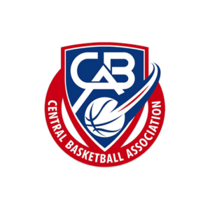
More importantly, color plays a pivotal role in design. Even if you’re designing a sports logo for a team that already has colors, understanding the psychological effects of color can help you decide which colors to feature most prominently in the design. The red and blue color combination in this Central Basketball Association is really eye-catching and makes it a memorable sports logo design.
Some of the best tones to use in your sports logo according to the principles of color design include:
- Yellow. This dynamic, energetic color is a common choice since it symbolizes confidence.
- Red. Masculinity, strength, and passion are all associated with the color red.
- Black. This color communicates excellence and control, making it a preferred color in a sports logo design.
- Blue: Blue stands for trust, authority, professionalism, and loyalty. Implementing the color blue in your brand can help you attract the best players and athletes in the area.
In a sports logo, the combination of multiple colors is much more than the sum of its parts! Combining blue and red, or black and yellow can help you truly bring to life the values and goals of your company.
When deciding on a color scheme, using a color selection program such as Color Scheme Designer, you can find the perfect selection of colors. Furthermore, a tool like this is useful whether you want an entire palette of colors or simply need the exact shade that will complement one of the main colors.
Alternatively, of course, work with the design team at The Logo Company to find a custom palette that is perfect for your unique needs.
Select Your Fonts And Typography To Get A Unique Sport Logo Design
Just like color, typography styles and choices can create different emotional responses. After all, people make subconscious assumptions about your brand based on what they see – meaning, the fonts, and the typography used. Whether you’re using a font unique to your company or you’re using one of the more common styles, keep in mind what the style says. It’s important in my opinion when creating sports logos.
Although no two logos are the same, here are some of the meanings behind the most commonly used fonts:
- Serif fonts work well for teams and companies with deep roots and a lot of history. Fonts like Times New Roman and Baskerville create a feeling of tradition and respect.
- Sans serif fonts can be perceived in two ways. Firstly, typography without the extra serif strokes appears bold and authoritative. Secondly, sans-serif with rounded edges may give a more laid-back feel. For example, Futura is a sans-serif font that is considered a strong, modern font, while Calibri is seen as clean and straightforward.
If you feel that these fonts don’t represent the personality of your brand perfectly, the team at The Logo Company can help you by creating custom lettering for your needs.
Use Icons and Symbols for Clarity
The icons or symbols you use in your logo design can make or break your level of popularity. Think, for example, of how easy it is to recognize the logo of famous brands like Nike or FC Barcelona – that level of memorability is certainly by design!
If you don’t already have a lot of brand recognition, but you are looking to grow your company, choosing to use imagery is one of the best ways to communicate what your company does.
Here are some key tips that can help you choose the best visual elements for your brand:
- Mascots: Brands that already have symbols associated with them, such as mascots, should use these. Therefore, this makes the sports logo design more recognizable. Perhaps the mascots are already tied to the brand.
- Images relating to the sport: You can also include an easily recognizable icon from a sport related to your brand. For example, a baseball equipment manufacturer may choose to use a baseball, bat, or home base in its sport logo design.
- Images associated with the name of your team: Consider choosing a visual element that allows the viewer to make a connection with your brand name. A winning example? The logo of Arsenal F.C.!
- Abstract images: Ex-novo icons and images can certainly help your logo stand out. But you need to make sure that you do not go too far with using abstract images: It may be difficult for people to realize your sports logo design is for a team if you choose to stay away from anything sports-related in the design.
While widely-used icons can sometimes help, watch out for using cliché symbols and images – this choice can cause your brand logo to fall back into the background noise and lose recognizability.
Create a Sport Logo Design with The Logo Company
As you can see, putting together a sport logo requires a thorough understanding of design concepts and best practices. The Logo Company’s team of experienced designers can help you create the perfect logo for your team to represent your brand. Furthermore, when you work with us, you’ll be given a choice of five designs from five different designers. Of course, you can then make as many changes as you want until we’ve achieved your vision.
A last few words: we will ensure every aspect of your design comes together to create a cohesive whole. With our help, your sports logo design can become a powerful way to attract people to your brand for years to come. Ready to get started? Get in touch with us or select the best plan for your needs.
