Sports are a big deal in America. Whether it’s baseball, football or basketball, the fascination for these big sporting events and their teams among their followers is undiminished. In the meantime, the athlete teams have developed into brands of their own and are characterized by their unique logos with high recognition value. Such designs can give a voice to local traditions and team history, which makes them not only to designs of the sports team, but also represent their supporters.
Many of these sports logos have their origins in college sports and some were designed by graphic designers or by ambitious amateurs. But what makes their sports logos so special and which are the most popular ones in America ? In this short blogpost we present the top 10 best American sports logos.
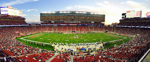
Top 10 of the Best Sports Logos
10. Boston Celtics' sports logo
Boston Celtics are an American professional basketball team that is based in Boston, Massachusetts. Since the 1960s their sports logo has featured a leprechaun spinning a basketball, named Lucky. For a long time, the logo’s only colors were black, white and green. Then for the club’s 50th anniversary, the logo got a full-color treatment. Because of the playful presentation of
Lucky and the basketball, you immediately know that this is a basketball team. With the incorporation of typical Irish symbols, the Boston Celtics differentiate themselves from other sports teams that often rely on elements of American history.
Connecting their logo to their Celtic-Irish origin reflects the commitment to their brand heritage. This connection to its origins makes the logo particularly authentic and testifies to its consistency. Through which the team has generated a high recognition value over the years.
9. Texas Longhorns sports logo
The logo of the Texas Longhorns, on the other hand, relies entirely on the symbolism of their origin state Texas. This sports team was established in 1893 at the University of Texas. Initially it was the name of a sports program to create a football club, which would compete in the NCAA. By today the team has grown into one of the league’s leaders, with numerous awards and titles throughout its history.
However, it took until 1961 until the Longhorn we now know today appeared. It boasts an orange silhouette of a Bull’s head with its horns elongated to the sides. This color choice did not just happen randomly, but was consciously selected since the brand color of the University of Texas is orange. Despite the fact that the team is now one of the most successful in America, it remains true to its brand personality and shows a connection with its origin by staying true to their color choice.

8. Seattle Seahawks
The Seattle Seahawks football team, on the other hand, chose a completely different way to create their sports logo. The name was selected by the team from a list of over 20,000 entries and 1,700 different names. The team picked the “Seahawks” in June 1975. This cooperation resembles a great sports marketing action, which has further increased the reach of this team. As we know, a sports team lives from the support of the public.
With this collaboration, a close connection between otherwise aloof athletes could be created. The Seattle Seahawks brand stands not only for the members of the sports team but for the result of the surrounding loyal community. The logo has always incorporated a right-facing Seahawk and has only been altered twice. Originally the logo has been derived from a picture of a transformation mask of the Kwakwaka’wakw tribe found in an art book called “Art of the Northwest Coast Indians.”
After the Seahawks create their rendition of the mask, a local artist named Marvin Oliver sends the Seahawks his version of the logo. Which he thinks better adheres to Northwest Coast design principles.
7. San Jose Sharks
The ice hockey team San Jose Sharks was designed by Terry Smith, a professional graphic designer. One interpretation of the triangle behind the share is meant to denote the Red Triangle. More know as a triangular area in the Bay Area, where many sharks are found. Yet, another one is to denote the three major cities of the Bay Area, San Francisco, Oakland and San Jose.
With the inclusion of these important nodes for the state of California, the deep roots of this sport team become obvious. With the incorporation of the field hockey stick, the connection to your sport is also evident. The combination of these elements makes this logo so special and creates a unique and memorable brand personality.
6. Boston Red Socks - best sports logo socks
Another example, the iconic Boston Red Socks sports logo has changed several times throughout the years. The baseball team logo as we know it today has actually only been around since 2009. Before that, a baseball was once included in the logo or a large red stocking with the word “BOSTON” in white letters was used.
Regardless of the multiple changes in their logo, the fascination with the team and their creativity around a design of a simple pair of red socks is undeniable. This is what makes this sports logo so special, as it is not obvious at first glance that this is a logo of a baseball team. Thus, it makes the Red Socks stand out from the crowd and creates a unique sports brand.
5. Golden State Warriors
Not only the logo of the Golden State Warriors has changed since its foundation in 1946, but also the name. First from Philadelphia and then to San Francisco Warriors until the popular basketball team finally came to the name Golden State Warriors.
The team has consistently used California Golden yellow and Warriors Royal Blue in their logos. In 2010, the sports team unveiled a new logo which they have been using until today. With the incorporation of the golden gate bridge in San Francisco, the symbol of the golden state of California, the basketball team shows their connection to their origin.
4. Los Angeles Lakers
When looking at the logo of the Los Angeles Lakers, it immediately becomes obvious that this sports logo must be related to basketball. The focus of this sport logo is on basketball. Furthermoe it is adorned with a purple lettering with the team name. Since the early 2000s the colors of Lakers have been in an orange/yellow shade and dark purple. The “speed lines” in the lettering helps to create the sense of speed. Associated with the Lakers and gives the design a good dynamic.
Some people even believe that these lines between the letters in the logo represent one of the most meaningful visual assets of the current brand. Despite the fact that this logo is kept rather plain, it captivates with this simplicity and remains so easily in the people’s mind.
3. Detroit Red Wings - third palce on best sports logos
One of the oldest unchanged American sports logos is the iconic design of the Detroit Red Wings. In 1932, the millionaire James Norris decided to change the entire brand identity of the club and first introduced the winged wheel emblem in red, and a new name.
What is interesting is that the team’s fortunes took a turn for the better with the introduction of the brand identity.
The Red Wings went on to win their first Stanley Cup in 1936 after adopting this logo. The ice hockey club has made no changes to its logo since 1948 and has remained consistent with a red and white wheel with two wings to its right. Choosing the color red, represents the hockey club as a determined and confident one.
The logo relies solely on its symbolism and does not include any lettering, yet it still manages to make an impact. The consistency of their logo design over the past decades has allowed the sports team to grow into an influential brand.
2. Chicago Bulls
There are only a few sports teams which could boast such popularity such as the Chicago Bulls. In 1996, the logo of the team distinguished by the basketball player Michal Jordan was created by a professional designer. With a head of an angry bull certainly attention is captured, especially with the team’s name displayed between its horns.
When it comes to strength, power, and force, few creatures can surpass the bull – particularly if it hails from Chicago. The branding of the basketball team emphasizes this message to the fullest, with strong colors of black and red.
As a matter of fact, the meaning behind the name “Chicago Bulls” is crystal clear: the team will overpower anyone who dares to challenge them. Thus, this branding is a perfect reflection of the sports team’s numerous accomplishments and makes this logo so special.
1. New York Yankees - famous sports logo design
It comes as no surprise that the iconic sports logo of the New York Yankees is on the first place of our Top 10 ranking of the best sports logos in America. Not only does the team impress with its sporting performance in the MLB, but also with its unique design. What makes this team even more special is that they don’t just have one strong sports logo, they have two. On the one hand the famous combination of the letters NY on the navy blue and white caps that have gone beyond just baseball and have become a global cultural icon. And on the other hand a modern version that was approved in 1968.
This displays a white baseball with red seams and stitches, accompanied by a red-scripted “Yankees” wordmark. Next to that, the logo includes the iconic top hat of Uncle Sam, a widely recognized national symbol of the USA. Having two strong sports logos at the same time is once again a testament to the changeability, strength and influence of this baseball team and the brand that has evolved around. Check out best and worse logos
Wrapping it up for best sports logos in America:
As we can see, the logo of a sports team has become more than just an emblem of the team’s identity. In fact, it has evolved into a symbol of a larger phenomenon. Representing the values and aspirations of the team and its followers.
Thus, logos for sports can serve as a visual representation of the team’s history, its players. The city or region it stands for. It’s not only the performance of each team that makes them so iconic. Furthermore, it has turned out that the merchandise of the teams has become a fashion statement. For instance, fans wearing jerseys, caps, and other accessories as a way to show support for their favorite teams.
Sports teams have come to realize the importance of their logos as a marketing tool. Like a mean to build brand recognition. If you are now thinking about designing your own sports logo, keep in mind that it should reflect your team’s values and aspirations. As well as the region or city it represents. It should be something that your supporters can take pride in and identify with.
A well-designed logo will not only help you create brand recognition, but it can also increase fan loyalty, leading to more significant profits for your team. At The Logo Company we have a vast portfolio of sports logos. Perhps they can inspire you in designing a logo that is perfect for your sports team!
