Designing for emotion: How an edgy logo can connect with your audience
“Edgy” logo designs are all the rage right now, and for good reason. These unique and cool logos not only make us and our brand feel good, but they also help us stand out in a sea of generic and cookie-cutter designs. But what exactly makes a logo “edgy”?
In this article, we’ll be looking at some edgy logo designs from different brands across various industries. Furthermore, we’ll explore the different elements that make these logos so cool and unique, as well as how they can help make your brand stand out.
What truly makes a logo design “cool” or “unique”?
First, let’s define what we mean by “edgy” logos. These designs often feature bold and unusual typography, unexpected color palettes, and unexpected imagery. For instance, they may also play with negative space or abstract shapes to create a sense of intrigue.
Color can give your logo and edgy personality
Colors evoke strong emotional responses in viewers, influencing their perception of a brand or product.
When it comes to creating a logo, the color palette you choose is just as important as the design itself. Furthermore, the colors you select will evoke specific emotions, reactions, and associations in your audience, and it’s no secret that edgy logos always have a great choice of color. Before settling on a color scheme, it’s crucial to research color psychology and trends . Especially when selecting hues that will inspire the desired response from your target audience.

For example, if you want to convey a sense of modern sophistication and glamor, black is an excellent option. Green, on the other hand, is associated with nature and can give off a more laid-back vibe. Likewise, if you’re targeting children. Bright colors like yellow and orange can be a great choice as they are associated with cheerfulness, friendliness, and energy.
Furthermore, keeping in mind that the colors you choose for your logo design will communicate a lot about your brand identity. For instance, making sure the message is aligned with your brand values. Just like the Harley Davidson’s color palette which remains unchanged since 1980. More importantly, they stand for confidence, power and simplicity. Mostly conveyed through their branding and its experience which is a key component of what makes them so attractive.
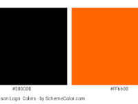
All in all, choosing the right color palette for your logo is not just about picking colors that you like, it’s about understanding the psychology of color and selecting hues that will evoke the desired emotions, reactions, and associations in your target audience.
Play with fonts and typography
From elegant, sophisticated and traditional to modern, minimal and progressive. Do you recall the transformation of the classic British fashion house Burberry?
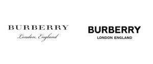
The reincarnation of Burberry might just look like a change of font on the surface, but it meant much more to its customers. The rebrand was part of the efforts to compete with high-fashion brands trying to appeal to younger consumers by giving it a more modern makeover. Find out more about how the 167 year old fashion house transformed into all caps in sans serif.
The choice of font and typography in logo design is just as crucial as the color palette. Unless you’re going for a pictorial mark logo, your design will include letters or words, and the font you select will communicate a lot about your brand personality.

Cool and simple logos are memorable just because
One great example for “cool simple logos” is the iconic service Spotify. The green and black color scheme, along with the uniquely simple sans serif typeface, creates a sense of energy and coolness that perfectly represents the brand’s mission to bring music to the masses.
If you’re aiming for a traditional feel, a serif font can be a great option. For a more modern, sleek look, a sans-serif font can be a good choice. And if you want to convey a more avant-garde or unique brand personality, a custom graphic font might be the way to go. Check out the cool text logo of the now defunct Spike TV with a clear nod to its meaning ‘Spike’. There’s no denying that its unique and striking appearance can arrest your attention.

The importance of font for a cool logo effect
It’s important to remember that the font you choose for your design will not only be used to display letters or words, but it will also be a key element in your brand’s visual identity. Type based logos which appear as too simple but striking on the surface are achieved through unique techniques. Checkout our blog on typography practices and basics to know more. Therefore, it’s essential to select a font that aligns with your brand’s values and personality.
Therefore, choosing the right font and typography for your logo design is crucial as it communicates your brand personality and will be an integral part of your brand identity and a key factor that makes them attractive.
Experiment with negative space
Have you ever looked at a brand logo and been truly surprised? Clever use of negative space will allow a logo to strike a mystery pure genius! Checkout The Guild of Food Writers Logo!
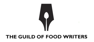
Negative space, also known as white space, is an important element in design. It can be used to create a visually appealing and edgy logo that stands out from the crowd.
Negative space can be used to create contrast between elements in a logo, making them more visible and easier to read. Using it to create balance and harmony in a design, helping to draw attention to certain elements while allowing other elements to recede into the background. Additionally, white space can help creating a sense of depth and movement in a logo design.

The use of negative space in logo design can be used in different styles within the design space (like these negative space graphics). It is most commonly used within a symbol, letterform or wordmark to create a whole new image. Here are 51 examples of clever logo design playing on negative space.
Shapes which embody a brand’s ethos
Research shows that shapes in branding can have a profound influence in conveying a message to an audience.
Shapes can be used to create an emotional and psychological connection between a brand and its consumers. Different shapes can evoke different feelings, so it is important to choose the right shape for your logo design.
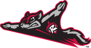
A great example are the logos of sports teams. They benefit from stylising the different shapes and forms of often animals or figures that resemble the values of the sports team. Let’s take a look at the cool animal logo for the minor league baseball team, the Richmond Flying Squirrels. The fierce and unexpected imagery of the squirrel perfectly represents the team’s tenacity and spirit.
Abstract shapes for cool an edgy logos
For cool and edgy logo designs, abstract shapes are often used. Abstract shapes can be used to create logos that are modern, unique, and eye-catching. Vintage inspired shapes can also be used to create logos with a classic look and minimalist shapes are also popular for edgy designs as they emphasize simplicity and boldness.
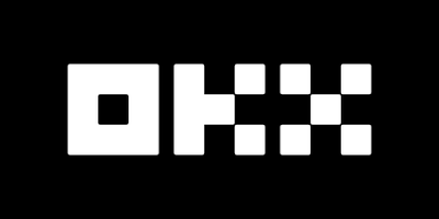
Looking at the innovative Crypto Exchange brand OKX’s logo designed with basic shapes to form the companies’ initials. The edgy use of squares creates techy (pixels, bytes and bits kind of style) look and feel making it simple and memorable.
Different schools of design also influence logo shape choices. For example, geometric shapes are often used in modernist designs while organic shapes are more common in postmodern designs. Additionally, retro-inspired logos often feature curved lines and bright colors.
It is important to consider the psychology of each shape when designing a logo. Each shape has its own meaning and connotations which should be taken into account when creating a logo. By understanding the psychology of shapes, you can ensure that your logo conveys the right message about your brand.
So why should you consider an edgy logo design for your brand?
For one, it helps you stand out in a crowded market. But more importantly, it can also help define and communicate your brand’s personality and values in a way that traditional, more conservative logo designs simply can’t.
Creating an effective logo requires careful consideration of all aspects of design, including color palette, font and typography, shapes, and white space. Professional logo designers like THE LOGO COMPANY typically follow a 4 step approach when creating a logo: Brainstorm (research & discovery); Sketch (Concept development and ideation); Create (Use different techniques to craft concept); Refine (refinement & iteration); before feedback and delivery. By following these steps carefully and ticking all the boxes above, a great edgy logo can be crafted and that’s what makes it truly cool or unique.
In conclusion, YOU get to define what’s cool!
Edgy logos are the new trend in the market. They are unique, bold and make the brand stand out. Brands across various industries are adapting this trend and it’s working wonders for them. If you’re looking for your own edgy logo design, be sure to get in touch with our professional logo designers who help you define what’s ‘cool’ for your brand. With unlimited redraws and revisions, you can make sure you have the perfect outcome, everytime!
