Professional logo design 101, Why design goes beyond just a ‘good look’.
While looking aesthetically pleasing is certainly a measure of an incredible logo, founders and business owners will need to be mindful about a few things before giving the seal of approval for their brand logo. Developing a brand identity should be as important as product design, finding your suppliers, setting up your SOPs, and driving sales. Your graphic embodies the core values of your business and what it represents. It is also the primary hook that grabs customer mind-share (the space in which your brand occupies in your customers’ mind). This can only be done by employing the right principles and techniques which is why most agencies could charge thousands if not hundreds of thousands of dollars. A well-designed image can help a brand stand out in the crowded marketplace and make a lasting impression on your customers.
Rule 1: Simplicity.
Strip away the artistic fuzz and keep it stupid simple. Take a minute to think about the most memorable brand logos and what you remember may surprise you.
We all know what Da Vinci said about this one. Simplicity is the ultimate sophistication and it’s certainly true in most cases of professional logo design. Many agencies spend hours designing drafts with contemporary and classical design techniques. Typography based or pictorial logos and even custom wordmark logos. Some may even meddle with the visual double-entendre to come out with the best design which achieves simple sophistication.
Simplicity also captures memorability and timelessness.
The essence of this exercise is to say more with less. However, there’s more to simplicity than just simple and clever logo design with a dash of intelligence. Simplicity in essence should also capture the following.
- Memorability – simplicity has its perks over aesthetically sophisticated good logo design. The use of simple combinations of color, symbols or letterform design is enough to visually arrest your audience before they even see your product.
These two examples don’t need much explanation for their iconic status. However, they are very different in style and design tehcnique. The Coca Cola logo is possibly the most memorable wordmark logo ever. Its bright red and white colourway is unmistakable no matter where ever in the world you are.
The Nike Swoosh represents the checkmark which signifies getting things done or as the brands’ tag line says, ‘just do it’. The logo certainly checks the box for its memorability and iconic status from the late 20th century to present day.
- Timelessness – this may be a point to pour some thought into. There are only a handful if not even fever brand logo designs which have managed to have remained timeless from its first draft. Take a look at the famous Swiss watchmaker ‘Longines’ whose logo is 133 years old and remains unchanged. The winged hourglass combination mark logo design is certainly timeless and will continue to remain that way.


However, creating a timeless brand design is a process and it can and should evolve as the business grows, but it’s very important to get it right at the initial stages of a business. Just look at how the Iconic Coca Cola logo has evolved through the ages and remains ingrained in the minds of billions of consumers.


Rule 2: Distinctiveness.
Perhaps the most challenging feature in logo design. The age old battle relevance and distinctiveness continues.
This one takes a lot of trial and error and many designs are exhausted in the process. Think about it. There are thousands of companies registered in a single day, and all of them are trying to establish their own, unique brand identity with distinctive business logo design.
Therefore, it’s not easy to be distinctive or atleast the best of the rest anymore. This is why most design services employ designers of many different skill sets from typography design to illustration to create unique and distinguishable designs for their clients. It’s especially important to consider the following to achieve distinctiveness in your logo design.
- Relevance. Distinctiveness does not appear out of thin air or sophisticated design. Think about the values of your business, and what you intend for your customer to remember you for. Relevance spurs from what you envision the company to be from what it does. It also needs to be relatable and resonate with what your business stands for. The renowned architect and designer Louis Sullivan’s famous axiom “form follows function” has been the bedrock of great design for many architects and designers alike.
Take a look at the iconic Chanel logo which has evolved over its lifetime. It’s a perfect representation of its Parisian origins and sophistication and the owner Coco Chanel’s identity with the two C’s interlocking to form a perfectly symmetrical monogram. The design speaks of the fashion icon’s individuality and to the design sense of its upscale consumers.
Iconic Brand Logos Distinctiveness.
While on the other hand, Barbie’s cursive wordmark design is as iconic as the latter. Its unique sans serif typeface appears in a fun and playfully bright pink and white colourway meant to appeal to little children. It’s safe to say that Barbie’s products have been as dynamic as its brand which was first introduced in 1959. Its newest iteration is very close to its original retro typeface design.
- Think outside the box. Don’t just blindly follow trends. Jump back to our first point, timelessness is not an outcome of trends that come and go. Consider different visual design techniques like utilizing negative space. Use white space to incorporate hidden elements which allows your customers to think and not glance over. The idea isn’t to be cryptic but be unique, witty and creative.
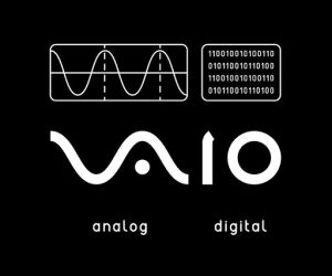
Sony’s VAIO is a great example of clever out of the box brand logo design. What was initially an acronym for “video audio integrated operation” inspired designers to put together the analog waveform and binary digitals of 1 and 0 in perfect harmony to represent the acronym.

Rule 2: Versatility
The challenge in making sure your brand stands out wherever and whenever without falling flat.
You may be targeting a specific niche or an incredibly broad audience which is why your business logo design needs to be versatile and adaptable. In business, you never seem to know which opportunity is around the corner. Certain decisions you take whether it is to diversify or expand into multiple categories will require a versatile brand identity. Professional graphic is carried out by designers who understand techniques which allow your logo to be the following.
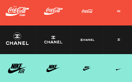
- Scalable – a logo design must be scalable. This means that it needs to look good in different sizes, mediums and materials. The logo must be reversible and adaptable to be incorporated well into product packaging or your website. It should inspire future design concepts relevant to your brands campaigns and promotions.
Responsive logo design – The digital age has called for logos and brand design elements to be adaptive to different mediums based on the complexity of the medium. Here’s a great example and interactive experiment on responsive logo design. The exercise requires choosing responsive fonts, creating stackable versions of the brand, removing details and merging certain parts of the image together in principle which however can change in many different creative ways. Responsive logo is an extension of scalable logo employed by design agencies all over the world.
In Short, the three key rules for logo design are simplicity, distinctiveness and versatility. Simplicity makes it easily recognizable and memorable, while distinctiveness ensures that the logo stands out from competitors. Versatility allows the graphic to be used in different contexts and mediums. Designing a logo requires careful consideration of these principles, as well as an understanding of the target audience and what the brand stands for.
Professional logo design can take you a long way.

(Credits: marketingmag.com.au)
Your logo will represent your brand for a long time. You may already have ideas of what your branding should look like and other visual design elements associated with your brand identity. However, if you’re not certain about the details, we are here to help. At the logo company, our designers are specialists in business logo design. Let us create your brand’s next logo. Simply click to order and select your custom logo design package to explore our complete branding solutions. With unlimited redraws and revisions, you can make sure you have the perfect outcome, everytime!
