Content marketing is a very big subject however, according to the latest research, people spend almost one-third of their lives online. It’s easier than ever for brands to reach their target audiences via well-produced content.
However, consumers have so many choices regarding what to read/watch/listen to. This means that businesses must do their best to create high-quality, engaging content that ranks high on SERPs.
But how do you ensure your content marketing efforts yield results in 2023 and beyond?
Well, one way to do it is to apply the principles of good web design to your company blog. Here’s how to combine visuals, copywriting, and practical layout to engage visitors.
Use Imagery in a Meaningful Way When Creating Content For Marketing
One of the easiest ways to improve reader engagement on your website is to enrich your written content with imagery.
Images and various formats of data visualization can be powerful tools for communicating complex concepts. They allow you to limit the number of words your prospects have to read and the time they have to dedicate to consuming your content.
For instance, a quick look at McKinsey’s The State of Organizations 2023 Report shows how the brand utilizes data visualization. Mostly to make its long-form content more attractive, approachable, and easier to consume (and remember).
One more thing to keep in mind when designing for reader engagement is that you should always choose relevant, impactful header images.
Ideally, you should stay away from stock photos. They harm engagement and prevent your readers from perceiving your brand as authentic. Often also lacking emotional impact, which is a powerful trigger that motivates your readers to engage with your content.
Instead, see if you can design header images from scratch. As you create them, pay attention to the following:
- your brand’s visual identity
- the topic you’re trying to cover
- the emotional cues that could grab your readers’ attention and inspire them to read
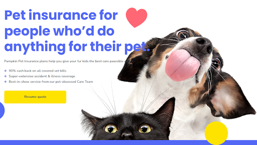
For or instance, Pet insurance company Pumpkin is a terrific example of header imagery that ticks all of these boxes. Above all, the quirky visuals align perfectly with the company’s slightly disruptive, off-kilter tone and do an excellent job of tugging at the heart string of their target audience.

Design Interactive Elements
Well, one engagement-boosting tactic you can use to inform your web design and content marketing decisions is to explore ways to enrich traditional content with interactive elements.
After all, research discovered that adding interactive elements to traditional content boosts views by 28% and user engagement by 52.6%. So, if you want to maximize reader attention, consider experimenting with formats that are a bit more dynamic than plain text or imagery.
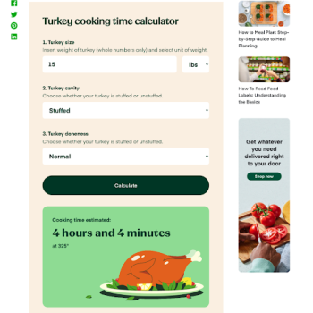
For instance, take a look at Instacart’s Turkey Cooking Time Calculator. It is an exceptional example of transforming a traditional, word-dense blog post into a super-helpful and easy-to-use resource with an interactive feature.

Make It Super Easy to Skim Written Content
Research from the NN Group shows that people don’t read online content word-for-word like they do with books. Instead, they skim online resources, aiming to find relevant information as quickly as possible.
With this in mind, one of the best strategies for improving reader engagement through web design is to create content in a way that’s skim-friendly. There are several design tactics that can help you do this:
1. Optimize the layout of each content page to allow readers to skim or scan.
The easiest way to achieve this effect is to organize text-heavy content pages according to people’s preferred reading patterns — the F-pattern or the lawnmower pattern.
For instance, if you look at Evernote’s guide on How to Keep Track of Expenses, you’ll see that the resource follows the F-pattern, placing important information at the start of each sentence.
2. Use features that give readers control over the content.
Jump links and content tables, like the one used in Going’s How to Use Google Flights to Find Cheap Flights article, are an easy-to-implement choice. Yet, they’re exceptional at maximizing page engagement. However, these elements allow readers in all stages of the buyer’s journey to quickly find the location of the info relevant to their pain points. Furthermore, this minimizes bounces and improves the chances of every site visit leading to a conversion.
3. Create logical subheadings for content marketing purposes
Finally, combine the powers of copywriting and design to create logical subheadings that attract user attention. Just to better guide prospects through the mini-journey that is your online article.
For instance, the How Social Media Can Supercharge Your SEO article on MOZ uses headings to guide readers through the process of learning the basics of social media marketing for SEO. This allows prospects to scan the resource for a quick way to find out what they’ll learn by reading it and a way to skip sections that might be irrelevant to them at the moment of reading.
Embrace Negative Space For Better Content Marketing
Definitely, visuals or attention-grabbing CTAs play a big part in getting people to interact with the content. But remember that negative space also has a role in maximizing reader engagement.
From a content marketing point of view, negative space frees up room for a big impact. A simple, decluttered page is not only aesthetically pleasing but also contributes to a more streamlined user experience.
Here are some ways to use negative space for maximum results:
1. Break up the text into many short paragraphs.
A great example here is Readable’s blog post about font readability.
This brand is all about helping its customers write accessible text. Which is why it implements the principle of negative space into its formatting strategies. Note how the sentences and paragraphs are kept short.
2. Use bullet lists.
Bullet lists, like the ones used by UnscrambleX on its Anagram Solver page, are another excellent way to utilize negative space while adhering to the F-shape reading pattern.
3. Increase margin sizes.
According to research from the Baymard Institute, the ideal line length for readability and engagement is between 50 and 75 characters. After reading that many characters, most people become fatigued and lose track of where the line starts and ends.
So, by keeping content within the prescribed character numbers, you can make it far easier for your audience to get value from your posts. Without having to focus too hard.
Highlight Credibility Signals
Naturally, people don’t want to read spam content. And they often find it difficult to trust organizations — especially those operating in low-trust industries like health and finance.
So, to keep readers on the page and get them to engage with your articles, explore ways to communicate your authority via visual signals.
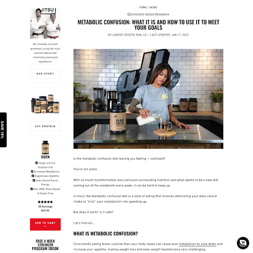
For instance, if you check out the article about Metabolic Confusion on the ATH Sport website, you’ll notice that the design incorporates several elements to support the brand’s expertise:
- the “evidence-based research” element above the headline
- the (clickable) writer’s qualifications below the headline
- Each claim in the text of the article includes a link to a relevant scientific study and clearly shows it.

Make It Easy to Find Relevant Blog Content
Collection pages, where web visitors can see everything you’ve posted, play just as crucial a role in grabbing people’s attention as the posts themselves.
So, do your best to optimize your content collections for a great user experience. Make sure that all the valuable info is clearly visible and presented attractively.
Let’s look at the web design tactics that will help you accomplish the desired result:
- Always display the full post title and present readers with a meaningful excerpt from the article.
- If your website design doesn’t allow for a long excerpt, write compelling meta descriptions. They’ll give your prospects a reason to click on a blog post instead of perceiving it as just another example of fluff content on a company blog.
- Use preview images that are visually attractive, relevant to the article, and communicative of the value it offers.
- Design and employ UX elements, like filters and search bars, to make it super-easy for your audience to find and identify relevant content.
Final Thoughts About Content Marketing
Maximizing reader engagement through web design is entirely possible — especially when you combine copywriting best practices with creative strategy.
You’ll find that most of the tactics we’ve discussed here require very little work. Yet, when done right, they can deliver impressive ROI. That’s why they’re the perfect choices to help you get more out of content marketing.
