When considering creating a podcast logo, it’s important to think about the various elements that will make you stand out from the rest. One of the key elements is your logo. In the following blog post we will show you 10 reasons why your listeners need to see your podcast logo even if it’s your voice that you are selling.

Benefits Of Having A Podcast Logo
1. Brand recognition:
A podcast logo helps establish a recognizable brand and helps listeners easily identify the podcast. This way, users always have a visual in front of them when they listen to your podcast or search for it.
2. Professionalism:
A podcast logo also adds a level of professionalism to the podcast and makes it look more legitimate to potential listeners. Like you’re actually a real person. This will take your podcast from an amateur level to a more advanced one, which also exudes a certain degree of trustworthiness.
3. Marketing Your Podcast:
A catchy and visually appealing logo can help with marketing efforts and attract new listeners. If you listen to the podcast and find the message rewarding, then perhaps your best friend might like it too. Reviews and word to mouth are the best way to attract people.
4. Differentiation:
A unique logo sets the podcast apart from others in the same genre or industry. After all, you need to be you. Not an imitation. Of course you can get inspired by the competitors logos, but keep in mind how your podcast differs and incorporate that in your podcast logo design.
5. First impression:
Obviously, often the first impression a listener has before even listening to the podcast, so it’s important to make it memorable. Your voice alone might not be enough so be sure to create a memorable graphic. Here a professional graphic designer can be beneficial, to transfer the message through your logo design. We at The Logo Company have years of experience and can assist you in designing your new podcast logo! Check out our portfolio here!
6. Podcast And Social media:
Well, a logo can be used across social media platforms to promote your podcast and increase engagement. Use all the different social media channels to put your podcast out there. Watch YouTube videos to get a grasp of what you are supposed to be doing and exchange with other podcast producers how they proceed.
7. Merchandising:
Consider that, a logo for podcast purposes can be used on merchandise articles such as t-shirts or mugs to create an additional revenue stream. Advertise your podcast in your own way and stand out with it.
8. Consistency:
Using the same logo across all platforms and promotional materials helps with consistency and makes the brand more cohesive. Also keep in mind, to alway be consistent with your brand colors so that your listener will recognize you.
9. Expansion:
A logo can help when expanding the podcast into other areas, such as creating a website or YouTube channel. With having your own website you have the opportunity to become more independent from the podcast platform and really build your brand. This step is to be considered once your podcast is already well established and ready to be brought to the next level.
10. Ownership:
Last but not least, a logo provides a sense of ownership over the podcast and helps creators take pride in their work. It represents the ownership, pride, and personal connection for creators. It becomes a visual representation of their dedication and accomplishments. Ultimately, a podcast logo can reflect your commitment to your podcasting journey
Popular podcasts and their logos
Now that you know why you should have a podcast logo, let’s have a look at some of the most popular podcast logos!
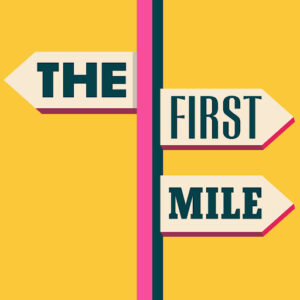
1. The First Mile

Source The First Mile
The podcast The First Mile delves into the fascinating world of travel, covering a broad range of topics including cultural tourism and ways to sustain a travel-centric livelihood. The vibrant logo, transfers a feeling of excitement and appeals to the youthful audience. With a playful directional placard holding the podcast title, the logo effectively communicates the podcast’s focus on travel, which can also be derived from its name. This serves as a great example on how to connect your podcast name with your logo design.
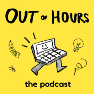
2. Out of Hours

Source Out Of Hours
For most people, their 9-to-5 job isn’t necessarily the dream they envisioned. Out of Hours aims to explore the motivations behind individuals pursuing passion projects and even transforming their side gigs into something outstanding. The producers of Out of Hours understand that extraordinary ideas require unconventional thinking, which they brilliantly incorporated into their logo design. The logo features a playful computer caricature on a backdrop of bright yellow, seemingly ready to leap off the box and chase after its big ideas. Such metaphorical designs may also be of interest for your podcast logo design.
3. Home Cooking

The initial idea of this podcast was to offer cooking ideas and keep people company during their stay-at-home orders when the pandemic occurred. The DIY, no frills logo looks like a sketch someone drew in their home. Each episode features a new recipe, and with it a new logo design. To add some extra spice, it includes some more subtle creative elements such as drawing in podcast creators Samin and Hrishi on the Morton’s salt container for example. It is a lot of work to make a new logo for every podcast, but the effect is brilliant and sets them apart from other cooking podcasts. This might be an option for you to consider as well, adapting your podcast logo depending on the content of your episode.
Podcast logos typography and colors
When designing a podcast logo, typography and color choice are important elements to consider. The typography should be easily readable and reflect the tone and genre of the podcast.
Color choice can also play a crucial role in the branding of a podcast. Bold and contrasting colors can draw attention and create a memorable impression. However, it’s important to choose colors that complement and enhance the logo rather than overpower it.
Consistency in typography and color across all branding materials, such as cover art, social media, and website, can help establish recognizability and build a loyal following.
Typical Iconography
Many podcast logos use iconography or illustrations to represent the topics or subjects covered on the show. Others may feature the host’s portrait or a stylized microphone to convey a sense of voice or personality.
Text is also a central element in podcast logos. Podcast names are often displayed in large, easily-readable font choices that are designed to stand out against audio streaming platforms. Sometimes, podcast logos include radio-inspired designs or references to sound waves and frequency.
While podcast logos can range in style, they all share a common goal: to visually communicate what the podcast is about and attract new listeners.
Wrapping Up: What to bear in mind when designing your podcast logo
Having a logo for your podcast brings numerous benefits, as you can see. It’s essential to create a design that stands out and effectively communicates your brand’s message. With the use of colors, typography, and iconography, you can visually represent your podcast. This helps ensure that you stay in the minds of your listeners not just through your voice, but also through your visual identity. Remember, a compelling appearance goes a long way in making a lasting impression!
