Which ones are the best education logo design? Well, when you think about the most recognizable brands, what comes to mind? Perhaps iconic logos like Apple or Nike. A logo is often the first thing we think of when you think of a company. Of course it’s no different in education. In fact, whether it’s a school, tutoring service, or educational app, the best education logo design plays a huge role in shaping the way people look at and connect with the institution.
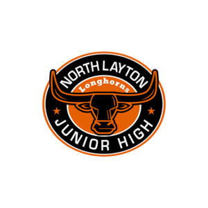
In this blog, we’ll take you through the journey of designing a top-notch education logo. Just take a look at the lovely bull in North Layton Junior High that we designed here at The Logo Company. A well balanced, easy to remember best education logo design in my eyes. We will in other terms, explore everything from the essential elements to how a logo shapes a brand’s identity in the education sector. By the end, you will hopefully have a clearer idea of what makes a logo stand out in this space.
Understanding the Importance of Logo Design in Education
At first glance, you might think the importance of logo design in education is all about creating something that looks attractive. Of course, a fantastic looking logo is certainly important. However, the real value goes much deeper. We all know that a logo is the heart of your company. More so, it tells a story and even communicates your values. It can also reflects what your educational institution stands for. When students, parents, or partners look at your education logo, it should give them an immediate sense of who you are and what you represent.
The best educational logo is more than just a symbol. You do need to understand its importance first. Above all, it’s a visual representation of trust, reliability, and a commitment to learning. Just think about how people feel when they see the logos of prestigious universities or community-driven schools. It’s not just about the design. It’s more about emotions. A strong logo builds trust, boosts confidence, and helps you look better than other schools.
Moreover, in today’s digital age, a logo needs to be pretty much everything. It must look great on a website, social media, marketing materials, and even merchandise. But above all, it must be a clear visual that shows who you are.
Creating the Best Education Logo Design: A Step-by-Step Guide
Now we have come to the fun part. The actual design. In fact, designing the best education logo begins with understanding what you are representing. It’s not about following trends or copying what others have done. More so, it’s about showing and being able to visualize the spirit of the institution in one unified design. Sound tricky, right ? It does not have to be. Here’s a breakdown of the steps involved in creating the best education logo.
Step 1: Research and Understand the Brand
Even before you even start sketching for the best education logo ideas, it’s crucial to understand the mission. What are your values, and personality. Is it a traditional university, or is it a modern, tech-driven learning platform? Does it focus on creativity, academic excellence, or community involvement? The logo needs to clearly show these main principles.
Step 2: Choose the Right Symbols and Shapes
Once you have a clear sense of the company that you would be proud of then think about symbols that could represent it. For example, books, graduation caps, and pencils are traditional symbols associated with education. However, perhaps consider more unique representations that tie into the specific ethos of the institution. For a tech-focused learning platform, you might want to use digital inspired icons, such as circuits or abstract shapes.
Step 3: Experiment with Fonts and Typography
Now we have arrived at the all important typography. This plays a huge role in how a logo communicates. The font you choose can show a sense of professionalism, fun, tradition, or modernity. Read this typography and font deconstruction. In short, play around with different styles, but keep in mind that the font should be easy to read. Too many intricate fonts can overwhelm a logo, so find a balance.
Step 4: Work with Color
Color is one of the most powerful elements in logo design. Colors evoke emotions and can influence the perception of your educational logo design. Take a look at our color emotion guide before you pick your colors. For example, blue is often associated with trust and professionalism. Of course this makes it a popular choice to create the best education logo design. Green is a color of growth and harmony. Mainly, ideal for schools focused on environmental education or wellness. It’s important to choose colors that you like of course so there are no wrongs here.
Step 5: Finalize and Test
Once you have a few education logo designs that feel right, test them. Does your logo look good on a small scale (like a social media icon) as well as large-scale formats (like posters or billboards)? Is it versatile enough to work across different platforms? It’s important to test your design in different contexts to ensure it’s effective in every scenario. Ask your friends and colleges to give you some advice. Have you forgotten somehting?
Inspirational Examples of Top Education Logo Designs
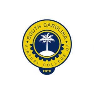
South Carolina Virtual College is one of the best education logo design that we have created in my opinion. The round logo really is effective because it goes with the colors yellow and blue. The palm tree in the middle all in white really stands out and balances the logo.
More importantly, sometimes the best way to get inspired is by looking at successful examples. Here are other logos that have done an excellent job of representing educational brands:
Harvard University: A classic probably the best education logo design. A classic example of how tradition and authority can be reflected through design. The use of a shield symbol conveys strength and history, while the bold, serif font speaks to the prestigious nature of the institution.
Duolingo: This app uses a friendly, approachable owl as its logo. This actually instantly evokes feelings of ease and fun. The bright green color also reinforces the idea of learning in a lively and fun way.
Khan Academy: Here we can see a clean typography and a simple, abstract design that hints at digital learning. More so, the modern font paired with the minimalistic shape reflects the brand’s tech-driven, online approach to education.
National Geographic: Though not strictly an education-focused company, National Geographic’s logo serves as a great example. The yellow rectangle symbolizes knowledge and exploration, fitting for an institution focused on educating the world about science, history, and nature.
Mistakes to Avoid When Designing an Education Logo
Since we have been designing logos for the past 20 years we have made a lot of mistakes for you so you don’t have to. In short, designing a logo is a delicate process, and there are a few common mistakes you’ll want to avoid to make sure that your design stands out for the right reasons. Take a look at the best and worst sports logos and you will better understand the difference.
Too Complex
Avoid overcrowding the logo with too many elements. A clean design is always more effective, especially in an education context where clarity and professionalism are important.
Using Generic Symbols
I know, it’s tempting to use typical education logo symbols like books or graduation caps. However, if everyone is using the same icon, it can be hard to differentiate your logo. Try to think outside the box and choose symbols that reflect your institution’s unique qualities.
Neglecting Scalability
To design the best education logo you need it to work across various platforms and materials. All the way from business cards to websites and banners. If the design doesn’t work in a variety of sizes or it could lose its impact. Always test the logo in different formats to ensure it’s scalable.
Inconsistent Fonts
We e did see that typography plays a major role in how your logo is looked upon. Using too many fonts or overly intricate styles can create confusion and make your logo look cluttered. Stick to one or two fonts that complement each other.
How a Good Logo Design Enhances Education Branding

Destiny University is another superb logo that we designed here at The Logo Company. The lion head inside a shield makes the image look both strong an dreamy. Blue and shades of blue and white really makes it one the best education logo designs that we have created.
First and foremost, a good logo shows your good looks into this world. You do need to make an impact if you want students and parents to pick your school.
Moreover, a logo can show your institution’s values. For example, if you’re an environmentally conscious school, a logo that incorporates green colors or nature-inspired elements will show that commitment. However, if your institution focuses on cutting edge digital learning then a more iconic minimalistic look will do better. m
Ultimately, trying to make the best education logo is a key part of building a strong brand identity and more importantly, sets you apart from other educational institutions. It’s the first thing people see, and it helps establish the foundation for all your future marketing and branding efforts.
Last Few Words
So, last few words in designing a standout education logo is that it is a rewarding challenge. From understanding the importance of the logo to using color, typography, and symbolism to communicate your values, the process is about more than just creating a nice design. It’s about reflecting the mission and ethos of your institution in a way that you and your community can be proud of.
So, take your time to understand your brand, create a design that you ultimately thinks goes with your values, and avoid common mistakes that could dilute your message. When done correctly, a strong education logo will not only give your brand a professional appearance but also improve your overall reputation and trust within the education community.