The History Of DC Comics Logo
The DC Comics logo has gone through many incarnations since the company’s inception in the late 1930s. As the company found its legs, its purpose and what it stood for it
The Simple DC Logo In The 1940s
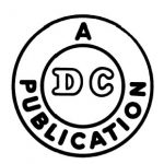
So, in 1940, DC’s first logo appeared. It was very simple and simply involved two circles and simple text. DC originally specialised in Detective Comics (hence DC).
The Superman DC Comics
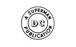
As the company DC Comics developed and the types of comics began to expand, specifically with the introduction of Superman to DC Comics, the DC comics too developed to incorporate this:
First Colors For DC Comics Logo
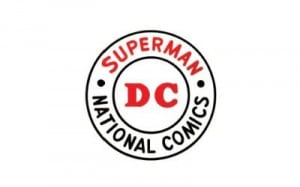
Furthermore, in 1949, the company changed its name to National Comics. The DC Comics logo was subtly adjusted to accommodate this. Colour was also added at this time.
Circle DC With Sans Serif And Bold
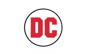
More importantly, it was in the 70s, 1972 to be exact that the recognizable bold sans serif DC letters were first introduced, still within the simple circle. Furthermore, this DC comics logo lasted from 1972-1974 before DC decided to play with it again.
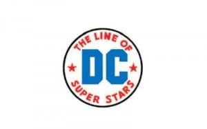
The Line Of Superstars
During 1974 the logo was again adjusted to include two starts and more text. However, this dc comics logo was a bit crowded, and akin to baseball logos of the time. Don’t you think?
Longest Running DC Comics Logo
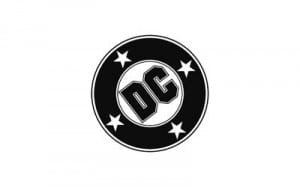
As the company gained a new publisher another new DC comics logo was designed. This one, known as the bullet was the longest running logo and one of DCs most recognizable. For me, it reminds me of an old vinyl record. Furthermore, it first appeared in 1976 and was used until 2005.
New Colour Scheme 2005-2012
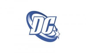
More interesting fact is that the logo that followed lasted from 2005-2012 and has been quite recognizable and liked by many. Furthermore, this one changes the colour scheme completely and the font. Mostly,it was re-designed to go along with DC’s move into the wider entertainment sectors including film.
No More Circle Shapes For DC Comics Logo
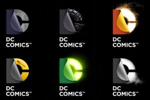
In the early 2000, DC added a new DC comics logo. They got rid off the trademark circular shape and stuck instead to the DC, pairing down the logo to its basics. During that time, the first response to the simple base for the logo was not good, however as DC revealed its many incarnations and comic specific designs for the new logo, it became clearer why they had chosen to do this.
Furthermore, this new logo also works well across different mediums, which is important in this time of cross-platform productions. In my opinion, this is quite exciting and the different designs are quite effective. I however am still partial to the black 1976 logo. One question still remains, should a logo be timeless?
What do you think?
Today, in 2023, the amount of DC characters is bless almost and ever growing.
Want to know more about the evolution of different famous logos? Take a look at Harley Davidson logos over the years. If you have a DC comics logo you’d like to suggest for our logo evolutions spotlights, pleased submit it via our Facebook page or via Twitter @thelogocompany.
