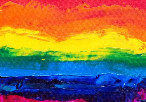
What are combination colors?

Combination colors are are created by blending two or more basic colors. Also known as secondary colors, they are the result of mixing primary colors, which are red, blue and yellow. The three primary colors can be combined to create the secondary colors of green, orange and purple. However, these secondary colors can then be further mixed to create tertiary colors such as yellow-green and red-purple.
Most of all, the use of combination colors is common in art, design and fashion. Above all, to create a wide range of color schemes and palettes. Extremely important in color theory as they can affect the mood, emotion. Even the perception of the viewer. For example, warm combination colors such as red and orange can create a feeling of excitement or energy. Bu cooler colors like blue and green can evoke feelings of calmness or serenity. Photo source Pexel
The Use Of Secondary Colors In Logo Design
Above all, secondary colors are often used in logo design to create a more visually dynamic and versatile logo. More so, these colors are created by mixing two primary colors together, such as green (a mix of yellow and blue) or orange (a mix of red and yellow). Interestingly, secondary colors tend to be more vibrant than their primary counterparts. Evoking different emotions depending on the specific shades used. For example, a green logo can represent growth and nature, while an orange logo might symbolize warmth and friendliness.
Green Logos Growing In Popularity In The USA
Green logo designs are increasingly popular in the USA and elsewhere. Reflecting a growing awareness of environmental sustainability among consumers and a desire by companies to align their brand with green values. Furthermore, these logos often feature natural imagery. Like for example, leaves or trees, and use eco-friendly colors such as green or earth tones. Sometimes incorporating symbols of renewable energy or recycling. Demonstrating the company’s commitment to reducing its carbon footprint. In addition to being visually appealing, green logos can serve as a powerful marketing tool. Helping companies to differentiate themselves from competitors and build trust and loyalty among environmentally conscious consumers. As companies strive to become more environmentally responsible, we can expect to see continued growth in the use of green logo designs across a range of industries in the years to come. See three combination colors below that we created.


Happy, Warm And Optimistic Orange Color
When it comes to the color orange, it can give off positive vibes such as enthusiasm, happiness, and creativity. Mixing orange with other colors can really make your logo pop and stand out. Furthermore, orange is a warm and friendly shade that can be perfect for industries like entertainment, food, and hospitality. By adding orange to your logo, you can give your brand a touch of creativity, energy, and warmth that can help set you apart from the competition.

Stand Out From The Competition With Combination Colors
Using combination colors in a logo can also help make it stand out from competitors who may be using more basic color schemes. When designing logos with secondary colors, it’s crucial to ensure they work well together and complement the overall design. With careful consideration, secondary colors can add interest and depth to a logo design.
Social media is a combination of vibrant, eye-catching colors that are just as diverse as the content shared on these platforms. First example, Facebook’s blue represents trust and stability. However, Instagram’s orange evokes feelings of energy and enthusiasm.
Third example, Twitter’s iconic bluebird symbolizes freedom and quick communication. Soon to be changed to an X. Let’s take, LinkedIn’s shade of blue symbolizes professionalism. Snapchat’s yellow brings a playful touch to the platform. While YouTube’s red represents excitement and creativity.
These colors not only make the interfaces visually appealing but also help to differentiate each platform from one another. Making it easier for users to identify and navigate between them. Overall, social media’s combination of colors is a strategic and intentional choice that adds to the user experience. Helping to establish each platform’s unique brand identity.
Famous Logos Created With Secondary Combination Colors
Secondary colors (combination colors) are colors that are obtained by mixing any two of the primary colors (red, blue and yellow). They are green, purple, and orange. Some popular logo designs that showcase the use of secondary colors are:
1. Amazon: The logo design of this famous e-commerce giant uses a combination of orange and black to create a recognizable brand identity.
2. Nickelodeon: The logo of this popular kids’ TV network boasts a bright orange splat over the text that is perfectly complemented by a deep green background.
3. FedEx: The iconic purple and orange logo of FedEx showcases a creative use of secondary colors. The colors perfectly complement each other and communicate the brand’s message effectively.
4. Gumtree: This classified ads website has a bold, identifiable logo that brings together green and blue colors with a recognizable, memorable tree illustration.
5. Fanta: This popular carbonated drink brand features a bright orange color in its logo design that quickly catches the attention of the target audience.
Last Few Words - Colors That Go Together
I’m here to help you out with choosing the perfect color palette for your logo. Colors have the ability to convey so much meaning and emotion, so it’s really important to choose ones that align with your brand’s values and goals. You’ll want to think about your target audience and industry as well when making these choices. Keeping things simple and cohesive is key! Don’t forget that your logo should be unique and memorable, so let your creativity and purpose guide you as you choose the perfect colors that make your brand stand out. Get excited – this is going to be great!
