What is so special about the color orange and should you use it in logo design?
Logo design in orange? I would use the color orange on my logo design, in fact I am. Look at our website and see out little the theme The Logo Company There are many reasons why we picked orange. Let me start at the beginning. Orange is the next stop on our trip through the rainbow. Furthermore it is a secondary color, made up of the primary colors red and yellow. I know the colors in logo design like orange combines the energy of red with the joyfulness of yellow.
Although considering that it’s wavelength is not as long as that of red, like red it is considered a high visibility color, hence it’s use in signage and high vis clothing. I know this has created an association with safety and with the construction and engineering industries. Furthermore, it also makes it an excellent highlight color for anything you wish to draw attention to in your orange logo design.
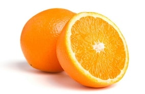
Orange associated with appetite and oxygen supply to the brain.
Did you know that the physiological responses to orange in humans include increased appetite and increased oxygen supply to the brain. More importantly, this latter reaction creates an invigorating effect and stimulates mental activity. More so this is no doubt why the color is linked with creativity and enthusiasm, and has become the color of a number of academic institutions.

(Image from Wikipedia)
Orange colors in logo design has association with fire and warmth, meanings that like red, it is a color of vibrancy and energy. I believe, somewhat more tempered than its aggressive neighbour. I understand that orange logo design, when paired with green, is considered to be a color of the tropics, hence a lot of my customers use it in tourism.

Orange logo design can be playful.
Orange logo design is a playful color and can often be seen in advertising for toys. Ever so popular color with young people, however while true orange tends provoke more of a love it or hate attitude among older individuals. The more muted shades of orange logo such as terracotta, peach and rust have a much broader appeal.
Beta Carotene like in carrots.
Thinking about plants where the orange color is produced by beta carotene. Although actually an inactive version of vitamin A. Above all, it is vitamin C that is most associated with the color due to its high content in the citrus fruit from which the color took its name. Nowadays I see that orange logo design is now a popular color for promoting food products due to this link with healthy eating.

Orange logo design also associate to food in association with autumn (fall) and harvest. This is the time when the trees turn from green to various shades of amber and orange. It is a time of change and transition, and of course, Halloween. From pumpkins to candy corn orange, paired with black, is the color of this modern version of an ancient fire festival.

Orange logo symbolizes strength and endurance
In heraldry orange is symbolic of strength and endurance. As such it has been adopted by numerous sports teams. Sports teams also wear orange logo design to support ending gun violence. USA today

The color saffron, a deep yellow-orange, comes from the stigmas of the saffron crocus. All about saffron in this interesting page Saffron orange colors This highly expensive spice, anything from US$500 to US$5,000 per pound, gave the name to the robes of Buddhist monks, although these were actually dyed with the far cheaper spice turmeric or with the wood of the jackfruit tree.
Our professionally designed orange logos
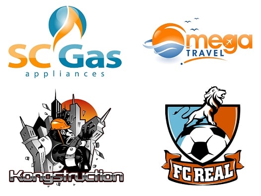
Furthermore below is a selection of some Logo Company designed logos where orange is an integral part of the design. Look at John Savill’s orange logo design that we created for him.

However, in many cases you will notice that it has been paired with its complementary color, blue. This is to contrast with the orange and blue and orange do go very well together I think. Take your business to the next level


