Exploring Creative Food Logos Ideas
So you like and need new food logos ideas? We all like food, dont we and its a pretty easy task to create a food logo that customers will see and like, right? In the bustling world of the food industry, where competition is fierce and consumers are flooded with choices, a standout logo based on some super planned food logos ideas can be the key to success. It’s well known that a good looking, suitable food logo can attracts more customers and make your business survive in this market.
In fact its all about the emotional connection that you try to establish with your food eaters. Who are they and what kind of food logo ideas will work on them? In this article we will find out more and give you examples on successful designs. From us at The Logo Company but also designs created by other famous companies.
Therefore, whether you’re launching a new restaurant, a food truck, or a packaged goods brand, your logo is often the first impression customers have of your business so do get it right the first time. Be ie inspired by some of the best food logo designs.

6 Food Logos Ideas
Below, you will find 6 different food logos ideas that I strongly recommend that you take into consideration when starting your journey towards a new logo.
1. Embrace Iconic Food Imagery
It goes without saying that you need to focus on the imagery. The visual appeal and likeableness is going to be crucial in the food industry. Therefore try to incorporate iconic food images like fruits, vegetables, utensils, or dishes that can immediately show that you sell and serve food.
For instance, a pizza shop could perhaps use a stylized slice of pizza in its logo. However, a posh bakery might create a loaf of bread or a cupcake. Above all, these elements make your logo instantly recognizable and relatable. Even more so if you design it with a creative twist, such as using abstract shapes or bold colors.
One good example of good food imagery is to visualize Applebee’s logo. Here, cleverly you see that the apple not only represents the brand name but also suggests freshness and quality.
2. Play with Typography
When it comes to font choices then you are pretty free to use what you like. It sets the tone of your brand and should be either a script font (might suggest elegance and tradition) More used for a fine dining restaurant. Secondly, it could be bold and chunky font which could imply a fun and casual eatery.
Do consider using a custom typography that mimics food textures. That is to say, a font that looks like dripping sauce or melting cheese. More importantly this can add a bit of fun, adding a unique touch.
One prime example of a playful font is the Subway logo. An incredibly bold, rounded typography with arrows on the “S” and “Y,” symbolizing freshness and “Eat Fresh” motto.
3. Use Color to Convey Flavor and Emotion
We have written a lot about psychology of color and the color emotion guide is very useful to try to figure out which colors are right for you. Did you know that colors in a food logo can trigger specific cravings or emotions.
Let’s take, red and yellow for example. These 2 colors are often used to increate your appetite. That is of course why many fast-food chains use these colors. Earthy tones like greens and browns can indicate natural, organic products. However, bright, vibrant colors suggest fun and excitement.
Choosing the right color palette is essential as you can understand. One great example is that of McDonald’s. Red and yellow to evoke excitement and hunger. Did you know that the fast food chain is not allowed in Iceland for example because it does not offer the right kind of food according to their government. Whole Foods Market uses green to emphasize natural and organic products.
4. Incorporate Cultural or Regional Elements Cultural Connection
This one is the one to focus on when making a plan for your food logos ideas. Where are you from? Normally, you are a person who is proud of your roots and would like somehow to incorporate this into your logo. So, if your food brand is rooted in a specific cuisine or region, then do incorporate cultural stuff and symbols into your logo to create a genuine feel to your new look.
For instance, this could be through traditional patterns, symbols, or even color schemes that are associated with the cuisine’s origin. Let’s look at a sushi restaurant which might use Japanese calligraphy or a stylized fish. However, a Mexican taquería could feature a sombrero or chili pepper. A very typical look for a Mexican place.
One fantastic example is of course, the Taco Bell logo. Here you see the stylized bell with a bright color scheme.
5. Simplicity for Versatility
Maybe you would like something a little simpler. A simple, clean design is often more versatile and memorable. For certain restaurants this is exactly what is needed. A simple clever logo actually makes sure that you can use it in all logo dimensions necessary.
One prime example is the Starbucks logo. In fact this one was a complicated decorative design a few years ago but it has evolved into a rather simple green food logo with a siren.
6. Experiment with Negative Space For Your Food Logo Ideas
So, you might have heard of the use of negative space and hidden meanings. In short, negative space is a clever design technique where the empty spaces within or around the logo are used to create more imagery or meaning. I believe that this approach adds depth and creativity to your logo. Adding a bit of mystery and intrigue to it. Even making people top and think about it.
For instance, a coffee shop logo could incorporate a coffee cup within the negative space of the text or surrounding elements.
The logo for The Food Network cleverly uses negative space within the circular emblem to create a plate and fork, symbolizing the brand’s focus on food.
Generative Logo Ideas for Food Businesses
A little complicated but could work. Above all, generative logo ideas for food businesses use algorithmic design to create a dynamic, and customizable logo. What do I mean by that ? Well, these logos can change colors, shapes, or patterns based on factors like seasonality, location, or menu offerings. Forever giving your brand a fresh and relevant look regardless of if its X-mas or Easter.
For example, a restaurant could have a logo that subtly changes its background or even the elements depending on the time of day or type of cuisine being featured. Its actually not that complicated but does require some planning. An innovative approach that offers memorable experiences for customers.
Discovering the Best Food Logo Designs
A great food logo is more than just a visual symbol. In fact it is a big part of the whole experience when it comes to your company’s brand story. In the competitive world of food and drink, the best logos ideas are those that not only catch the eye but also almost taste good. Whether you’re a new food business owner or looking to rebrand an existing restaurant, discovering what makes food and drink logos stand out can provide valuable insights and inspiration.
The In-N-Out Burger logo
The first example is the In-N-Out Burger logo, with its simple arrow and text. You can tell that the company really goes for the brand’s reputation for quality and consistency. Opened in 1948 by Harry and Esther Snyder, California. Did you know that they created the first the first drive-thru window?
To have an appetizing imagery is important and can make all the difference.
The Dunkin’ logo
My second super example is The Dunkin’ logo. A famous coffee cup that immediately signals what the brand offers and appeals to coffee lovers. Read all about their SMS success story
Flowing Script of the Coca-Cola logo
Of course one example not to be missed is, the Coca-Cola and its distinctive typography
Why It Works? Well, custom typography or carefully chosen fonts can give a food logo a unique personality. It could be elegant or bold or even playful. More so, the right typeface can show the brand’s character and make the logo more distinctive.
The Chipotle logo
When it comes to cultural and regional attachments then the Chipotle logo is an excellent example. The Chipotle logo incorporates Aztec inspired typography and imagery. Successfully, connecting the brand with its Mexican roots. In fact, adding culture adds authenticity and depth. This is particularly helpful for brands that focus on specific cuisines or are trying to sell local flavors. These elements can help communicate the heritage and story behind the brand. Why not try a round logo design.
Fast-casual chain Sweetgreen
Now we have arrived at the more modern and minimalist designs. Sweetgreen is a great example of this. A minimalist approach strips away unnecessary elements and focus on the essentials, often resulting in a sleek and timeless design. The logo for the fast casual chain Sweetgreen uses a simple, lowercase font with a clean design. This in itself becomes a symbol for the company’s focus on healthy and easy going food.
Inspiring Logo Design Ideas for Your Food Venture
You see it is not difficult to gather some good food logo design ideas. Everybody likes food and a lot of people are fortunate enough to go to a restaurant every now an again. More importantly, inspiring out of the box logo design ideas for your food venture can set your brand apart. Mostly by mixing creativity with originality. Therefore you should consider using unexpected elements like abstract food shapes, unconventional color palettes, and/or playful typography to add to your mystery and intrigue. Don’t forget to add cultural or regional motifs. Even experimenting with negative space to reveal hidden messages as this can add layers of meaning to your logo.
By daring to break the mold, you create a memorable and unique visual identity that makes your mark in the very competitive market of food and drinks.
Our Recent Food Logos Projects
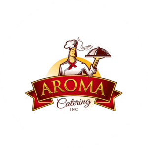
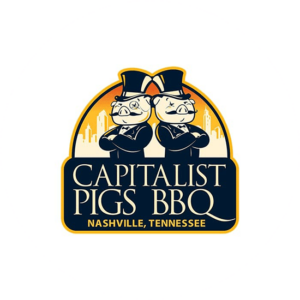
We have of course made many drinks and food logos over the years and my 3 favourites can be seen on this page. The Metropolitan bar & grill. A delightful red and black logo that really shows sophistication and luxury. The second example is Aroma Catering is a character logo with a chef holding a plate of food. The plate is hot and the colors are vibrant in yellow and red. The third example is Capitalist pigs BBQ with 2 good looking pigs dressed in black with a top hat stand back to back. Then colors are yet again vibrant and bold in black and yellow.
Wrapping Up
In conclusion, designing a creative and effective logo based on your own food logo design ideas can be as easy as it sounds. You need to consider certain elements and aspects BUT most of all you do need to love it as you are the one who has to have it consistently on everything from marketing material to street signs.
