What do you mean by impact logo design ? Well, try to imagine. You’re walking down a busy street, surrounded by storefronts, billboards, and signs. Among the chaos, one logo catches your eye. Most of all, it’s simple, bold, and unforgettable. That’s the power of impact logo design.

A strong logo isn’t just a pretty picture. It’s a visual ambassador for your brand. Understandably, it tells your story in an instance and leaves a mark long after someone has moved on. But what makes a logo truly impactful? How do you design and impact logo that gets attention and builds a lasting identity?
Let’s explore the key elements that make impact logo design more than just ink on a page.
Importance of Logos
Try to imagine your brand as a person. The logo? Firstly, it’s the handshake, the smile, and the eye contact. It’s the first impression people get before they even speak to you. That’ why it’s more than a design, it’s a handshake that says, “Nice to meet you.”
A strong logo acts like a shortcut to brand strategy and recognition. Think of brands like Nike, Starbucks, or McDonald’s. You don’t need to see their names to know who they are. The swoosh, the mermaid, the golden arches, Actually, each logo is a visual cue that sparks immediate recognition.
So, what happens if your logo doesn’t hit the mark? At best it can confuse potential customers or, worse, make them forget you altogether. Therefore, in a world overflowing with visuals, a forgettable logo is a missed opportunity.
An impactful logo is more about looking good. It’s about creating an emotional connection. Think of Apple’s logo. A simple, clean apple with a bite taken out of it. Actually, it’s not flashy, yet it shows sophistication and innovation. That one small image represents the brand’s entire philosophy. That is to say, sleek, smart, and user-friendly.
Most of all, a logo anchors your brand’s identity. Whether your business is playful and quirky or sleek and sophisticated, your logo is the visual anchor that ties it all together. It becomes a symbol that speaks for you, long after the first interaction.
Psychology of Impact Logo Design
Have you ever wondered why some logos just feel right? It’s not magic—it’s psychology. Colors, shapes, and fonts all send signals to the brain, triggering specific feelings and associations.
Colors Speak Louder Than Words
Take color, for instance. Blue often makes you feel trust and calm, which is why banks and tech companies love it. However, red is bold and energetic, perfect for brands that want to be seen as passionate or powerful. What about green? Well, think nature, health, and renewal. The right color isn’t just about looking good—it’s about feeling right. Take a look at the color emotion guide to be sure you get it just right.
However, keep in mind that color can also have cultural meanings. In some cultures, white signifies cleanliness. In other cultures, it’s a symbol of mourning. Therefore, choose the right color means by thinking beyond images and considering context and culture.
Impact Logo Design Shapes Create Meaning
Logo design shapes play a role too. For exemple, curved lines suggest warmth and friendliness. Angular shapes feel sharp, modern, and edgy. A circular logo shape feel inclusive and complete, while squares and rectangles convey stability and structure.
Take the Target logo, for example. A simple red circle with a smaller circle inside. Sounds a bit boring to be honest but it works. It’s friendly and feels inclusive. Like for exemple, a welcoming target. Meanwhile, the Mercedes-Benz logo uses a precise, symmetrical star to suggest precision, balance, and strength.
The Font Factor
Then there’s typography. Fonts can be playful, serious, elegant, or techy. For exemple, a handwritten font might suggest a personal touch, while bold sans-serif fonts feel strong and direct.
A tech startup or telecom might choose a clean, modern font to convey innovation, while a luxury brand might opt for classic serif fonts that feel refined and established. Imagine a children’s bookstore with a heavy, bold typeface, it would feel out of place, right? The right font shows the right message, without saying a word.
Enhancing Brand Identity
An impact logo design isn’t just a standalone design, it’s the centerpiece of your company’s identity. Think of it like the cover of a book or a record. It hints at what’s inside, sets the tone, and sparks curiosity.
Creating a strong identity means thinking beyond the graphic itself. It’s about how that logo interacts with everything else. That is to say with colors, fonts, packaging, even website, social media. When everything is in sync, your brand feels intentional and cohesive.
For instance, let’s say your logo uses earthy tones and organic shapes. Your website might mirror that with warm, nature-inspired backgrounds and gentle typography. However, if your logo has sharp, modern lines, your business cards and brochures should carry that sleek, minimalistic vibe.
Consistency builds recognition. Imagine walking into a hotel where everything, from the welcome sign to the notepads, features the same logo, colors, and style. It feels polished and intentional. It says, “We care about the details.”
Creating a Lasting Impact Logo Design
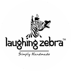
First impressions are important, but lasting impressions? Those are priceless. Just think of some of the world’s most iconic logos. Apple, FedEx, Mercedes-Benz. One that we have created and that we believe is an impact logo design is the laughing Zebra product logo. Simply handmade products. They’re not just gorgeous, more so they’re unforgettable.
So, how do you create an impact logo that leaves a lasting impact? Well, above all, start with simplicity. Of course, complex logos might look impressive, but they’re harder to remember. Therefore, a single, striking shape or symbol can be more memorable than a busy, intricate design. Even if you love delicate designs it might be best to stay clear.
Another key is relevance. A logo should feel connected to you and what you are all about. If you’re running a children’s toy store, a dark, moody logo probably won’t work. However, if you’re launching a luxury spa, playful fonts and bright colors could send the wrong message.
And let’s not forget the all important scalability. Your logo should look just as good on a tiny social media icon as it does on a massive billboard. That’s why vector designs are essential—they keep every curve and line crisp and clear at any size.
More importantly, timeless logos often share a common trait: they evolve without losing their essence. Think of Pepsi. Over decades, the logo has changed, but the core shape and feel remain. Evolution, not revolution, keeps a logo fresh without sacrificing familiarity and thus creates an impact logo forever.
Impact Logo Evolution Trends
We all know that design trends come and go, but some principles stay the same. In recent years, we’ve seen a shift towards minimalist, flat designs that feel clean, bold, and versatile. Brands are stripping away the noise and focusing on what truly matters—simplicity and clarity
Take Google, for instance. Their old logo had shadows and gradients. The new one? Flat, simple, and instantly recognizable. Why? Because simplicity scales. It works on tiny icons, large posters, and everything in between.
Let’s talk about another trend. That is to say, the use of negative space. Logos like FedEx and the WWF use hidden symbols that add depth and meaning without adding clutter. It’s a clever way to stay in customers mind.
Understandably, hand-drawn and custom typography are also on the rise. With so many brands using the same stock fonts, a custom typeface can make an impact logo design feel more personal, more authentic. It’s a nod to the past while still feeling modern and fresh.
But here’s the thing about trends: they’re fleeting. So, if your goal is a logo that lasts, focus on timeless principles—simplicity, balance, clarity—and add just enough contemporary flair to keep it relevant.
Last Few Words
Lastly, impact logo design isn’t just about creating something that looks good. More so, it’s about creating something that means something. It’s about telling your brand’s story in a single, unforgettable image.
By focusing on color psychology, consistency, relevance, and simplicity, you can create a logo that not only shows who you but also builds brand identity over time. After all, a great logo doesn’t just look impressive—it represents you and what you love.
So, are you ready to make your mark? Start with a concept that reflects your brand’s essence. Test it. Tweak it. Let it evolve. And most importantly, let it speak for you long after the first impression fades away. We can help of course, if you need a professional designer to do the job.