Iconic logos beginning with B
Welcome back to Friday Feature! Logos beginning with B.
Continuing on in our logo alphabet series, this week we’re looking at some of the best iconic company logos beginning with the letter B. Last week, we obviously talked about logos with the letter A
1. Bacardi’s iconic bat logo begins with a B
First of all, Bacardi’s famous bat logo, which is recognizable to most people around the world and is often even recognized without the context of the rum itself. As the first drinkers of Bacardi rum were illiterate, the bat symbol made it easier to sell and maintain brand loyalty without requiring text to be read. Customers simply looked for the “rum of the bats”. Bacardi company started with a dream by one man. Furthermore, Bacardi has worked to make the shape of the bat as recognizable as possible. This includes using simple, bold lines and distinctive wings to help distinguish the bat silhouette from other shapes that might appear on a bottle or in advertising.
Additionally, Bacardi has used other visual cues, such as color and imagery, to help reinforce the idea that the bat represents the brand. By taking these steps, Bacardi is able to communicate its identity and values to a wider range of consumers, regardless of their reading level.

2. BiC pens logo design begins with the letter B
Second example is, BiC pens logo which also starts with a B. The brand is one of the most trusted in the world, considered reliable and affordable. After all, many students and young people stock up on the packs of BiC pens at the start of each school year.
Most of all, BiC’s logo taps into their main market of students by depicting the little BiC person standing beside the main typographic logo. The BIC logo is a simple and effective representation of their brand identity. The iconic hexagon shape is instantly recognizable, with the blue color reinforcing their message of trust and reliability. Most importantly, the bolded “BIC” in capital letters draws attention to the brand name and suggests leadership in the industry, while the logo design overall reflects their values of quality, trust, and dependability.

3. Blu Leone – lions
Let’s look at number 3, This next logo is for a new clothing company called Blu Leone, and it is gorgeous. At first glance, this design is not a world-wide recognizable logo. (not yet anyway) However, consider it for a moment. Check out, the use of space, colour, and simple typography. Making it a beautiful piece of logo design. The intricacy of the lion’s design is inspiring. I love it. What do you think?
As a side note, lions are a popular logo feature for sports, luxury brands, and finance-related businesses. Usually, due to their symbolism of strength and power. A roaring lion can convey intensity and energy that can attract customers. Furthermore, lions are visually striking animals and a natural choice for designers. However, if overused can lead to cliche or loss of impact. Thoughtful and strategic use of lions in logo design can evoke specific emotions and communicate certain values.

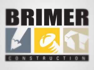
4. Brimer Construction logo design
Another logo that isn’t plastered all over the internet or around the world but which is quite beautiful in its thoughtful design. Admittedly, I like this logo because it clearly has been well researched and thought through. Let’s see what the company says about this design:
“the three colors in the logo were chosen for their masculine and yet soft tones. Each color holds an icon of the area in which the company specializes in. The first, in blue, a pencil, signifying the drafting and design aspect of their construction business. Second in yellow, a screw, conveys the work done. While the third, a taupe-beige color, shows the final results of the construction process.”
Overall, the logo conveys Brimer Construction’s mission to provide innovative solutions. Alos delivering quality workmanship with precision and attention to detail.

5. Last logo beginning with the letter B – BBC
Well, probably one of the most recognizable logos in the western world, this screams of dependability and loyalty and yet it is a very simple design. Above all, I love the sense of stability that is invoked by the BBC logo.
Furthermore, I also love that it works in this way or with the black and white reversed. Regardless of background or colours, this iconic logo beginning with the letter B works. After all, it has stood the test of time, embodying the BBC’s dedication to authenticity, loyalty and steadfastness.
The BBC logo was designed in 1997 by graphic designer Martin Lambie-Nairn as part of a rebranding campaign for the British Broadcasting Corporation. The inspiration behind the iconic logo was to create a simple and easily recognizable symbo. One that would represent the BBC’s commitment to excellence in broadcasting.
For instance, the logo features a series of blocks configured in a unique arrangement of letters that spell out the letters “BBC.” The color scheme of the logo – red, blue, and white – is also symbolic. Red representing passion and emotion, blue representing stability and trust, and white representing clarity and purity.
Today, the logo is one of the most recognizable and iconic symbols in the world of media and broadcasting. With variations of the design used across the BBC’s many platforms. Including its television channels, radio stations, and online presence.

In two weeks time we’ll be looking at logos with the letter C. If you’ve got a favourite you’d like to appear here or one you designed yourself. Please submit it to us via Facebook or tweet it to us @thelogocompany using the hashtag #fridayfeature
