Ever wondered about why some companies have logos with E? It’s finally the end of the week and time for another Friday Feature.
This week we’re on logos beginning with the letter E in our company logo design alphabet, and E is for…
1. eBay – begins with an E

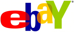
First logo with E is, eBay” is actually a contraction of Echo Bay Technology Group.Interestingly, this name having been the second choice of founder Pierre Omidyar after he discovered that EchoBay.com was already taken. However he thought it sounded cool. eBay started out as AuctionWeb, which used a drab monochrome logo referred to as the ‘Death Bar’.
Looking at the eBay logo’s bright primary colours. A very far cry from the Death Bar, these and the uneven letters suggesting fun and energy. The way they overlap is meant to suggest the togetherness of the eBay community, while the Y was capitalised instead of the B in order to stop it looking like a roadblock in the middle of the logo design.
2. EA – Black and white logo with E

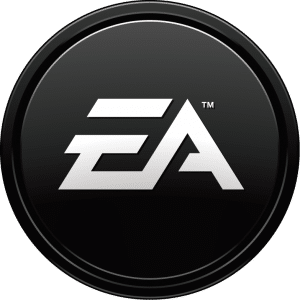
Second example in logos with E, EA, once better known as Electronic Arts, started out in 1982 as Amazin’ Software. The Electronic Arts logo was fairly simply, featuring the company name below a segmented overlapping cube, sphere and pyramid. The contemporary EA logo is simpler still, the stylised letters of the company name enclosed within a simple solid circle.
3. British video game publisher Eidos Interactive

Third on up, British video game publisher Eidos Interactive, their name coming from a Greek word meaning “species”, have produced a number of awesome titles from Tomb Raider to Deus Ex. Their logo with E, a relatively simplistic font flanked by a large arrowhead, is quietly unmistakeable.
4. The ESPN – bright red and unmissable

We have arrived at, The ESPN (Entertainment and Sports Programming Network) logo is another example of iconic simplicity. Having been the same since 1985, the capitalised letters of the ESPN are still united – or, perhaps more accurately, divided – by the same distinctive horizontal line.
5. Emporio Armani

Last, but certainly not least in logos with E, Emporio Armani is a name synonymous with glamour and high fashion. So it makes sense for the company to have an equally stylish logo. It depicts a stylised representation of an eagle, which subtly bears Giorgio Armani’s initials, looking in ‘the right direction’. Thus drawing attention to the brand’s renown for quality and excellence.
Next up will be letter F, so if you have any suggestions for logos or companies that start with this letter then don’t hesitate to post them on our Facebook page or else tweet them to us at @thelogocompany with the #fridayfeature hash tag.
