In today’s world, where brands compete for attention, more businesses are turning to something timeless – nature, with a natural logo design. A natural logo design speaks to values like authenticity, calmness, and connection. More so, it reflects a growing desire for honesty and simplicity in how companies present themselves. This approach doesn’t just look good but it creates an emotional bond that people remember. And you do want to be remembered.

Above all, nature has always inspired creativity. Its forms, rhythms, and textures bring a feeling of balance and beauty. Therefore, when used in natural logo design, these elements help brands stand out, not with noise, but with meaning. Let’s explore how natural shapes, earthy tones, and organic flow can bring your business logo to life.
Embracing Nature in Logo Design
We all know that nature is full of powerful imagery. Think of the curve of a leaf, the spiral of a shell, or the steady lines of a mountain range. These nature inspired shapes feel familiar, comforting, and real. When a natural logo draws from these forms, it brings a sense of calm and reliability.
Of course, using nature in design doesn’t mean copying an object exactly. It’s more about the impression it gives. Understandably, a swirl can remind us of ocean waves. A rounded edge may feel like a stone smoothed by time. These logo shapes suggest growth, stability, and care, qualities that fit many businesses today.
Most of all, a natural logo design often avoids sharp angles or rigid symmetry. Instead, it flows. It might use curves, circular logo shapes, or asymmetrical balance. The goal is not to look perfect but to feel natural, much like nature itself. This approach invites people in rather than pushing them away.
Most importantly, colors also play a big role. Earthy tones—like moss green, warm beige, soft browns, and deep blues—support the organic feel of the design. These shades calm the eye and suggest health, grounding, and sustainability. When paired with natural shapes, they complete the story your logo tells.
The Beauty of Organic Logos
Logos inspired by nature often feel more approachable. They don’t scream for attention. More like they speak with quiet confidence. This subtlety is part of their charm. For instance, a natural logo design doesn’t just aim to be different. It aims to be meaningful.
These logos often reflect a business’s care for people and the planet. A small food brand might use the curve of a vine. A wellness company might echo the shape of a lotus. Even tech companies can benefit by softening their image with fluid lines or calming tones.
What makes organic logos so appealing is their warmth. They break away from the cold, mechanical look that’s been popular for years. They feel handcrafted, even when created digitally. This handcrafted feeling builds trust. It shows effort, detail, and connection.
Interestingly, many of the world’s oldest symbols come from nature. Trees, animals, and the sun have been used for centuries to share ideas. They carry meaning without needing explanation. A logo that uses similar forms taps into something ancient and universal.
Natural logo design is not tied to trends. It draws on something much older and actually, and more lasting. That’s why these logos often feel timeless. They don’t rely on tricks or flashy effects. They work because they speak to something we all recognize.
Harmonizing Elements in Natural Logo Design Creation
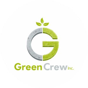
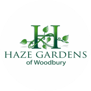
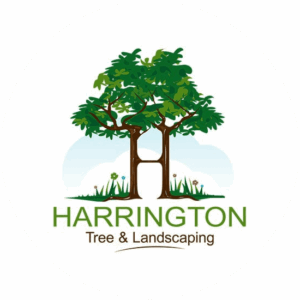
Most of all, a strong logo, especially one inspired by nature, feels balanced. Just look at the natural logo designs above to see how well shaped and balanced these creations are. That balance doesn’t have to come from symmetry. Nature itself is often unbalanced, but still feels whole. For exemple, a branch may curve to one side, a wave may lean in one direction, yet the scene remains complete.
Designing with harmony in mind means letting the elements of your logo support each other. More importantly, logo shapes, logo colors, and text should feel like they belong together. For example, a flowing symbol pairs well with a softer, rounded typeface. A gentle color works better with gentle curves than with sharp, harsh lines. A modern logo touch is to be preferred.
Spacing matters too. Natural logos often breathe more. They don’t try to fill every space. Instead, they leave room, like open air between trees or ripples on a pond. This space helps the design feel open and inviting. Let the customers brain see your logo in an inviting way.
Typography plays a key role in harmony. A natural logo design often uses fonts that feel handwritten or slightly irregular. These fonts echo the imperfect beauty of nature. Of course, clarity is still important. The name of your business must be easy to read, but it doesn’t need to look stiff or overly formal.
When all elements work together, your logo tells a complete story. More so, it says your business is thoughtful, grounded, and connected to something bigger. That kind of story builds loyalty. Of course, not just recognition.
Crafting a Sustainable Logo Aesthetic For Natural Logos
When it comes to logo aesthetic, sustainability in branding is more than using green colors or plant symbols. It’s about sending a clear message that your image or company values the future. Furthermore, a natural logo design supports this message by showing that your brand is rooted in care, not just profit.
Designing a sustainable logo means thinking longterm. Obviously, you don’t want something that will feel outdated in a year. You want a logo that grows with your business. Nature offers a rich source of timeless inspiration. Like for exemple, trees, stones, rivers, sky. These images feel grounded and lasting, just like a good company and brand should.
Also, a natural logo design is easier to translate across platforms. Its gentle forms usually scale well. Whether printed on recycled packaging or used as a website icon, the design keeps its feel. For instance, it easily adapts without losing its spirit.
So, understandably, using natural shapes can also help reduce visual noise. This makes your image clearer and easier to remember. In a world full of fast visuals and constant change, calm and steady design stands out. It lets people rest their eyes, and their minds.
Most of all, a logo designed with sustainability in mind doesn’t need to try hard. It feels right because it aligns with your values. Interestingly, it reflects your mission in a quiet, powerful way. That honesty builds trust, which leads to loyalty.
Final Thoughts
Final few words when it comes to using a more natural side when creating a logo. Choosing a natural logo design is more than a style decision. Actually, it’s a step toward building a brand that feels human, honest, and lasting. Above all, nature offers endless inspiration, from its colors and shapes to the way it moves and grows. Go outside and take a look.
By taking on these ideas in your logo, you send a message, one important one that says your business values balance, beauty, and care. Ass a result, you connect with people not by shouting, but by simply being true to what matters.
And in the end, that’s what great branding is all about. Don’t you agree ?