A circular logo, as the name suggests, is a kind of logo design that is primarily characterized by its circular shape. In fact, this design choice is no accident; it’s based on the fundamental appeal of circles in our visual perception. The circular logo has earned its place as a popular and timeless choice for businesses and brands alike, all thanks to its qualities of balance and visual harmony. With its smooth, continuous shape of a circle instills a feeling of completeness and cohesion. It’s as if the design itself radiates a sense of wholeness, making it a perfect representation for many brands striving for a well-rounded image.
In one of our earlier blog posts about yin and yan logos we already touched upon the symbolism and power of circular shapes in logo design. However, today we want to dig deeper into what makes such logos so appealing and showcase real-world examples of iconic circular logos by dissecting their design elements that make them effective and result in customer loyalty.
We at The Logo Company believe that four components contribute to whether a circular logo works or not: simplicity, versatility, interplay of text and image and colors.
Simplicity:
First and foremost, simplicity is key. A circular logo should feature a clean and straightforward design. Avoid overly intricate details, as they may become indiscernible when the logo is scaled down or used in smaller formats. A simple design also contributes to your customers memorizing your logo more easily. We know that it is tempting to get lost in the process of designing a logo, since there are so many possibilities. But you need to stay focused on the essentials for your brand. With our years of experience we can assist you in designing your circular logo. Check out our blog post about what it’s like to be a client at The Logo Company.
Versatility:
Another important aspect is the versatility of your circular logo. This is also strongly connected to simplicity. Consider how your circular logo will appear on different backgrounds. It should be visible and distinguishable whether it’s placed on a white background, black background, or any other color. The logo’s adaptability to various backgrounds is essential for its versatility. This also includes color flexibility. Design your circular logo to be suitable for various color schemes. This includes creating a full-color version, as well as monochrome versions. This way, it can seamlessly integrate into different contexts and materials.
Interplay Text and Image:
Lots of these circular logos cleverly blend words and images to convey the brand’s message. The circular shape lends an appealing and organized appearance, allowing the words and images to harmonize effectively. As for the placement of the text, that opens up a world of possibilities. You can tuck it within the circle, have it gracefully embrace the edges, or even experiment by integrating it with the imagery. The choice ultimately depends on your desired aesthetics and your brands’ personality. But keep in mind to keep it simple and displayable!
Colors For Circular Logos
Now let’s get to the last component of a successful circular logo: colors. This may sound simple, but there are many pitfalls across the path of designing. Colors have the remarkable ability to evoke emotions and associations, and the selection of colors can profoundly influence how your brand is perceived. Warm colors like red and orange can convey feelings such as energy and passion, while cooler tones like blue and green evoke a sense of calm and trustworthiness. Therefore, you should consider the aspects of color psychology before deciding on a color that may not represent or align with your brands’ core values.
Famous circular logo designs
Now that we know more about the potential circular logos may have for your business, let’s look at some companies, who already implemented these designs. And their success proves them right!
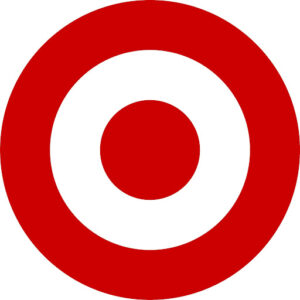
Target A Logo With Circles
When aiming for simplicity in logo design, Target sets a high standard of success. This US retail giant has achieved a remarkable circular logo that seamlessly mirrors its name through a bullseye-style graphic. Beyond its visual elegance, this logo also weaves a subtle narrative for consumers, it communicates that the store is precisely attuned to meet their customers’ shopping needs. This deceptively simple yet sophisticated logo made its debut in 1962, underwent streamlining in 2018, and has since become one of the most instantly recognizable symbols across North America (Source: https://logo.com/blog/target-logo).
Whether standing alone or accompanied by its wordmark, it has firmly took its place in the hearts and minds of consumers and therefore represents one of the most popular circular logos in America.
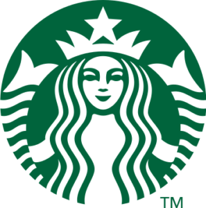
Starbucks‘ circular logo holds a special place in the world of branding for several compelling reasons. Firstly, it has historical significance that traces back to the company’s founding in 1971. The logo’s origin story is rooted in a 16th-century Norse woodcut of a two-tailed mermaid, connecting Starbucks to seafaring traditions and adventure, making it stand out in a sea of logos (Source: https://www.tailorbrands.com/blog/starbucks-logo).
The logo’s simplicity is another noteworthy factor. Its circular shape is clean, uncluttered, and effortlessly recognizable. This simplicity lends itself to versatility, allowing it to be printed on everything from coffee cups to store facades, merchandise, and beyond.
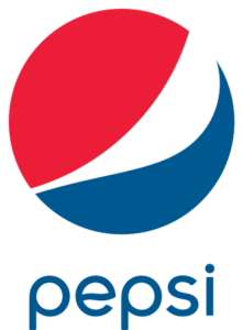
Coca Cola may be the world’s biggest-selling soft drink, but Pepsi has done pretty in recent years. Pepsi’s circular logo has left an indelible mark on popular culture. It has featured in countless advertisements, sponsorships, and references in movies. It’s a symbol that has witnessed generations grow and evolve alongside it. That classic red, white, and blue circle logo? It’s been their trademark forever which evokes a sense of nostalgia while remaining relevant in contemporary society.
What to keep in mind when designing a circular logo
As we could see, circular logos are everywhere, no matter the industry. For years they have been captivating customers’ attention and created brand loyalty. If you now consider display it on different marketing materials. Also remember to choose your colors carefully and match your text and used images properly. Then nothing stands in the way of designing your new circular logo!