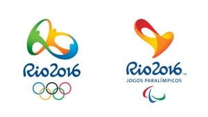
So, the Olympics logo designs for Rio 2016 are almost forgotten. The London 2012 Olympics closed on Sunday with a bang. With a huge closing ceremony ‘party’ took place. As well as the musicians, fireworks, athletes and speeches there was another part to it that is traditional to every Olympic closing ceremony. Obviously, the handing over of the Olympic flag to the country that will host the Games, which in this case is Rio in 2016.

For many people this was the possibly the first glimpse of the logo that has been designed for the Rio 2016 Olympics.
The Olympics logo designs for the Rio games consists of two logos. First one for the Olympics and one for the second one Paralympics. Both Olympics logo designs were designed by Tatil, a Brazilian consultancy.
According to creative director of Tatil Fred Gelli, in an interview with Design Week, the initial brief for the design of the olympics logos featured 12 separate attributes that needed to be reflected within the logo design. I believe this must have been a challenge beyond beliefs.
All of the 130 staff working at Tatil were able to give input into the designs as they were produced. I do believe that must have taken some time.
Both of the designs are 3D logos, but with the Paralympics logo sculpture Tatil added a sound of a heartbeat, a subwoofer with vibrations so deaf people could feel it, plus a rhythmic light. I am personally not sure I like it as it seems that the Paralympics olympics logo is smaller and less significant. Perhaps, it should have been the opposite.
With four years to go before the opening of the 2016 Rio Olympics it will be interesting to see whether there is as much furore and discussion as happened when the London 2012 logo was produced.
