What are website design tactics good for? First of all, business owners use different metrics to gauge the effectiveness of their small business web design. Let me tell you more:
Some will look at conversion rates. Others will pay attention to traffic. But those entrepreneurs who genuinely understand the connection between great design and positive consumer behavior will focus on engagement.
High engagement rates are an excellent indicator that a website utilizes effective design. Furthermore, engaged audiences are more likely to convert, less likely to bounce, and have a higher chance of walking away with a great customer experience. Moreover, higher web engagement (measured through dwell time) translates into higher SERP rankings.
So, if you’re looking to employ web design tactics that boost visitor engagement, here are the methods most likely to result in the desired outcome.
Dedicate Prime Real Estate to Customer Value
Establishing and communicating customer value is paramount in 2023 — especially as most people are cutting back on non-essential costs.
Nowadays, consumers want to ensure they spend their hard-earned money on products that offer real benefits. So, businesses and designers need to work together to effectively communicate customer value by dedicating prime real estate to it.
According to data from the Nielsen Norman Group, web users spend 57% of their page-viewing time interacting with content above the fold. So, to improve engagement and ensure web visitors instantly recognize the benefits offered by your brand’s products/services, use the hero section to communicate customer value. Branding consistency is in other words extremely important.
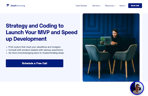
For a great example of this strategy in action, check out the Trustshoring homepage (image source). Here, the design prioritizes user benefits — receiving coding and strategy support for quickly launching an MVP.
Also, note how the hero section utilizes bullet points. This is a simple yet highly-effective design technique, which makes use of people’s tendency to skim text searching for keywords (like “startup experience” or “budget”) until they’ve found a term that’s relevant to their needs.

Trigger Emotions with Imagery
Emotional marketing can be an excellent way to influence your target audience’s behavior.
For one, marketing messages that evoke specific feelings encourage your target audience to act in a desired manner. Secondly, emotions can help your prospects perceive your brand in a favorable light. Thirdly, feelings can help prospects see your products as having a positive impact on their lives.
So, if you can get web visitors to respond emotionally to your value propositions or web visuals, you automatically increase their chances of actively engaging with your site.
For example, addressing your audience’s negative emotions — like frustration or fear — can drive them to action. A person wanting to stop feeling bad about their self-image will be more likely to convert when presented with web design elements that call their attention to the negative feeling they’re experiencing and offer a possible solution.
On the other hand, positive emotions — especially those your target audience wants to experience — can also boost visitor engagement. For example, website imagery that shows how happy and satisfied users are when interacting with a product can significantly increase web visitors’ chances of perceiving that solution as valuable.
Overall, as you explore ways to include more feeling-evoking imagery on your site to boost engagement, make sure you stick to the following rules:
- Stay away from stock images. They don’t encourage emotional investment at all. Plus, 80% of consumers prefer seeing UGC over stock photos.
- Use relevant visuals that appeal to your audience and tell a story.
- Employ color psychology to convey your brand’s message.
When possible, opt for dynamic over static imagery. It can add an extra layer of value and meaning to your web visuals. Moreover, interactive content boosts user engagement by 52.6%.
Embrace Video
According to Wyzowl, video marketing can help brands:
- Improve product understanding.
- Increase brand awareness.
- Increase web traffic.
- Generate leads.
- Boost sales.
Moreover, if you’re looking for design tactics that boost visitor engagement, you’ll find it fascinating that 87% of marketers who used video in 2022 say it increased dwell time.
As you explore web design tactics that have the potential to encourage visitor engagement, look for ways to employ video — whether on the homepage, landing pages, or even product pages.
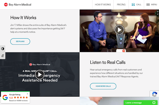
For a great example of how to do this, check out the Medical Alert System product page on Bay Alarm Medical. (Image source) Most importantly, this landing page includes a 4-minute video that explains the systems to potential buyers. Plus, there is also a recording of a real medical alert call to help prospects visualize the value they receive by investing in such a product.

Be Crystal Clear on What You're Selling
Web users make snap judgments about brands and products. And during online interactions, they do so based on web design.
But, when looking to boost visitor engagement, it’s also important to note that people have short attention spans. So, if they don’t immediately recognize it upon landing on a page, the most likely scenario is that they’ll bounce.
This outcome is easy to avoid. All you must do is be crystal clear on what you’re selling. By avoiding confusion, you can significantly increase the chances of web visitors recognizing the value of your offer.
Of course, to accomplish the desired effect, do your best to be logical and concise when describing products or services. Break complex product features into bite logo sized bits. And always lead with user benefits to ensure your prospects understand what they’ll be getting.
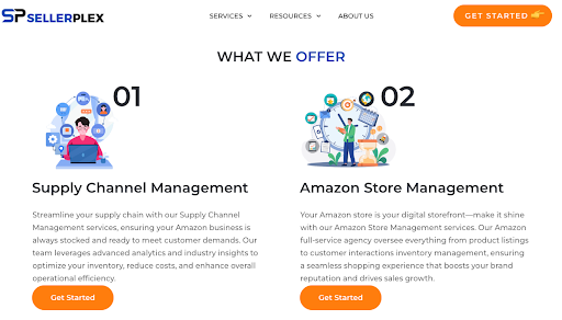
For a great example of this website design tactic, check out the What We Offer section on the SellerPlex homepage. (See image source) Cleverly, the services are broken up into seven easy-to-understand categories. Moreover, each service is visually presented to boost understanding and engage web visitors.
Plus, the service descriptions are short, which increases the chances of prospects reading the captions and recognizing the potential value of Sellerplex’s offer.

Make Clever Use of Negative Space To Improve Website Tactics
No matter your goals, one of the best website design tactics you can embrace is using negative space.
In addition to making web design more appealing, white space can help accentuate engaging page elements like visuals and copy. Moreover, it can also aid in establishing visual hierarchy, USPs, and other high-value components (like CTA buttons) to pop against their backgrounds.
When exploring strategies for improving visitor engagement by using negative space, the best thing you can do is identify the elements you want to stand out.
Define the desired action you want web visitors to take after interacting with the element (like navigating to a product page).
And finally, explore ways of surrounding said elements with sufficient negative space.
That way, you’ll ensure that they pop and attract user attention. You’ll make it easier for prospects to find these elements after they’re finished interacting with the rest of the content of the page they’re browsing.
Collapse Non-Essential Information
As you explore the web design tactics that can boost visitor engagement, do your best to direct your prospects’ attention toward the information you want them to notice.
One way to do this is to use color, contrast, and size. However, unless you want to overwhelm visitors with too much visual information, curate the content they immediately see.
Collapsing information and allowing web visitors to expand relevant sections will do this wonderfully. And not just because it won’t force you to remove information from your website. This design strategy will also encourage web visitors to actively engage with page elements and take a deeper look into the products you offer.
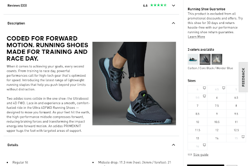
An excellent example of this engagement-boosting design strategy in action can be seen on the Adidas website. Understanding that its audience consists of both regular consumers and runners, the brand organizes the ULTRA 4DFWD product page (image) in a way that prioritizes relevant information.
So, those buyers making their purchasing decisions based on visuals have the opportunity to look at a host of high-quality product photos to see how the sneaker looks. People who want to see social proof can choose to expand the “Reviews” section to see what users have had to say about the show. And those looking for technical information — like weight or midsole drop — can expand the “Details” section of the product description to find these specs.

A simple Website Tactics Is To Invest in Improving Site Speed
Finally, when it comes to utilizing web design tactics that boost visitor engagement, don’t forget about the tremendous importance of site speed in providing web visitors with an enjoyable browsing experience.
Research shows that today’s web users want to interact with sites that are lightning-fast. Google discovered that when page load time goes from 1 second to 3 seconds, the probability of a bounce increases by 32%. And even more worryingly, a 10 second increase in load times boosts bounce rates by a whopping 123%. Adobe also found that site speed directly influenced web visitor engagement. According to a UX design report, 41% of internet users would stop interacting with pages that load too slowly.
Design-wise, one of the best strategies for improving visitor engagement via boosting site speed is to optimize the images you use. You can achieve this by:
- Choosing the right format — JPEG or PNG for static and GIF for dynamic images.
- Resizing images to smaller sizes — a width of 1920 px will be more than enough for most uses, though you can go with even lower sizes when optimizing images for blog posts.
- Compressing large files so that they don’t exceed 2 MB.
In addition to these design hacks, you can also optimize site speed and boost engagement by caching website content, minimizing the number of HTTP requests required to load your homepage, optimizing website code, and, of course, investing in better hosting. Furthermore, accept that busy web design doesn’t necessarily translate into high engagement rates, so give yourself permission to go with a simpler look for your site — especially if it’s going to lead to better performance.
Final Thoughts On The Use Of Simple Website Design Tactics
Effective web design doesn’t need to be complex. Especially not when trying to boost visitor engagement. In fact, simple tactics, like the ones outlined in this article, can go a long way in helping brands accomplish their goals.
So, if you’re searching for easy-to-implement design hacks to improve your site’s KPIs, start with the tips in this article and read more on why your website isn’t converting visitors into customers. Employ them one by one. And make sure you test performance. That way, you’ll see exactly what strategies deliver the results you want. Plus, you’ll have room to adjust as needed, as you won’t be trying to make too many changes at once.
