So, what logo size do you need are there any optimal logo dimensions?

Image credit: Unsplash
Appearances impact our first impression. For a company, it’s the logo that customers typically see before products and a website and rely on to establish their perception of the brand. But apart from the logo appearance, there are some other crucial considerations. One of them is the logo size. How big should this picture be?
While the answer may seem easy, you need to consider the different dimensions required for a website, social media, print, emails, etc. The correct choice of logo size can make or break its impact.
It determines whether the logo will be noticeable or will get lost among the rest of the content. It also influences brand recognition. And finally, it helps you deliver the brand’s identity, values, and essence. In this article, we’ll cover the ins and outs of choosing the perfect logo size for various purposes.
Logo Sizing: Why It Matters
A logo is ever-present, be it on pens distributed during the event, corporate cups, or on the website. Your task is to make it just right in every case. Here is why:
- It establishes an identity.
- It attracts customers.
.
Imagine wearing an oversized suit or a tight-fitting dress to a professional meeting. As it won’t sit right, so won’t the logo, the face of your brand, do if you place it without thinking of its dimensions. The right size ensures your brand is presented consistently across all platforms, from your website’s header to the business card you hand out at meetings.
You often only get a split second to make an impact. If your logo size is off, potential customers might scroll past, mistaking your brand as unprofessional or out of touch. A properly sized logo, on the other hand, commands attention and pulls customers in, setting the stage for them to dive deeper into what you offer.
In this light, creating a clear and visible logo is one of the ways to optimize the user experience. It covers studying every pixel and vector to make the logo stand out and resonate with the target audience. The rule of thumb is to combine design and user experience. The result? A frictionless customer journey, guiding a visitor from seeing your logo to deeper brand exploration.
Understanding Logo Size and Format
Let’s bring up some terms frequently used in logo design:
Pixels: These are the components of digital images. A pixel is one of the most popular measurement standards and represents a square of a particular color. The more pixels, the clearer and crisper your logo will appear on screens. However, too many pixels can bulk up the file size, increasing web page loading times. It’s essential to find a balance between quality and speed.
Vectors: Vector files, or SVGs, don’t use pixels but mathematical equations. As a result, the logo remains sharp and clear at any size, regardless of whether you zoom in, expand the image, or shrink it. It’s perfect for scaling up the logo for billboards or down for business cards. It never gets pixelated and blurry.
File size: This is all about how much storage space your logo occupies. A heavy logo file is one of the reasons for slow page loading, which can potentially divert impatient visitors. Always aim for a logo file size that’s light enough for quick loading but doesn’t compromise quality.
DPI (Dots Per Inch): It’s one of the widespread terms in the print realm. It denotes the number of dots that fit in a line across one inch (or 2.54 cm). A higher DPI means a clearer printed logo. So, when 72 DPI suffices for an online demonstration, you’ll need to increase this number to 300 DPI or more when printing. The goal is to avoid a fuzzy or grainy appearance.
How to Master the Logo Size
Before we present the best logo dimensions for various cases, let’s share some tips on succeeding in this task. First of all, you need to stay adaptable. Different devices have varied screen sizes. So, you need to keep separate logo versions for smartphones and larger desktop monitors, for example.
Use professional tools like Adobe Illustrator or CorelDRAW when working with vectors. They allow for seamless resizing without quality loss. Remember to always test before finalizing. Compare how the logo looks on varied devices and platforms to avoid unpleasant surprises.
And, of course, don’t underestimate user feedback. Sometimes, you can get used to the project to overlook flaws visible with a fresh look. Ask people to evaluate your logo size to gain invaluable insight
Logo Sizing Basics and Variations
of pixels, vectors, and formats. As we move to logo variations, let’s explore how this knowledge spirals into creating versatile logo adaptations suitable for various visual contexts.
Crafting Multiple Logo Versions
When reduced to an app icon, a logo that worked well on the website might not retain the same attraction. That’s where the subtle art of developing different logo variations comes in. You need to ensure that each one still effectively communicates your brand’s narrative, no matter where it’s presented and in what form. To maintain visibility and impact even in a scaled-down state, you need to reformulate the design, not just make it smaller.
Logos should be responsive. They should effectively morph across different digital landscapes. To achieve this, use media queries (for web use) to apply style rules to devices according to their characteristics.
Action Plan: Initially, create a logo with a balanced and symmetrical aspect ratio to ensure easy resizing and adaptation. Test it on varied platforms and modify the aspect ratio per each medium’s demand.
Next, colors also matter. The logo will appear on various backgrounds. Ensuring it maintains its impact both across light and dark backdrops is vital. Remember that colors can look strikingly different on screen compared to print due to the RGB vs. CMYK color modes.
Action Plan: Choose a versatile color palette and check it against multiple backgrounds and contexts.
Ensuring Consistency with Logo Lockups
A logo lockup is the final version of the logo with all the elements fixed. Whether it’s your logo symbol, wordmark, or tagline, these elements should retain a cohesive and harmonized appearance. Also, keep the proportions between logo elements consistent to maintain visual harmony.
Logo lockups should be adaptable to various orientations. For instance, a vertical lockup might be splendid for a brochure’s cover, while a horizontal one suits email signatures seamlessly. Analyze different mediums, optimize the logo for various scenarios, and gather feedback from stakeholders to improve the image.
Practical Applications of Logo Sizes
A logo may appear in two places on the website: in the header, which is the most prominent website feature, and in favicons. Favicons are those small images on the browser tab. They serve as a brand reminder.
Ideal logo dimensions for the header placement range from 160x 160px for a vertical layout and 400 x 100px for horizontal layouts. However, these numbers may vary for every website according to its owners’ tastes. So you may come across 250 x 150px and 350 x 75px dimensions.
For favicons, stick with 16 x 16px or venture up to 48 x 48px. 32px x 32px is also appropriate. As this place is so small, you don’t need a huge logo.
Note: Don’t use large files that are more than 200 KB in size, as they will compromise the website’s loading speed.
Horizontal vs. Vertical Layouts
The choice between horizontal and vertical layouts depends on your goals. The horizontal one gives you more freedom and flexibility, perfectly fitting most platforms. One of the most vivid examples of such a presentation is the Coca-Cola logo. This logo is immediately recognizable due to its elongated, scalable design.
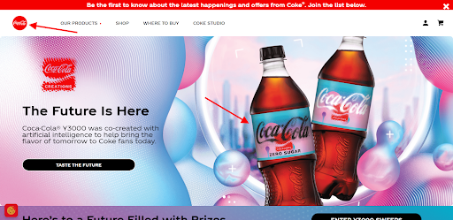
Screenshot taken on the official Coca-Cola website
Alternatively, a vertical layout, like Yves Saint Laurent’s emblematic YSL logo, can give your brand a unique edge. For instance, it can appear more compact, distinctive, and elegant, like in the case of the luxury fashion house. The bottom line is to represent the logo cohesively across all platforms.
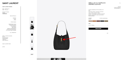
Screenshot taken on the official Yves Saint Laurent website
Logo Sizes for Social Media
Social media have become an essential part of marketing strategies for numerous businesses. So, if you also create a profile on these networks, you’ll need a dedicated image. More often than not, it’ll be your logo. That’s why it’s essential to choose an appropriate size for the “face” of your company. Here is where you can put it on social media:
- profile photo;
- cover photo;
- banners;
- image posts.
Depending on the placement, the logo will be circular, square, rectangular, horizontal, or vertical. But the most critical, eye-catching elements of your logo design should be centrally located, drawing the viewer’s attention to the middle of the image.
A Facebook profile picture should be 170px by 170px, a cover photo 820px by 312px, and image posts 1200 x 630px.

Screenshot taken on the official Domino’s Pizza Facebook page
Instagram Logo Sizes
For Instagram profile pictures, employ 110 x 110px dimensions. Other specifications are as follows:
- square image post: 1080 x 1080px;
- portrait image post: 1080 x 1350px;
- Stories: 1080 x 1920px;
- Reel: 1080 x 1920px.
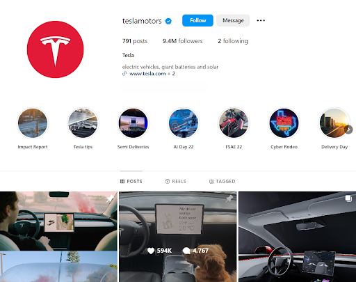
Screenshot taken on the official Tesla Instagram account
Let’s take X (Twitter). Here, 400 x 400px dimensions tend to sit perfectly as a circular profile photo. A cover photo should be 1500 х 500px, with image posts being 1024 x 675px.
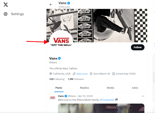
Screenshot taken on the official Vans Twitter page
On LinkedIn, enlist a logo sizing about 400 x 400px for a profile photo, 1128 x 191px for a cover image, and 1200 x 1200px for posts. In a video-centric platform like YouTube, ensure your 800 x 800px profile image is unambiguous. Pick 1280 x 720px for a thumbnail photo and 2560 x 1440px for a cover picture.
TikTok calls for a 200 x 200px logo. Pinterest, in turn, requires 165 x 165px for a circular profile image and 1000 x 1500px for posts.
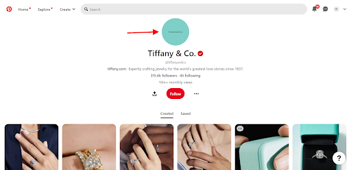
Screenshot taken on the official Tiffany & Co Pinterest page
For Google My Business, choose a slightly larger 970 х 530 px for a profile picture and 1024 x 576 px for a cover photo to ensure your logo stands out crisply in local searches and map results.
Logo Sizes for Print

Image credit: Unsplash
Apart from digital media, you can place the logo on printed material to boost brand awareness. That’s where the main focus is on maintaining quality during scaling. Because a tiny mark on a pen or hat will require a different size compared to tote bags and T-shirts. A standard print size is 8.5 x 3 inches, but you need to adapt it to a particular merchandise.
T-shirts, mugs, and bags have a big print area and provide around 14 x 15 inches for a logo. On business cards, aim for a sophisticated, clear logo around 3.5 x 2 inches.
Logo Sizes for Emails and Signatures
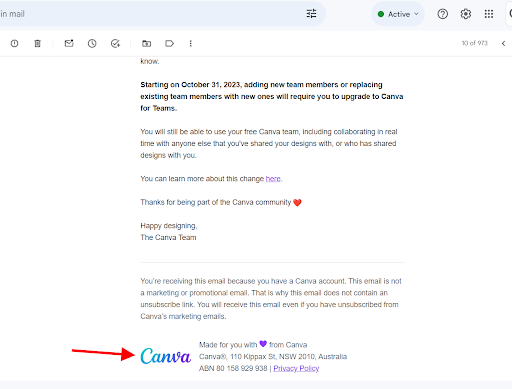
Screenshot taken on Gmail
Email signature is a great way to look professional and promote your brand. Here, the logo shouldn’t overpower but should be legible, around 300—400px wide by 70—100px tall.
Remember, it’s not only about the logo size. In an email environment, the logo should be visible and clear but not distracting, slow-loading, or obstructing the crucial content. It’s vital to ensure mobile-friendliness as well. As most emails are opened on mobile devices on the go, the smaller screen shouldn’t be a problem when displaying a logo. Don’t make users pinch in and out.
Critical Considerations in Logo Sizing
Choosing the right logo size isn’t just about picking the right number of pixels. It also implies balancing various factors, such as clarity, visibility, and aesthetics, to keep your logo effective everywhere it appears. What does an effective logo mean? It’s the one that puts the brand front and center.
To give an example, picture Nike’s signature swoosh logo. It’s compact yet impactful and fits equally well with a mobile app icon and billboard.
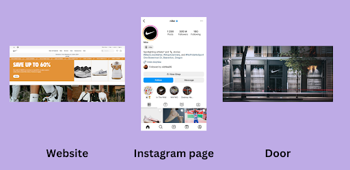
To make sure your logo looks great everywhere, always prototype it on diverse mockups, including app icons, web headers, and promotional flyers. This will ensure consistency and exposure in a range of scenarios.
Another thing to take note of is the logo format. Some file types, like PNG, are better suited for digital platforms, such as websites, apps, and emails. PNG supports a transparent background, is lighter than JPG, and maintains a high image quality. Meanwhile, physical prints necessitate vector formats like SVGs. They are perfect for scaling the image and retaining it without pixelation.
At last, you should also pay attention to the elements surrounding the logo. It needs to be visible without overshadowing other important content. Let’s take Amazon as an example. When you visit its website or get a parcel from the store, its upward and smile-like arrow is always there. It harmoniously integrates with other visual elements, allowing for a seamless user journey.
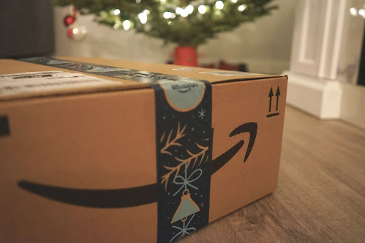
Image credit: Unsplash
When optimizing your logo, aim for just the right fit. Make use of contrast and step back to review it like a first-time visitor.
Final Thoughts
Here’s what choosing the logo size entails. We’ve covered various places where you can put your image and what dimensions it should have. We’ve also highlighted logo sizing basics, formats, and considerations when designing this element of your branding. Here are some ideas to remember:
- Choose the logo size according to the context and the media requirements.
- Stay flexible and convert the logo into various formats to be in sync across multiple platforms.
- Strike a balance between size and the environment, ensuring it’s neither a domineering visual force nor a wallflower.
As we wrap up our journey through logo sizing, keep in mind that your logo, with its size, shape, and color, tells a story. It determines your place in the market, embeds the brand in the minds of consumers, and rapidly evokes particular emotions. So take the logo and all its aspects seriously.

Kate Parish is a chief marketing officer at Onilab. She has almost a decade of experience in the company and is still enthusiastic about every aspect of digital marketing. Kate sees the marketing mission in ensuring sustainable business growth. For this purpose, she helps companies and readers create efficient campaigns, solve common problems, and enhance crucial website metrics, such as conversions, bounce rates, and others
