The Famous Harley-Davidson Logo Has Gone Through Many Changes
Interested in the the Harley, Davidson logo and its evolution? Well, first of all, Harley-Davidson is one of the most widely known motorcycle producers in the world. Really, as such it’s no real surprise that its logo is so well known. Indeed, the company’s logo is pretty important in its own right, the licensing of it and the Harley-Davidson brand having accounted for $40 million of their net revenue in 2010 alone. That was a lot of money even back then.
However, to motorcycles’ many loyal fans, the Harley-Davidson represents freedom in its purest form. But how has the Harley-Davidson company logo, which hog owners have stood together under for decades, changed over the years?
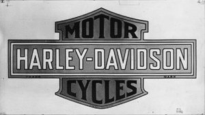
Although the very first Harley-Davidson motorcycle was officially assembled in 1903, it was in 1910 that the first version of the company’s distinctive ‘Bar and Shield’ logo was created.
The Evolution Of The Harley Davidson Logo in 1953
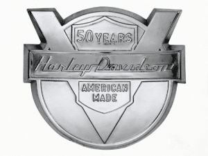
So interestingly, in 1953 Harley-Davidson celebrated their 50 year anniversary. Issuing this elaborate new logo design in order to commemorate it. The ‘V’ was included in order to honour the type of engine so commonly used in the company’s bikes. However, a medallion version of this logo went on to appear on the front fenders of the 1954 models.
The Birth Of The Iconic Harley Davidson Logo in 1965
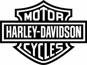
Furthermore, this version of the classic Harley-Davidson logo, arguably the most iconic, was introduced in 1965. Although this logo has pretty much remained standard, each proper Harley-Davidson dealership tends to have its own unique logo. Above all, one can see that the bar and the shield is back to stay. Similar to it’s original version in the 1910
The 100th Anniversary With A Pair Of Wings
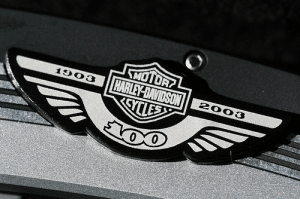
Let’s look at the 100th anniversary, which is nothing to be sniffed at, and neither is the logo Harley-Davidson commissioned to mark theirs. Featuring the unmistakeable Bar and Shield logo nestled between a pair of wings. Bearing the all-important dates, it appeared as part of a variety of different types of Harley-merchandise in 2003.
More importantly, the Harley-Davidson’s 105th anniversary logo bore some similarities to the 2003 version in that it also featured wings either side of the company’s traditional emblem. Furthermore, in this 2008 iteration, however, the wings curved upwards and were more or less contained within a circular border. Bearing the dates. Interestingly, limited edition 105th anniversary styling was specifically available for the Dyna Fat Bob, Rocker and Rocker C.
The HOG Look
During the more modern times, the Harley Owners Group, colloquially known as HOG, uses the following rather impressive Harley-Davidson logo. Mostly created in 1983 in order to build and maintain lasting relationships between Harley-Davidson and their customers. However, today you can find HOG chapters all over the world. Furthermore eagles in a logo is also used in veteran logos as their royal look adds that little something extra, just like it does for the Harley hog logo.
Whether you’re a HOG or not, do you have a favourite Harley logo?
In Conclusion – The evolution Of The Harley Davidson Logo
Most of all, it has changed and somehow remained the same. The Harley-Davidson logo has surmised many by staying so loyal to its original look in the early 1900s. Not many companies can boost having been this loyal to its owners and customer over the years and you would struggle to find a more reputable company. I mean, who would not want to own a Harley. Which types of people own a famous Harley today? It’s not just a bike, but a way of living. Interested in more interesting fact about the evolution of DC comics, or even the evolution of another famous brand, Starbucks, here you go.
