The Many Changes For Starbucks Logo
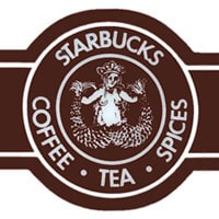
Let’s start with the fact that the Starbucks logo has only been what we know of it today since the mid 1980s. However, the company began back in the early 70s. Understandably, the logo, like the company has evolved over time. Many people are up in arms over Starbucks ditching “coffee” in its logo design, but the evolution was natural as the company adapted to changing times both economically and socially.
The Origins Of Starbucks Logo
Historically, the coffee and tea company began as one small shop situated in the famous Pike Place in Seattle, Washington. Actually, on the Pacific Northwest coast of the United States. Interestingly, the brand originally took its name from the classic novel Moby Dick, and everything from the name to the mermaid design was intended to evoke the romantic feel of seafaring coffee traders of old.

Friendly Looking Mermaid Logo
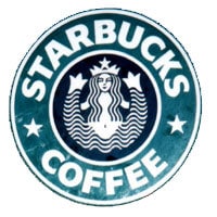
However, when the company’s founder Howard Shultz took a trip overseas to Italy, he fell in love with Italian coffee culture and endeavoured to bring it to the US. Therefore, the Starbucks logo then was re-designed to be more universally friendly and welcoming.
Furthermore, the mermaid was adapted to the more simplistic and cheerful design we know today. However, she still had a bellybutton and more of her torso was showing in general. More importantly, the design also changed from the broody brown colored logo to a more vibrant green. More importantly, the mermaid was also adapted to be more friendly.

No more visible bellybutton for the Starbucks Logo in the 1990s
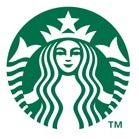
Furthermore, in the 1990s, the company went through another incarnation and sought to be more family friendly and cross-culturally accessible. Resulting in cutting out the “risque” belly button and creating a close-up of the mermaid, thus simplifying the Starbucks logo even more.

As the company has continued to adapt in its goals, vision, products and services, it makes sense that the logo has once again evolved. Ditching the word “coffee” and the black in the logo. Going for a simplistic and tremendously iconic text free design that is yet again a further close up on the mermaid. More importantly, this design frees the company up to expand their product line to include items that are not related to coffee. Very cleverly done.

Last Few Words
Some have been quite upset by this change. What do you think of the latest rendition?
PS. Want to read about the evolution of the iTunes icon? Well, I know just the right icon evolution blog
If you have a logo you’d like to submit for our logo evolutions spotlights. Pleased submit it via our Facebook page or via Twitter @thelogocompany.
