How do you get an impressive black logo ? Well, in the modern world of design, a well-designed, well balanced logo is quite a powerful thing. It’s the reflection of your brand’s uniqueness, something that people pay attention to in the first place. Especially an impressive black logo design. That is bound to make an impression.
First of all, black color in design is like that secret ingredient in your favorite recipe – it makes everything deeper, contrasting, and more elegant. Without any special effort, this alluring color blends tradition with modernity and is widely used in many spheres of art. For instance, black is one of the most frequently used colors by tattoo artists. And if you’re looking for one, your perfect destination is Ink-Match, an online platform for booking tattoo artists.
So, if you are willing to create an impressive black logo that looks great, you’ve come across the perfect guide. In this article, we’re sharing the seven vital steps to creating a breathtaking black logotype. Doesn’t matter if you’re a design enthusiast or a startup founder in search of the perfect emblem, these steps will unveil the art of designing logos in the captivating shade of black.
Step 1: Understand Your Brand Personality
Most importantly, take time to determine your brand identity. What makes it unique? What values and principles does it stand for? Or, who is your target audience? Understanding these points will lay the foundation for your impressive black logo design adventure.
For instance, think about how you want your audience to recognize and perceive your brand. After all, it will strongly influence the design choices you make, especially when it comes to incorporating the color black in a logo design. Also, remember that decisions about your brand personality should deal with the values and the types of connections you want your audience to make with your company. Understandably, they shouldn’t solely be based on what interests you personally.
So, a good tip that might help you explore the identity of your brand is getting inspired by famous companies that have had success with their impressive logo designs. More so, think about what makes them different and unique, and how they embody it in their brand personality. Finally, you will understand how this concept works and get the way you want to with your impressive black logo.
Step 2: Research Your Competitors To Better Succeed In Creating An Impressive Black Logo

To create an appropriate logo that sets your brand apart from the crowd, it’s essential to research your competition.
First of all, start by simply analyzing the black logos of your competitors. What visual graphics do they use? How do their logos make you feel? As soon as you understand it, you will be able to identify opportunities to stand out.
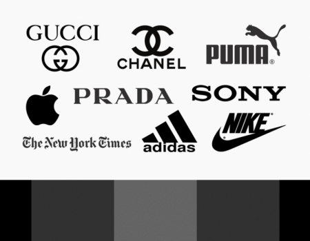
For instance, since black is often associated with power, competence, and seriousness, this is usually a choice for reputable data and technology giants, such as Apple, Sony, The New York Times, BBC, etc. Also, for example, many people are inspired by the black color to feel confidence, strength, and discipline. Therefore, it is also used by sports companies such as Nike, Adidas, Puma, and others.
Nevertheless, you should keep in mind that you’re not aiming to copy your competitors – your goal is to make yourself different and unique. Look for the areas where your logo can be exceptional. Think about how you can translate your brand personality in a way that differs you from the others.
Step 3: Choose the Right Typeface For Your Black Logo
While dealing with the creation of an impressive black logo, choosing the right typeface shouldn’t be underestimated because it can either save or destroy the whole look. The reason why the typeface matters so much is that it establishes a certain tone for your logo. It can make your emblem look friendly, professional, or even quirky, depending on the font you use.
When you work with a black logo, think about how the font interacts with the color. After all, some fonts may look sharp and bold in black, while others may look more subtle. Again, think about your brand personality. Is it bold and confident or delicate and sophisticated? Choose the font appropriately, so it matches the company’s identity.
Therefore, the advice you can follow to end up making the right choice is just experimenting with various fonts and paying attention to how they look in black. Remember, you’re aiming to create a balanced combination of typography and color, where black multiplies the general impact of your logo.
Step 4: Optimize Color Contrast

However, if you want the impressive logo to get a lot of attention, you should work on optimizing color contrast. Here it is all about creating a balance between the black and other shades in your logo to make it easy to remember and also visually pleasant. Check out the balance in the yin and the yang graphic designs in our precious blog.
When it comes to pairing black with other tones, you have to keep in mind that it is a very powerful color that creates a strong impact. The tip for you is to choose complementary colors to increase contrast. For example, it can be either bright enthusiastic colors that stand out on the black background or soft colors that possess a delicate vibe.
Another tip is to think about the emotions you want to express with your logo. After all, your choice of supporting colors will play an important role in achieving this. So, just try playing with various color combinations and then define the most favorable one.
Step 5: Focus on the Simplicity When Creating A Logo In Black
When you think about some of the most iconic black logos, such as Apple’s apple or Nike’s swoosh, what idea comes to your mind? The answer is that they are all really simple, but at the same time incredibly memorable. So, that’s the power that a non-sophisticated design can hold sometimes.
And you always have to rely on this principle, especially when you work with such a striking color as black. Because when you combine it with a complicated design, you can struggle even more with keeping it simple.
How can you solve such a problem? Firstly, focus on the details of your black logo design. Define which of them you really need and which aren’t that necessary. Finally, remove the elements that don’t add anything to the core message of your emblem.
Remember that simplicity doesn’t mean boredom — it represents clarity and impact. Therefore, an ordinary black logo can translate power, elegance, and sophistication in a much easier way than you could ever imagine. That is also the reason why it is often used in security companies branding
Step 6: Create a Versatile Black Design

When you’re crafting an impressive black logo, versatility is one of the keys to success. Most importantly, it can easily help the emblem to adapt to different settings and sizes without losing its essence.
In the process of logo creation, you have to consider that it will appear on various platforms and in different sizes – from small social media icons to huge billboards. Therefore, any emblem should always be clear and adaptable. One of the easiest ways to do it is to create the logotype in a vector format. Thanks to that, any of your designs will be able to be scaled up or down and preserve their initial quality at the same time.
Besides, another important detail of the designing process is thinking over the color variations of the logo. As we already mentioned, black can often be paired with either bright contrasting colors or subtle monotonous shades to fit particular contexts. Thanks to such an amazing flexibility of the black color, you can have no doubt that your logo will look gorgeous in any case.
Step 7: Seek Professional Design Assistance
Sometimes, when it seems to you that you’ve followed all the steps accurately and created the ideal logo, it still might be a good decision to turn to experts. Usually, these people are incredibly creative: they can take any of your ideas and turn them into a visual masterpiece. Moreover, they always follow design trends, ensuring your impressive black logo stays relevant and fresh.
Another reason why calling in the experts is a good idea — it will simply save you time and stress. They will deal with the technical aspects, and it will allow you to focus on what you do better – running your business or pursuing your creative passions.
Of course, professional logo designer services are never free — they always come with a certain price tag. However, if you think of it as an investment in your brand’s future, you won’t be able to perceive it as a useless expense. In the end, a well-designed logo is something that will pay off in the long run by attracting customers and building trust in certain industries.
The Conclusions to Make
And here they are – the seven important steps to creating an impressive black logo!
You’ve learned how important it is to understand your brand personality, research your competitors, choose the right typeface, optimize color contrast, focus on simplicity, create a versatile design, and seek professional design assistance.
Each of these is like a block you have to pass on your way to designing a perfect logo, so by following them, you will be able to attract your target audience and make them remember you. Have you ever noticed that the interior design logos are often black because the color stands out in the windows?
Keep in mind that your logo is the first thing people notice about your brand, and it’s what they will remember. And, of course, don’t forget about the power the emblem can get with the help of black. Because black is indeed the magical color — it can bring your logo to new heights, but only when used thoughtfully.

