Do you need to create a logo design for crime media? Well, know the the true crime boom shows no signs of slowing down. For example, podcasts, documentaries, YouTube series, and indie crime storytellers continue to get our attention with scary tales, unsolved mysteries, and psychological intrigue. However, with so many voices in the genre, standing out is harder than ever. That’s where smart, strategic branding comes in—and it starts with your logo.

Actually, a strong visual identity isn’t just a nice bonus for content creators in the crime genre. It’s essential. Whether you’re producing a podcast, launching a docuseries, or publishing a newsletter about cold cases, logo design for crime media is your first and best opportunity to build atmosphere and trust. So in short, when it’s done right, your logo design fro crime media becomes more than just a graphic—it actually becomes part of the mystery.
What Makes a Crime Media Logo Effective?
Understandably, creating a logo for crime content means tapping into mood and tone more than literal representation. In short, you’re not just creating a look but you’re setting an expectation for your potential customers. A logo design for crime media that looks good in this niche should immediately communicate genre, without slipping into cliché. It goes without saying that it needs to suggest suspense, intellect, darkness, curiosity… and still remain professional and recognizable.
Your logo might appear on tiny podcast logos thumbnails, YouTube banners, merchandise, social clips, and cover art. That means it needs to work at multiple sizes and evoke the right feeling in just a glance. Above all, it must fit the emotional weight and visual drama that crime storytelling often carries.
Typography That Sets the Scene
More importantly, one of the most effective tools in crime logo design is typeface choice. Typography in logo design for crime media becomes atmosphere. We often see the use of typewriter-inspired fonts, distressed serif lettering, or custom hand-drawn text that feels slightly aged or imperfect. These fonts can be associated with classified files, court documents, or handwritten case notes. Above all, making then perfectly fitting the world of investigations and hidden truths.
However, this isn’t about grabbing any free “typewriter” font and calling it a day. The trick is balance. Our designers at The Logo Company often pair a rough-textured, classic font for the main name with a simpler, modern sans-serif for a subtitle or tagline. By doing this they give the logo both character and clarity, which is especially useful when working across various platforms. More so, it’s also what sets a professional brand apart from an amateur effort. More importantly, fine-tuning those typographic details so nothing looks thrown together or off-theme.
Texture, Tone, and Visual Atmosphere For Logo Design In Crime Media
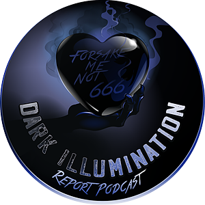
One key reason crime podcast branding and crime media design as a whole stands apart from other niches is the way it uses texture and tone. A crime brand doesn’t feel flat. It often incorporates background grit—grainy overlays, paper-like textures, or subtle imperfections that hint at something buried beneath the surface. Just take a look at this recently created logo design for crime media below. Can you feel the dark intriguing font giving it a chilling aspect.

A logo might use faint newspaper layers, photocopy smudges, or faded stamping to suggest age, secrecy, or truth hidden in plain sight. In some cases, fingerprint motifs or thin redacted lines are incorporated into the design. These aren’t overt symbols, but mood-builders. Done well, they make the logo feel like part of the evidence.
The Power of Red—When Used With Restraint
It’s no surprise that the color red often appears in crime-related logos, but the modern approach is far more subtle than past design trends. Instead of splashes of blood or dripping fonts (which quickly feel tacky), today’s designers are more restrained. For example, a crimson underline beneath a word. A blood-red full stop at the end of a clean logo. Or perhaps a single letter rendered in oxblood or deep maroon while the rest remains grayscale. Definitely more effect in any of those images.
Of course, this minimal use of color becomes more impactful because it doesn’t overwhelm. Furthermore, it adds tension, not gore making that tension exactly what draws your audience in.
Logo Design For Crime Media : A Symbolism Without Cliché
One of the biggest risks in designing for crime media is falling into the trap of obviousness. A skull, a knife, or even dripping wordmark is just not enough. These might have shock value, but they rarely convey sophistication. The logo design with the chilling heart above does not have any of that. More often than not, they signal low production value, which is not the message you want to send when launching a professional crime podcast or series.
Instead, subtle and conceptual symbols tend to work better. Abstract icons like an eye, a lock, an old cassette tape outline, or even a stylized puzzle piece can be enough to suggest secrecy and mystery. The best crime logos invite questions—they don’t give away the ending.
Crime Podcast Branding: Simplicity is Strength
If you’re specifically creating branding for a crime podcast, things get even more focused. Not surprisingly, logos for podcasts often need to work within a square format and be legible at very small sizes. Of course this makes simple, bold design even more important.
Actually, the most successful crime podcasts rely on typography first logos. The name of the show becomes the focal point. This is often with a clever type treatment or small detail that hints at the subject matter. Some of the most memorable logos in the genre don’t even include a symbol at all. However, they rely on stark contrast, strong type, and tonal clarity.
Many crime podcasts branch into merch—stickers, T-shirts, mugs—the logo design for crime media should feel iconic enough to work on its own, even outside the app.
Who Needs a Logo Design For Crime Media?
While true crime podcasts are the most obvious fit, logo design for crime media extends far beyond. Like for example, if you’re building a brand around mystery, investigation, or anything rooted in psychological thrill, you’ll benefit from this kind of imagery.
Just think newsletters about unsolved cases, YouTube channels breaking down real-life scams, short films, or even fictional noir storytelling. In all of these cases, a sharp, logo becomes a visual signature. The he core of it all. One that says, this brand is serious, smart, and just a little bit sinister.
Final Thoughts: Suspense Is a Visual Art
In the world of crime content, tension is everything. In conclusion, your logo design for crime media should reflect that. We know that a good design will build anticipation. It won’t scream—it will suggest. It will whisper something chilling and draw the viewer in, compelling them to click, watch, listen, or read more.
At The Logo Company, we understand the subtle power of branding in niche media. Check out this featured article written about us in The Wall Street Journal So, whether you’re launching a gripping true crime series, a psychological newsletter, or your first murder mystery podcast, we help you translate mood into marks. We can give you a crime logo that doesn’t just fit, but intrigues. Read our testimonials on Trustpilot.
