You have money back guarantee of course and we keep your file in an archive in case you lose it for any reason.
Small anecdote!
A long time ago we used to charge people $20 to get the archived logo out of our extensive archive but customers were furious so we stopped. Some were comparing it to robbing their grandmother.
What Kind Of Podcast Is It?
Let’s start with the project. Health Privy Podcast is informative and engaging discussions on various health-related topics with medical experts. Covers mental health, nutrition, exercise, disease management, and more. Listeners learn practical advice and insights into latest medical research to maintain a healthy lifestyle. A valuable resource for those interested in living a healthy and fulfilling life.
Customers Logo Brief For The Podcast
As you probably know by now. Every customer fills out a logo design brief that then makes up the base for the entire logo. It is therefore very important to explain as much or a little as you want. Below you will find the customers brief that I have shortened a bit.
Podcast Logo Brief
“I don’t really know much about design stuff, but here are a few things I wanna mention that may help them . . .”
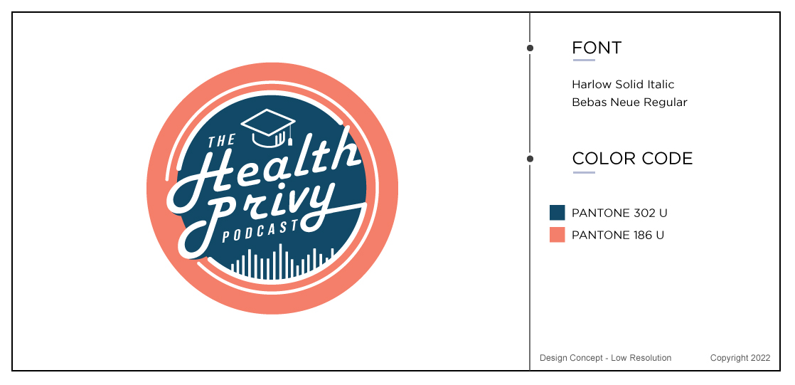
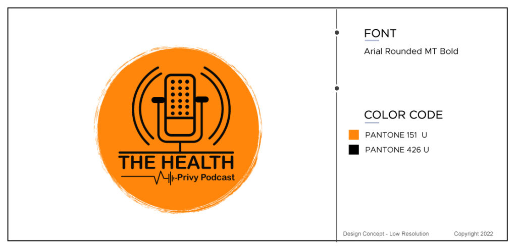
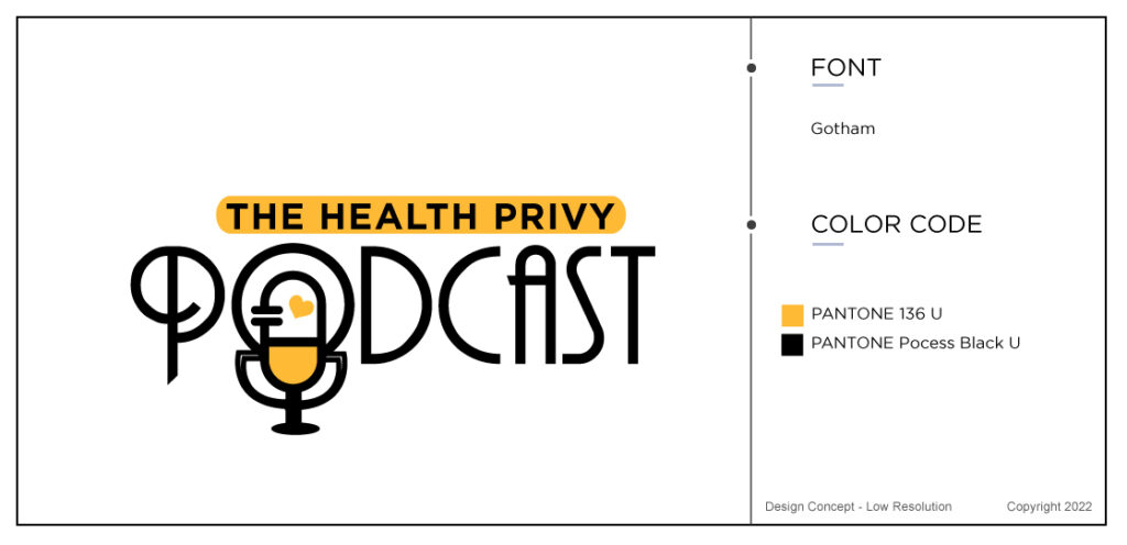
I like a “round” logo idea for this one, so let’s go with that.
The podcast is a subset of Radiant Lifeway, so you have the colors & fonts of that logo you designed. I don’t think they should be the exact same colors, but maybe this logo could employ some colors that are complementary to Radiant. And maybe the same fonts tie the logo together in some way ? But maybe colors & fonts should/could be completely different ? You guys certainly know better than I.
The podcast will discuss & integrate short segments from video interviews we do with health experts/scientists/PhDs, etc. There will be 3-5 min videos on various topics on the Radiant member site, so this podcast is a lead magnet to promote member signups for people to gain health knowledge to help improve their lives.
I’d prefer not to have any copy going around the edge of the circle. I just find that difficult to read and the lettering is usually pretty small.
Some graphics or background images in the design, should you choose to use any, could be a podcast mic, sound waves, a graduation cap (learning).
Many customer are not so precise and we had done his Radiant logo previously and had an idea of what style of podcast logo he liked.
Initial Podcast Logo Design Concepts
Customers Feedback On The Initial Podcast Logos
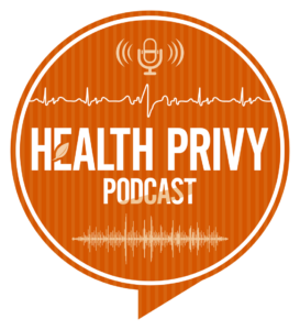
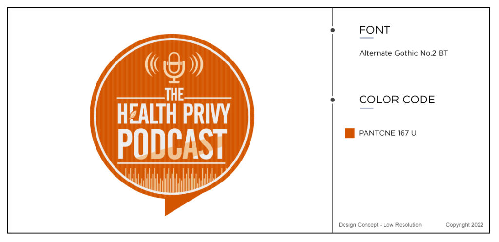
Thank you for these. I like #4 and here are some revisions I’d like to see, please.
1.- Let’s first just eliminate “THE” completely as I don’t think its really necessary after all.
2.- Keep elements of “Health Privy” as is, but if its possible, as big as you can to fit nicely, but doesn’t look too crazy.
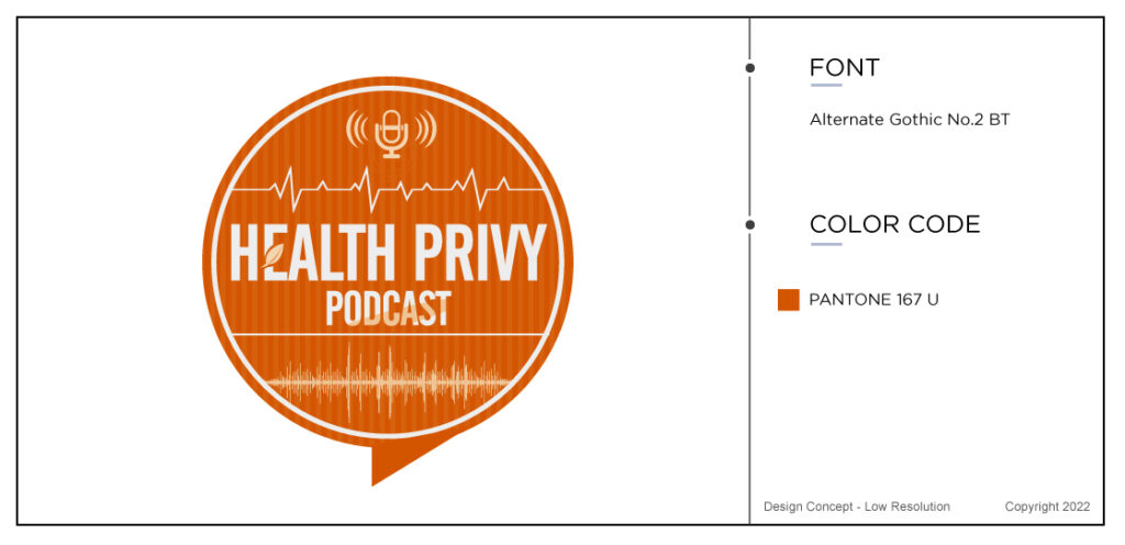
3.- For a line element above Health Privy, try a mimimalish heart rhythm like the image I have below. That may look dumb, but it sorta says health.
4.- Let’s make “PODCAST” smaller so that “Health Privy” is larger in size.
5.- I like the microphone image on top & the wavelength at the bottom, but it overall it seems a little cramped. Losing “THE” and making “PODCAST” smaller should help, but maybe both the mic & wavelength need to be a little smaller ??
I think that’s it for now and should get us real close. Thank you very much. Exciting !
Unlimited Podcast Logo Revisions
Perry (the customer) had a few more comments but the logo designer fromThe logo Company was definitely heading in the right direction with this circular elaborate logo.
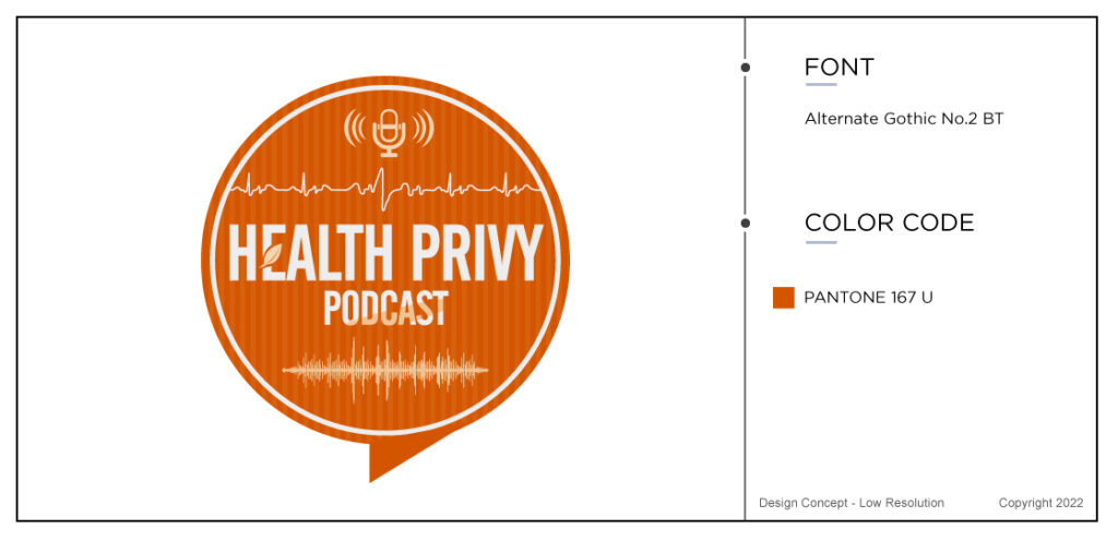
1- Lose the solid line under Podcast completely.
2- With the sound wave, have the ends not touch the edges of the circle so its standalone in space.
3- And is it possible to compress the up & down lines of the “individual” bleeps even a little more ? If not, I’ll be fine with it.
Only 4 Logo Revisions Later
The final podcast design can be seen at the top of the blog and I do believe that it is very podcast looking. The customer was very pleased and we loved working with this project. I hope you enjoyed the case study for a podcast logo as well and that you give us a try by ordering. Read more about podcast design ideas here.
This week we wrote about another happy customer who wanted a sports logo for his basketball team. Check out what we managed to create based on what he wrote in his sports logo brief.