Sports Logo For Sewanhaka Mens Basketball
Now it’s time for a case study for a sports logo. How do you order a sports logo from us? Well, the logo order process it is very simple and I am going to show you how a logo came to life in this case study for Sewanhaka Mens Basketball. Amazingly, in less than 3 days from start to finish this client had his finished product to add to game shirts and website and everything else that he might want to add it to but let’s start at the beginning.
Case Study: The Customer Orders A Sports Logo
First of all, the client fills out an order brief on our website and tells us all about his/hers project. In this case study for a sports logo brief you can add as much or as little information as you want. If you add just a little information then our designers gets lots of room to create what they feel like. This is sometimes good but when a client puts in detailed project information, then that can lead to a quicker process. However, this is a personal matter, some people like to take their time others are quick and know what they want.
In this case study I would like to take the example of a sports logo recently finished for Sewanhaka High School Mens Basketball.
Most of all, the client wanted a custom logo and a design that would go well on apparel for fans and team members. Furthermore he said “We want a nice logo that has school colors and design that can be printed on high quality clothing as well poster boards for advertising”.
Who are your customers and competitors?
We also ask who your customers are and who you think is your competitors. To this the client answered was other high schools as well as folks from the local town. As well as, other high schools in the district would be the main competition.
Furthermore he put in the sports logo brief that he had not got any preferred style nor sure was he sure about the details about the logo.
The name had been decided to be Sewanhaka Indians Mens Basketball.
The overall feel should be…
– Artsy
– Modern
– Contemporary
– Corporate
Color And Font Information
This case study for a sports logo had a few important points in the brief about the all important colors and fonts to use.
- How many colors should we use? 4 colors
- What colors would you like to use? Purple, yellow, black and white
- Font Choice Creative strategy: Make the logo like a professional NBA style logo.
- What applications do you have in mind for your logo? Basketball logo that will incorporate the “Indian” & “BasketBall” because we will be printing on clothing for the team and fans.
The Initial Design Concepts For The Basketball Sports Logo
So, now, the 5 professional logo designers that I dedicated for this project started to look at the sports logo brief and make their initial logo concepts. Understandably, this process can take up to 3 working days as they need time to visualize and to make sure they come close to creating your edgy logo that is going to stand out in the crowd. Right now the logo is only in your mind and we have to somehow bring it to life.
Below, I will show you the different designs that we came up with for this client based on his sports logo brief. Pretty good don’t you think? In just 2 days the designers had made 6 different concepts. Normally it is a minimum of 5 different logo design concepts but its up to the designers as well to see what they would like to show the client.
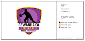
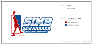
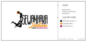
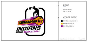
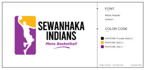
On the designs you can also see that the designers have put the name of the font used and the name of the Pantone colors used. Of course, we always try to use Pantone colors as they are suitable for professional printing unlike RGB colors. We were exited to find out what the customer would think about these. He came back with the following comment.
“We choose design concept Taylor. However remove the word Indian. Change of name from every one.”
Case Study: Revision 1
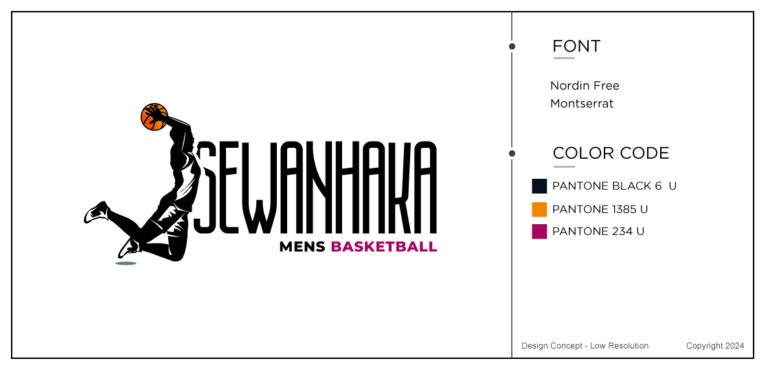
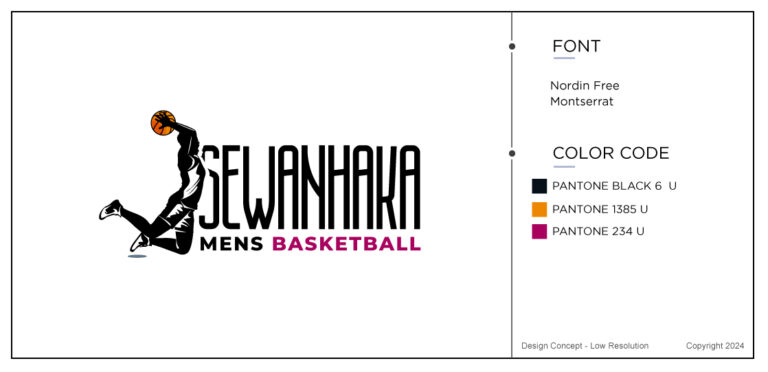
So, Taylor worked on his concepts and removed the word “Indian” and sent it back to the client to view. Theres is absolutely no limit in how many times you can revise a logo. Nor is there a time limit. Of course, we would like to get it right within the first 2-3 revisions but the record holder for most revisions is currently 43. Not that we want to go through that again!
Back to our project and after viewing the new revisions the customer wanted the following changes made.
“Can we add some more of the purple color to the Taylor 1A & 1B clothing so that its not so much black?”
Sports Logo Case Study Revision 2
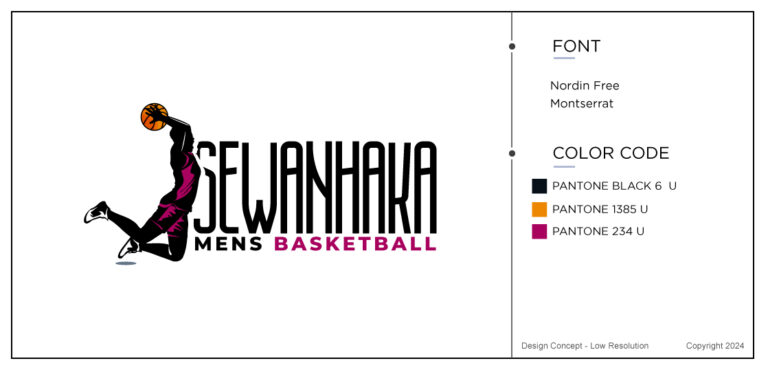
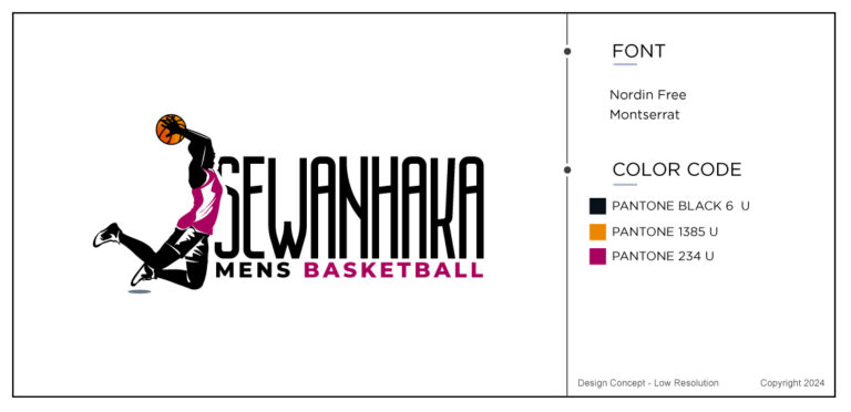
And there we had the last and final decision from another happy customer.
“Guys, Taylor 2C is the winner. No more changes. Just make sure the details are sharp enough for printing on clothing. “
Which of course we complied with. What do you think? Of course Im never biased but I think the result is stunning and this is a memorable sports logo in anyones eyes. Furthermore, the entire process based on the sports logo brief took less that 3 days as. In just 72 hours we managed to create a logo that the customer accepted and liked. I’ts easy to see how this design will go well on all sorts of advertising.
Of course not all designs are created with this much ease but you would be surprised at how many times its just a very smooth process. Most of all, it’s so much fun, visualizing customers dreams.
Wrapping Up This Case Study
Last few words about this case study for a sports logo. Nothing makes me happier than having happy customers and quick turn arounds. For the last 23 years we have been designing logos, printing and designing stationery, websites, flyers, and banners etc… I think you can tell by now that we love it and our brand story is solid, full of dreams and hopes for the future. Who does not love to see your own design “live” on television, in ads or online. Nothing makes me happier than your success. A success that The Logo Company perhaps contributed towards. Check out some of our other teams logos in our portfolio.
