Time for another case study and this time it’s a case study for a real estate logo. Last week we finished a study a landscaping logo. The order process is as usual very easy to follow and you can always send us an email incase there is something that you don’t understand. Let’s start this case study by looking more closely into the real estate logo brief that the customer filled in for us.
Most of all, the brief is so that we understand what you have in mind and how you envision your dream logo. Sometimes the customer leaves this questionnaire pretty much empty but some customer put in detailed information and adding images they like. In this case, we received a fairly detailed brief as the customer knew more or less what he wanted to see.
Real Estate Logo Brief Questions
Below you can find the questions that we asked in the real estate logo brief. Easy questions, where you can add as much or as little information as you want. The questionnaire consist of the following 8 questions.
1. Describe your company and what it does?
- We will be launching a real estate brokerage group that will be branded as NW Nest Real Estate. We have purchased www.nwNestRE and www.NWnestRealEstate for when we launch the brokerage. Our website is Justinkiesz
2. Who are your customers?
- The market segment is even male / female. Home buyers are primarily in the Baby Boomer, Generation X & Millennial generations. Gen X might be the main group among them
3. Who is this logo for?
- A new business I am starting.
4. Preferred Design Style Icon with text Details About the Logo Exact name or abbreviation we should use on your logo
- NW NEST REAL ESTATE Slogan or Strapline N/A
5. The overall feel should be..
- Contemporary
Corporate
Color And Font Information For The Case Study For A Real Estate Logo
Now we have come to the all important font and color information. Usually customers have an idea of how many colors they would like to use and sometimes they have already searched up different possible fonts at Dafont
6. Color Information How many colors should we use and what colors would you like to use?
- I would like to use 2 colors.
- The text copy would be black, the icon/drawing would be Gold = Pantone 4515 PC C – 8 M – 14 Y – 50 K – 24 Pantone 4515C R180 G167 B108. The gold would also be able to be used when the logo is reversed on black.
7. Font Choice Font preferences for your real estate logo
- We were thinking that the NW NEST font as a stacked serif font while the REAL ESTATE font would be sans serif. Also thinking that all letters would be capitalized. We are open to other suggestions.
8. Creative real estate brief strategy
The letter/copy to be stacked with justified alignment. To complement the copy, we would like to have a sketched drawing of a bird in a nest. As you’ll see in the attached file, the drawing would be minimalized and not overly drawn. The attached has a few rough draft versions using elements from the web as ideation.
We like:
1) using the birds in the house made with sticks
2) the sketch of the bird in a nest
3) could a key come out of the birds beak with a key and possibly a house shaped key fob.
The key could separate the NW from the NEST letters. Any other information: The weight of the elements could be roughly 30% icon and 70% logo fonts. We realize that the smaller weight of the REAL ESTATE copy line would make this smaller – our thought is it becomes more of supporting text and not as prominent as NW NEST purposely
The Initial Logo Design Concepts For The Real Estate Company
Below you will find the 6 initial concepts that our talented designers created based on the real estate logo brief that the customer filled in. I believe that they followed the initial instructions very well and the result speaks for itself. Now we were very curious as to what the customer would think. Remember that the initial concepts usually takes 2-3 working days and we do not work weekends. Every revision, however small can take up to 2 working days. We do not like to hurry creativity.
Case Study For A Real Estate Logo Revision 1
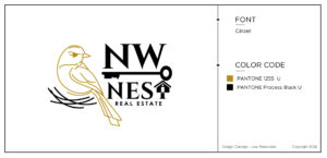
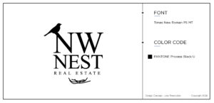
So, the logo designs that the customer liked the best was Agnew and Agnew 2. That is to say number 4 and 5. The first design with the two little golden birds in the house and the second design with one cute bugger bird where there is also a key and a house in black. As you can see, for this case study for a real estate logo, the customer wanted 3 different revisions for the two logos that he picked initially.
- Reduce the size of the bird house about 10-15%
- This will make the bird house slightly narrower
- Spread out the birds, making them slightly taller to fill into the house
- Top of the bird house aligns with the top of NW copy text
- Bottom of the bird’s tail aligns with bottom of REAL ESTATE copy text
- Use the NW NEST font from Design Concepts Ford5
- Keep REAL ESTATE font from Design Concepts Agnew
- Remove the key & key fob element from this design
- Have size of bird & nest align with proportion of copy elements
Case Study Revision 1
- The new text for NW NEST is a bit too contemporary. While we would still like it to be a serif font, please revise with one less contemporary. The new font would also need to work reversed and embroidered.
- reduce the height of the bird’s nest so that more of the base of the T is visible. (see image)

Case Study revision 2
Now, the customer wanted to see the golden bird but a little bit more modern version. One with the little house and one without.
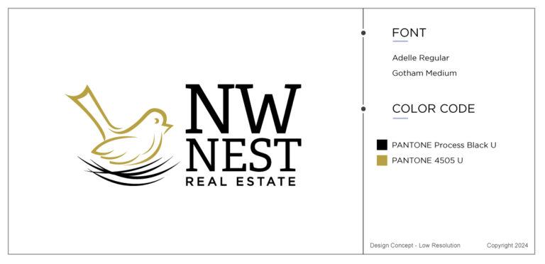
While we are leaning toward consideration with Design Revisions Agnew 1 we would like to have a edits made to the other two for consideration.
- Use NW NEST text from Agnew 2e (FrizQuadrata BT)
- Change the gold birds in the nest to 1 Bird centered slightly wider and taller (+/- 10% larger)
- All copy and the bird nest to white
- keep the single bird at 4505 U (gold)
Final Decision For This Case Study For a Real Estate Logo
Finally, we arrived at the last stage of the creation. The customer sent me a message saying :
“we would like to finalize Agnew 3D and the reversed version of Agnew 3E”
In this case, one set of logo is included in the price. Our logo designs cost 199 dollars and if you want to have an additional version of your logo. Like in this case, the reversed logo, then we charge an additional 80 dollars.
Wrapping Up
Understandably, a case study for a real estate logo or any other business all depends on you. Some customers are very clear and really put everything down in bullet points. However other people are very vague and just know what they like when they see it. Next week we will dig into a write a new case study and look at a client who ordered a handyman logo.
Our job at The Logo Company is to be there for everybody. We have been in business for over 23 years and we continue to make fantastic logo designs. Regardless of AI. There is nothing quite like the human touch.
