Landscaping Logo For Andy’s Tree and Lawn Service
The Customers Landscaping Logo Brief
Now it’s time to present this case study for a landscaping logo that we recently finished for Andy’s tree and lawn service Inc. Andy described his company in the landscaping logo brief as being a company that mainly removes big old trees.
“Removes large tree’s daily and Lawn Service” and that he “wants to target old gardens with large tress rather than mowing lawns”
Furthermore he explained that “We’re a Tree and Lawn Service but mostly trim and remove large tree’s daily only a little lawn care .
In general he wanted some some kind of cool old dead tree in my logo. He was not sure about his preferred design style but he was sure about the exact name or abbreviation that we should use on the logo. Andy’s Tree and Lawn Service Inc. Slogan or Strapline ATL
The overall feel should be…
Artsy
Corporate
Casual
Case Study Image From The Client
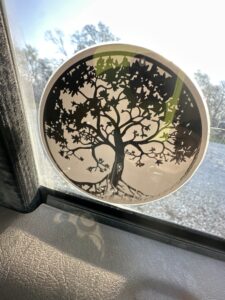
Sometimes we get an image or several images sent to us in the landscaping logo brief. Most of the time this is really useful but in this particular case study for a landscaping logo the image did not really end up having anything to do with the logo. The customer still liked another design, not that similar to the image. Often we use images as inspiration to try to guess what the client likes but a lot of the times the customer ends up with a totally different looking design.
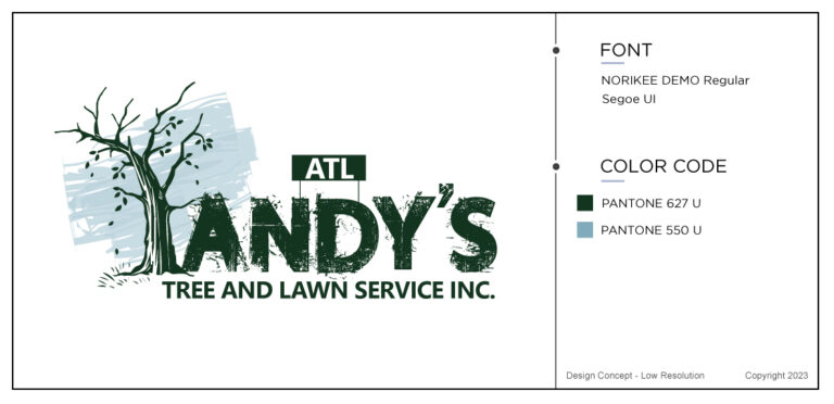
You will see that a lot of people dont know what they want until they see it. Its like buying a nice pair of high heel shoes in a shop when you went in to buy a pair of sandals. Impossible to know until you are actually looking at the designs. Tyler’s design, in this case study for a landscaping logo won the best logo and its easy to see why. Regardless of the image of the tree that the customer sent, the designer managed to make a well balanced, super looking tree and the font Norikee demo regular with Segoe UI fitted in just perfectly in the design.
Who Are Your Customers?
Furthermore, the questionnaire also asked about your customers and who you think will be your customer. In this case study for a landscape logo the customer would be people living in both private residential properties and also big commercial properties like apartment complexes ex. However he did not want to too much focus on lawn moving service.
What Is Your our Competition Like?
When it came to the competition it was pretty much everybody, that is to say other tree services in the area. To have a clear picture about who your main competitor is gives you a great advantage as you can then focus better on finding your own niche. In this case the niche is the removal of big old trees. Not every landscaping company has that knowledge or equipment to do that kind of job.
Case Study Color And Font Information
We had no information about his preferred font or colors that he liked. When it comes to landscaping or gardening companies, the colors they prefer is usually green, like the grass. But a company that specializing in removing dead old big trees might need a little darker color.
When it comes to fonts and what font to choose we sometimes refer to Dafont Its sometimes easier for the customer to visualize a font that they like if they look at a few themselves. However a lot of our customers, let us pick the colors and font. We are professional logo designers and when it comes to creating a working brand kit then we know what we are doing.
Initial Logo Design Concepts Made For A Landscaping Logo
In this case study for a landscaping logo, the 6 initial logo design with trees concepts came back to the customer within 2 working days. In my opinion they all looked good. All of the different designers had looked at and interpreted the landscaping logo brief in a different light. What you think is attractive and beautiful is not necessary what the customer thinks. Most of the time we have to be mind readers. Trying to guess between he lines what people like. After 23 years in business we are getting very good at it.



The Winning Concept
In this case study for a landscaping logo the client was extremely quick and after the initial round of logos he decided straight away for the design made by Tyler. He did not want any changes and just took it like it was. Of course, I can see why as it fits the best with his landscaping logo brief explanations. The designer managed to captivate the look that the customer was looking for and in less that 48 hours the logo had been created an finalized. Another successful project made by the talented designers.
Examples From Other Customers

I wanted to show these three designs recently finished by us as well. In time, I will eventually write more case studies for every single logo in our portfolio. However, let’s look at these three above first. The customers filled out a landscaping logo brief before getting their initial concepts.
First logo, Evergreen. A soft actually kind of feminine logo where the leaves comes out of a branch and softly wrapps themselves around the letter “e” for Evergreen, the name of the company. The logo is very easy to add to any social media since it is a very memorable look.
Second logo example, Harrington Tree & Landscaping design consists of two large trees merging into one making a really big tree crown. The design is again green, as most landscaping logos are and there are little pretty flowers at the bottom of the tree on the ground. This logo goes really well as a banner on trucks etc..
Number three, a mean but cute looking Mean Green Lawn Works. The company went for a more character logo design where the lawn mover actually has his own life. It’s easy to see this design on all sorts of marketing material.
Last Few Words
As you can see, a case study for a customer that has a landscaping company can be similar to another. Like for example, the use of the color green. I have also noticed that a lot of people send images that they like or fonts that they want and settle for something totally different. So, you never know what you want until you see it.
Last week I wrote about a case study for a sports logo so I would recommend reading that one if you need more information about how a logo design order process for a real customer looks like.
