This week we look into a case study for a tattoo logo. From concept to connection: explore the creative process behind the logo that has transformed the InkMatch brand, fostering stronger ties within the tattoo community.
Of course, a website’s logo is the first impression you make on potential clients. A well-crafted symbol visually communicates your brand identity, setting the tone for potential clients’ experience from the very first moment. An impactful logo could be the determining element that convinces them of your professionalism.
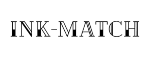
The logo of InkMatch features the brand name in bold, uppercase letters. Furthermore, the letters are stylized with a unique, interconnected design, creating a sense of unity and community. The color palette is black and white, emphasizing simplicity and elegance. Interestingly, this reflects the platform’s focus on connecting tattoo artists and fans, fostering a sense of belonging within the tattoo community.
Design Analysis
The tattoo case study captures the essence of what tattoos represent: self-expression, belonging, and a lasting connection. The intertwined letters subtly reflect these themes.
This simplicity translates into beauty. Bold, uppercase letters ensure instant recognition, while the black and white color scheme keeps it elegant. This simplicity translates into versatility – the logo will look crisp on business cards, scale seamlessly on the website, and maintain clear visibility on social media profiles and banners.
In this case study for a tattoo logo this fine line, linework aesthetic resonates with a growing trend in tattoo design. It leans towards delicacy, zero shading, and intricate details. The logo, by embodying this style, positions the brand as modern and in touch with current tattooing preferences.
Target Audience In This Case Study For A Tattoo Logo
Here we connect two passionate communities within the world of tattoos. On one side are the tattoo enthusiasts, a group driven by the desire to express themselves through permanent art. Who are they?
- First-timers considering their first tattoo and seeking guidance.
- Experienced collectors who already have tattoos and want to find the perfect artist for their next piece.
- People with a specific vision who know what they want, but need help finding an artist who can execute their idea.
On the other side are the talented individuals who transform visions into stunning creations:
- Experienced tattooers looking to expand their clientele.
- Up-and-coming artists seeking to build their reputation and attract clients.
- Specialists in specific styles (traditional, tribal, Japanese, etc.)
This tattoo case study has a website that also provides an opportunity for tattooers to showcase their work in the InkMatch tattoo gallery and connect with potential clients. Find out more about how to market your tattoo parlor.
Tattoo Logo Style
A minimalist tattoo logo offers several advantages, especially for a website featuring tattoo artists and tattoo ideas. Why does it work for this company? Many tattoo artist use smilar images and minimalistic logos are popular in this sector.
More importantly, the focus of minimalism is to remove disorder and emphasize the main aspect of the brand, which in this case is tattoos. Furthermore, this design approach enables visitors to easily see and admire the work of the featured artists without any interruptions, thus giving them the opportunity to fully appreciate the detailed and well-crafted designs.
The concept of minimalism naturally suggests a feeling of contemporary style and elegance. In n fact, this appeals to an increasing number of people who admire simple designs and a modern look, which is frequently evident in their tattoo choices.
A simple logo is easier to read, especially on small screens. It provides a seamless user experience and allows visitors to quickly understand the purpose of the website
Finally, while trends come and go, minimalist symbols tend to have lasting appeal. They are less likely to become dated and can be a strong visual representation of the company brand for years to come.
A Seamless Match
In this case study for a tattoo logo, the black-and-white color scheme of the logo mirrors the minimalist aesthetic of the site, establishing a unified appearance in which each component strengthens the others.
Imagine a logo bursting with color on a website with delicate lines and negative space – it would clash! This case study for a tattoo logo achieves harmony by keeping it simple.
The logo likely sits prominently in the website’s header or navigation bar. This strategic placement serves two purposes: it strengthens brand identity by ensuring visitors instantly recognize the logo, and it acts as a visual guide, helping users navigate the website.
This tattoo case study has a simplicity of the logo that isn’t just aesthetically pleasing. More so, it also ensures visual harmony with other design elements. Fonts, images, and buttons – all likely share a similar clean and modern style. Resulting in a balanced visual experience, free from clutter or conflicting styles.
By analyzing these details, we can connect the logo to the company’s brand identity. This cohesive minimalist look, accentuated by the black and white color palette, reinforces the brand identity, specifically catering to those seeking modern, clean-lined tattoos.
Tattoo Logo Competition
Tattoo-themed websites or tattoo shops come in various forms, offering appointment booking, artist portfolios, and online communities. Some cater to a general audience, while others specialize in specific styles or geographic regions. Of course this creates a competitive environment where websites vie for the attention of both tattoo enthusiasts and artists.
How does the logo set InkMatch apart in this tattoo case study ?
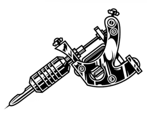
The tattoo machine is a common element in tattoo-inspired logos. This saturation can make it difficult for individual studios to stand out. Imagine scrolling through search results and seeing multiple logos with similar imagery – it can be hard to recall the specific name of each site.
InkMatch breaks free from this mold. By avoiding the cliché of the tattoo machine, their logo has the freedom to focus on what truly sets them apart: their role as a connector between tattoo enthusiasts and artists.
Bold lines, a splash of black, or a typeface hinting at strength and individuality. In this tattoo case study the design might not be overtly tattoo-centric, but it can still incorporate these subtle design elements that resonate with the target audience.
Conclusion
In the case study for a tattoo logo, the company strikes a powerful balance. For example, the design is both uncomplicated and elegant, classic yet contemporary, and captures the core of self-expression and connection that is central to tattoo culture. However, it doesn’t scream “tattoos” in a generic way, yet it subtly conveys the unity between artists and enthusiasts in creating something meaningful.
The logo’s versatility ensures it works well across various applications. Overall, it is a memorable and effective ambassador for the brand identity, leaving a lasting impression on anyone who sees it.