Recent Caricature
Logo Design
Caricature Logo Design: Adding Personality to Your Brand
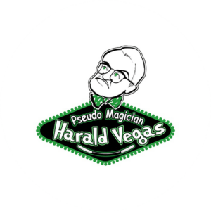
Looking to infuse your brand with personality and make a memorable statement? You’re at the right place. Before we delve further, take a moment to explore our portfolio logos below for inspiration, featuring stunning examples of caricature logos.
At The Logo Company, we see a logo as more than just a visual symbol. It’s a potent tool that can capture your brand’s core, leaving a lasting mark on your audience. With caricature logo design, we elevate this concept, adding humor, charm, and uniqueness to your brand’s identity. Let’s embark on this creative journey together.






Logo Packages
Do You Have Any Questions?
Caricature Logo Designs Explained
Most of all, caricature logo design offers a unique and versatile approach that transcends industry boundaries and business sizes. Regardless of whether you’re a small startup or an established corporation, caricature logos have the potential to set your brand apart in a competitive marketplace.
Most of all, these distinctive logos strive to achieve much more than mere visual appeal. For instance, they aim to capture the very essence of your brand in a playful and memorable manner. Effectively telling your brand’s story and forging a meaningful connection with your target audience. In essence, a caricature logo serves as a vibrant and visual representation of your brand’s personality.
When crafting a caricature style for your logo, understanding your target audience becomes paramount. After all, different demographics have varying tastes in humor and visual styles. Therefore, it’s essential to ensure that your logo resonates with your ideal customers and conveys the precise message about your product or service.
Beyond their aesthetic appeal, caricature logos hold significant weight in brand communications. Furthermore, they possess the ability to communicate your brand’s values, mission, and personality. Facilitating a deeper and more meaningful connection with your audience. After all, this isn’t just about creating eye-catching designs; it’s about crafting a unique visual language that speaks volumes about your brand.
Caricature Design Styles
So it’s safe to say that, caricature design styles offer a captivating and diverse range of options to bring life and character to your brand’s visual identity. Furthermore, caricature involves the art of a caricature artist crafting a depiction of a real individual. Or even an animal or famous figure, in a manner that amplifies specific traits or twists them slightly. These traits of the individuals in the portraits are highlighted or simplified with the purpose of conveying a message or creating a distinct visual impact.
Most imortantely, these styles, while varied, all share the common goal of infusing your logo with personality and charm.
Let’s go into into some popular caricature design styles:
a. Cartoonish Caricatures:
One example of a style are that cartoonish caricature logos are a lighthearted and playful take on the subject matter. Exaggerating features and using bold, vibrant colors to create a whimsical and fun atmosphere. Making this style is perfect for businesses targeting a younger or family-oriented audience, as it can evoke a sense of nostalgia and joy.
b. Exaggerated Caricatures:
Another style, exaggerated caricatures, push the boundaries of reality by amplifying distinctive facial or physical features. Furthermore, this style adds an element of humor and intrigue to your logo, making it memorable and eye-catching. So, exaggerated caricatures are ideal for brands looking to inject some humor and quirkiness into their image.
c. Minimalist Caricatures:
For or instance, minimalist caricatures take a more understated approach, focusing on simplicity and elegance. Distilling the subject’s essence into clean lines and subtle details, creating a refined and sophisticated logo. This style is often favored by brands aiming for a modern and timeless look.
d. Realistic Caricatures:
Let’s move onto, eealistic caricatures. Mostost of all good at striking a balance between accuracy and exaggeration. Capturing the subject’s likeness while amplifying certain features for effect. This style can be used to create logos that exude professionalism and credibility, making it suitable for industries like law, finance, and healthcare.
e. Vintage Caricatures:
Understandably, vintage caricatures draw inspiration from classic illustrations and art styles from the past. They evoke a sense of nostalgia and can give your brand a timeless quality. So in short, this style is particularly effective for businesses looking to establish a long-standing and trusted reputation.
f. Geometric Caricatures:
Geometric caricatures use geometric shapes and patterns to construct the caricature. This style adds a contemporary and abstract twist to the traditional caricature, making it visually intriguing and unique. It’s an excellent choice for brands that want to convey innovation and creativity.
g. Mascot Caricatures:
Mascot caricatures transform your brand’s character into a memorable and endearing figure. They can become the face of your brand, creating a strong and recognizable brand identity. Mascot caricatures are often used by sports teams, food brands, and entertainment companies.
So, the key is to choose a caricature style that resonates with your brand’s personality and aligns with your marketing goals. Whether you opt for a cartoonish, exaggerated, minimalist, or any other caricature style, the result will be a logo that stands out and leaves a lasting impression on your audience.
Choosing the Right Colors. Are There Too Many Color Choices?
Color plays a significant role in caricature logo design. Different colors evoke different emotions and associations. Understanding color psychology can help you choose the right color palette to convey the desired message.
For instance, take the color red, known for its ability to symbolize passion and energy. In the context of a caricature logo, red can add a lively and friendly touch to your brand’s personality. Yet, it’s equally crucial to acknowledge that red can also signify danger or aggression, emphasizing the importance of using this color judiciously in your logo design.
In contrast, the color blue is universally favored and versatile. Different shades of blue evoke a spectrum of feelings and emotions. Navy blue, for example, stands as a beacon of reliability, stability, and trust. Medium blues like royal blue and turquoise carry connotations of cleanliness, efficiency, and environmental consciousness. Meanwhile, light blues gently invite a sense of tranquility, making them particularly appealing to a younger audience.
Selecting the right colors for your caricature logo involves a holistic approach. Consider your brand’s values, industry standards, and the emotions you want to evoke in your audience. Consistency across all branding materials is key to aligning your chosen color palette with your brand’s identity and message effectively. Incorporating color psychology insights can create a visually striking and emotionally resonant caricature logo. For more inspiration, explore our caricature logo designs on Pinterest by TLC.
Do Fonts Matter in Caricature Logo Design?
Indeed, fonts matter significantly in logo design, with typography serving as a vital component. The fonts you select can influence how easily your logo is read, the recognition it garners, and the overall impression it conveys about your brand. Custom typography further enhances the distinctiveness of your caricature logo, infusing it with a unique identity.
When choosing fonts, it’s essential to grasp the contrast between sans-serif and serif fonts. Sans-serif fonts are typically favored in contemporary and minimalist designs, offering a clean and sleek aesthetic. In contrast, serif fonts introduce an element of elegance and tradition, lending a sense of timelessness to your logo. The decision ultimately hinges on your brand’s personality and the message you wish to convey through your caricature logo. By making thoughtful font choices and considering the interplay between typography and design, your logo can truly stand out and reinforce your brand identity effectively.
Clever Caricature Logo Design
Creating a clever caricature logo is all about striking a balance between simplicity and creativity. Let’s dive into some essential aspects that make these logos stand out.
Keeping it Simple: The saying “less is more” holds true in logo design. A cluttered or overly complex logo can confuse your audience and dilute your brand’s message. Clever caricature logos keep it simple by focusing on the essential elements that define your brand. This simplicity ensures that the message comes across clearly and memorably.
Use of White Space: White space, or negative space, is the empty area around and between the elements of your logo. Clever caricature logos make smart use of white space to enhance the visual impact. It can help define the subject’s features and create a sense of balance in the design. This careful use of space contributes to the logo’s overall effectiveness.
Bringing All Elements Together: A successful caricature logo seamlessly integrates all its elements. From the caricature itself to typography and color, everything works harmoniously to convey your brand’s personality and message. Each component should complement the others, creating a cohesive and visually appealing logo.
Why You Should Consider a Professionally Designed Caricature Logo
a. Responsive Logo Design
In today’s digital world, your logo must work well on all devices and platforms. A professionally designed caricature logo is versatile and looks great whether it’s on a computer, tablet, or smartphone. It maintains its impact and consistency across different digital channels, ensuring your brand stays recognizable.. These are Simple looks
b. Files and Formats
Working with professionals like The Logo Company ensures you get your logo in various formats. These formats are designed for different uses, whether in print, on the web, or for promotional materials. Having your logo available in these formats simplifies your branding efforts and ensures your logo always looks great, no matter where you use it. It helps create a consistent and memorable brand experience for your audience.
c. Making it Memorable & Timeless
A great caricature logo design, especially when featuring brand heroes, is all about being unforgettable and timeless. Think of logos like Pep Boys – they grab your attention and stick in your memory with their unique red font and crisp black-and-white caricatures. Even if you can’t remember the business name, you’ll always recognize that iconic logo.
Logo trends may come and go, but a well-crafted caricature logo has the lasting power to stay relevant over the years. When you invest in a professionally designed logo, you’re not just following a trend; you’re ensuring that your brand remains memorable and resonates with your audience, regardless of how the design landscape evolves.
Ready to infuse your brand with personality and make a lasting impression?
Connect with us now to craft a powerful caricature logo that tells your brand’s unique story. Don’t settle for one design when you can explore multiple options with The Logo Company. Get started by filling out our design brief or reaching out directly. Let’s create something remarkable together!
